Value Over Time
Overview
Value Over Time shows you how your portfolio’s value has changed over time, factoring in inflows, outflows, and the underlying change in the value of the investments themselves.
You can view your Period Rate of Return (IRR) and Annual Rate of Return (IRR) for any selected period. You will also see investment appreciation, Return on Investment (ROI), and additional metrics such as % invested.
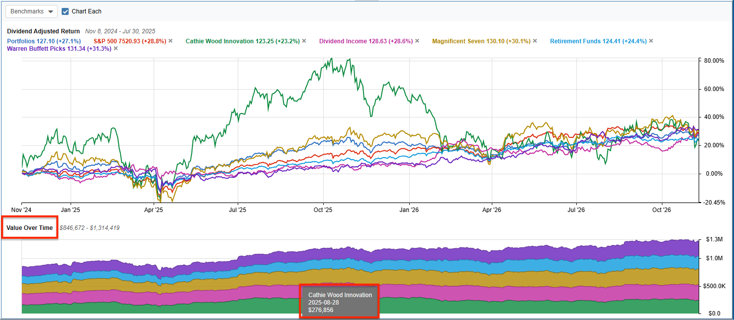
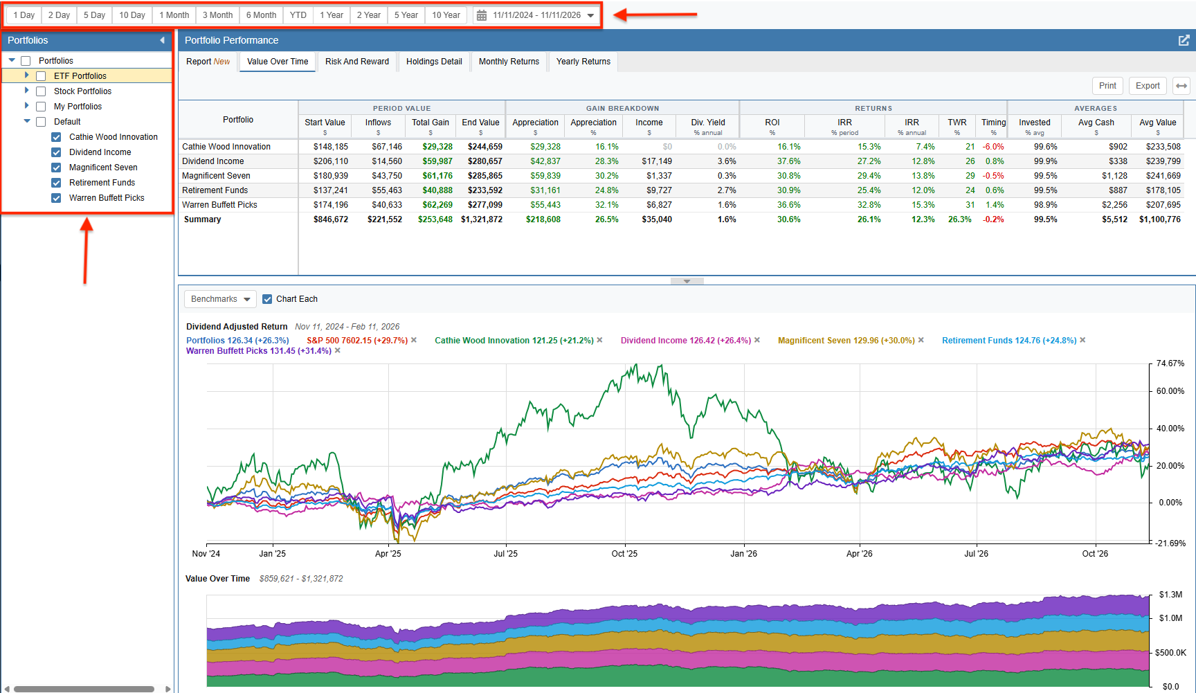
This tab displays the table at the top of the screen and the chart panel at the bottom. The chart panel includes two graphs showing the Price Change and Value Over Time for the selected portfolios.
The portfolios you wish to analyze are selected on the left, and the timeframe is selected at the top.
Table
The table (shown below) displays the following measures of your portfolios’ value over the selected period:
- Portfolio
- Start Value
- Inflows ($)
- Total Gain ($)
- End Value
- Appreciation ($)
- Appreciation (%)
- Income ($)
- Div. Yield (% annual)
- ROI (%)
- IRR (% period)
- IRR (% annual)
- TWR (%)
- Timing (%)
- Invested (% avg)
- Avg Cash ($)
- Avg Value ($)
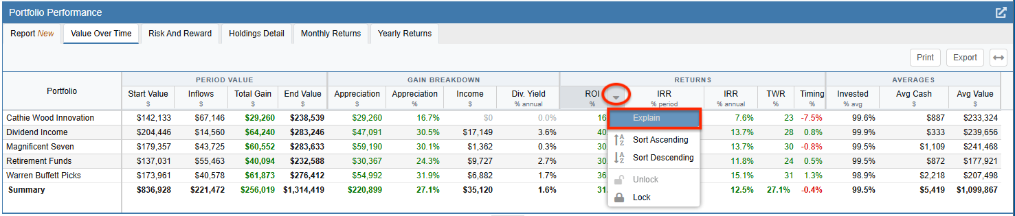
You can sort the rows in the table by any of these metrics by clicking on the column header. Clicking a header twice will reverse the sort order. You can also right-click any column header and select the ‘Explain’ option to view the technical definition of that metric.
Price Change Chart
The top chart is the Price Change chart. This allows you to chart your portfolios as one combined line or view them individually by selecting the ‘Chart Each’ option. Hovering your mouse over the chart will display a crosshair, allowing you to pinpoint the exact return percentage for any specific date.
Benchmarks can be added to the Price Change chart from the Benchmarks pull-down menu. Any benchmarks previously configured for the portfolio in the Portfolio Manager will also appear in this list.
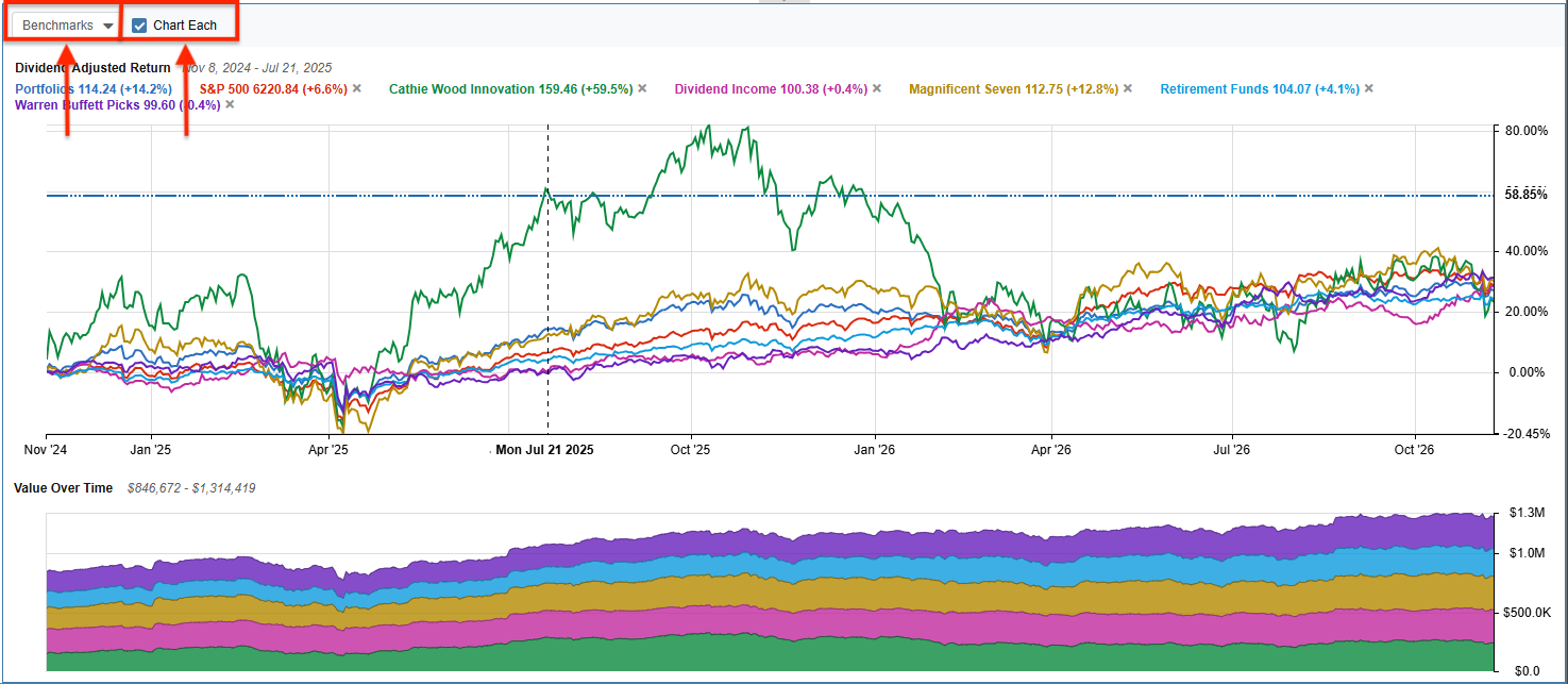
Value Over Time Chart
The Value Over Time chart is located at the bottom and tracks the absolute dollar value of the selected portfolios. Hovering your mouse over the chart will trigger a tooltip showing the exact value of your holdings on any specific date.