

Researching the Results of a Dividend Screener
 Printer Friendly
Introduction
This is the second of a three-part series that focuses on the Stock Rover features that help you quickly identify, research and track dividend investment candidates. The three-part series is structured as follows:
- Part 1 – Screening for Dividend Stocks and ETFs
- Part 2 – Researching the Results of a Dividend Screener
- Part 3 – Tracking Dividend Income
In this blog post we will cover using the Table, Chart, and Insight Panel to research the results of a Dividend Screener.
We’ll also show how to perform a deeper dive into a stock using Stock Ratings for peer analysis and Research Reports for comprehensive reporting.
Dividend Resources
Investor Library
To get started, Stock Rover comes with a wealth of out-of-the-box resources available in the Investor Library. These resources provide a tremendous head start and make it easy to quickly research dividend-paying stocks and ETFs.
-
Screeners
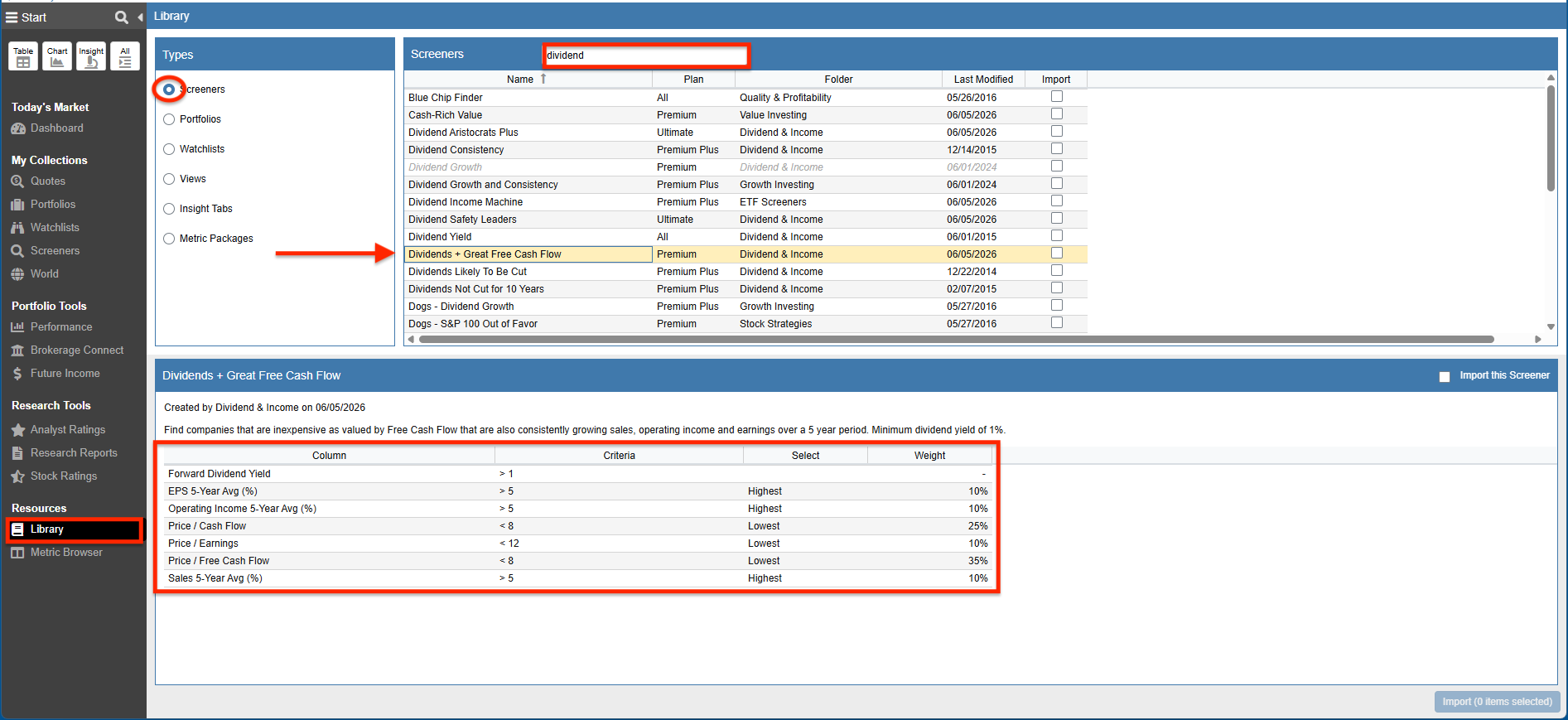
Whether we are interested in looking for companies that have a history of paying regular uninterrupted dividends, are growing their dividends, are providing a desired dividend yield, are ensuring that companies are earning enough to meet their dividend obligations or something even more exotic, there is likely a dividend screener to suit our needs.
Below we searched the Library and returned a list of Screeners that have the word “dividend” in the name or description. We can use these Screeners as is or tailor them to our specific criteria.
-
Portfolios
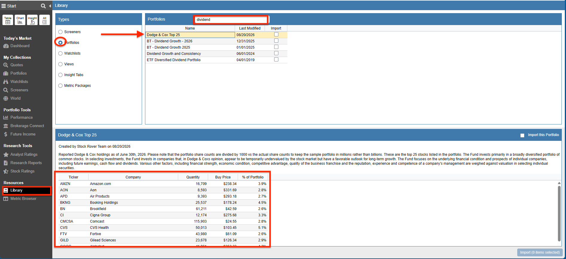
The Library also comes with dividend-centric Portfolios. We can import the Portfolios from the Library and either implement them as is or update them with new holdings.
-
Watchlists
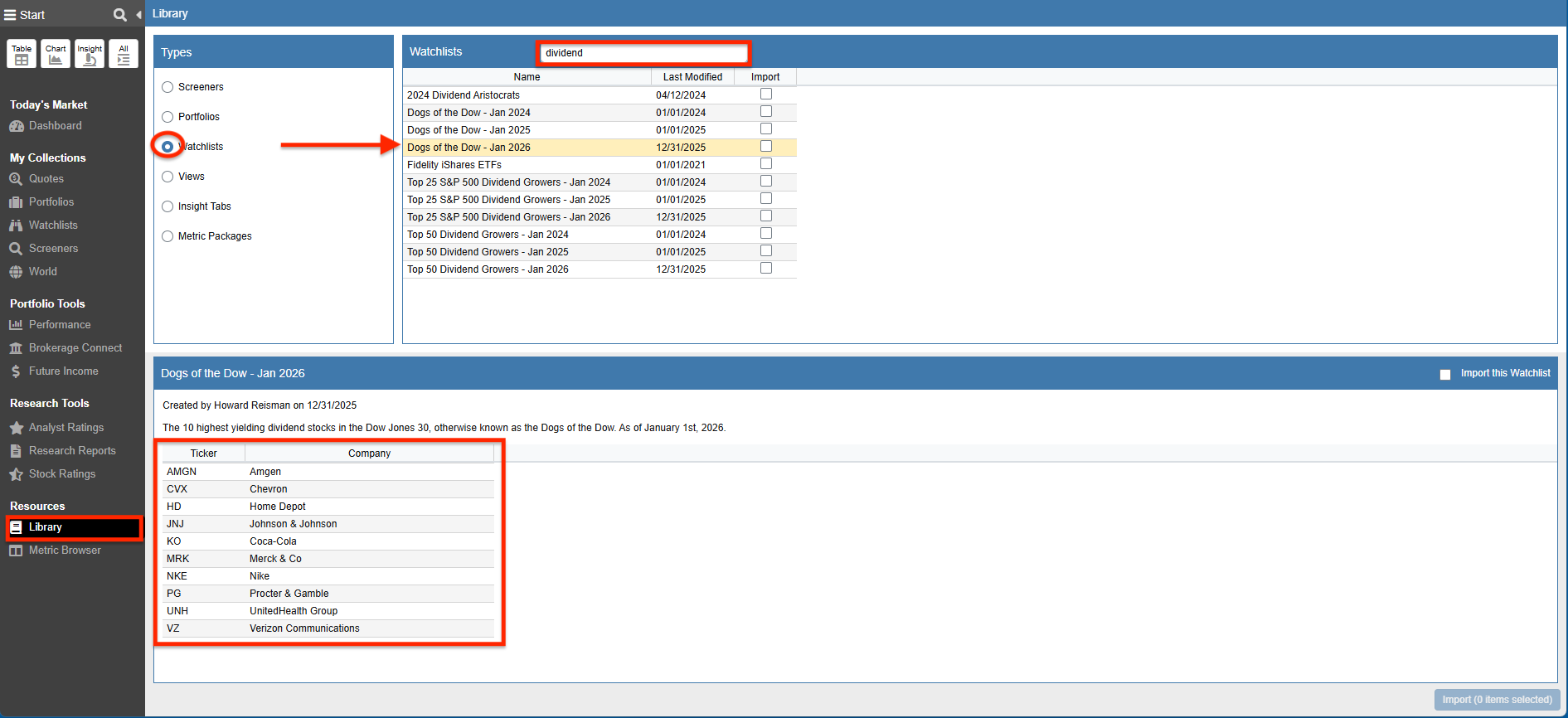
We can also target Stocks and ETFs to research by choosing any of the dividend-centric Watchlists. We can import the Watchlists from the Library and either implement them as is or update them with different tickers.
-
Views
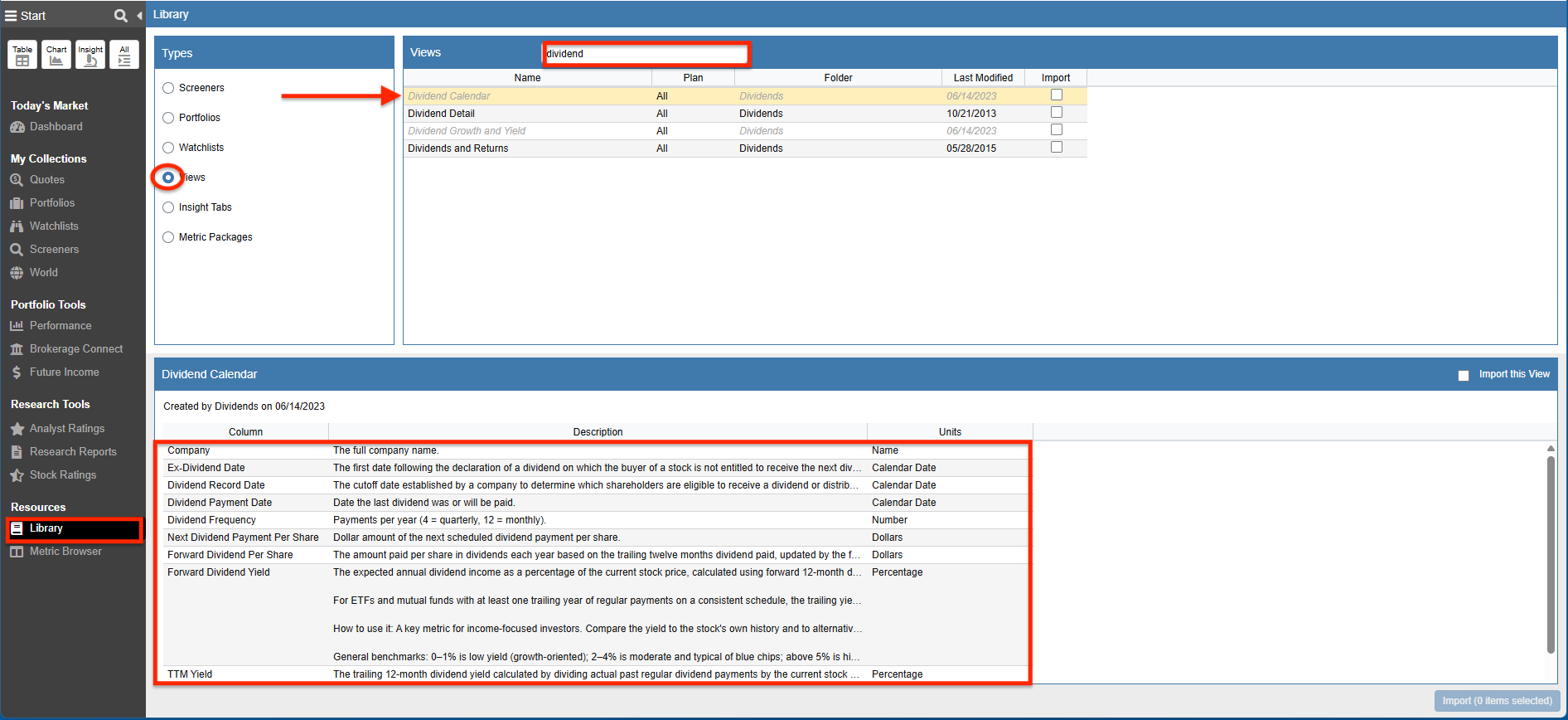
We can load the Table with any of the dividend-centric Views from the Library. These Views allow us to quickly perform a comparative analysis between tickers. We can use these Views as is or tailor them further to suit our requirements.
Metric Browser
Stock Rover comes with a solid foundation of dividend-centric metrics that we can use to perform our research.
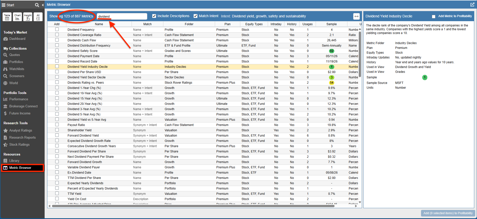
Below we launched the Metric Browser which shows all of the metrics available in Stock Rover, and then entered dividend into the search box.
The Metric Browser returned 123 metrics with dividend as part of the metric name or description. In addition, we have made this PDF file available which lists each out-of-the-box metric along with a description.
Researching Dividend Stocks
We are going to demonstrate researching dividend stocks using the results from our “Stock Rover Dividend Ratings” Screener which we imported from the Investor Library.
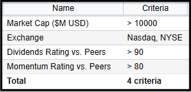
This is a simple screener that returns tickers that meet the following criteria:
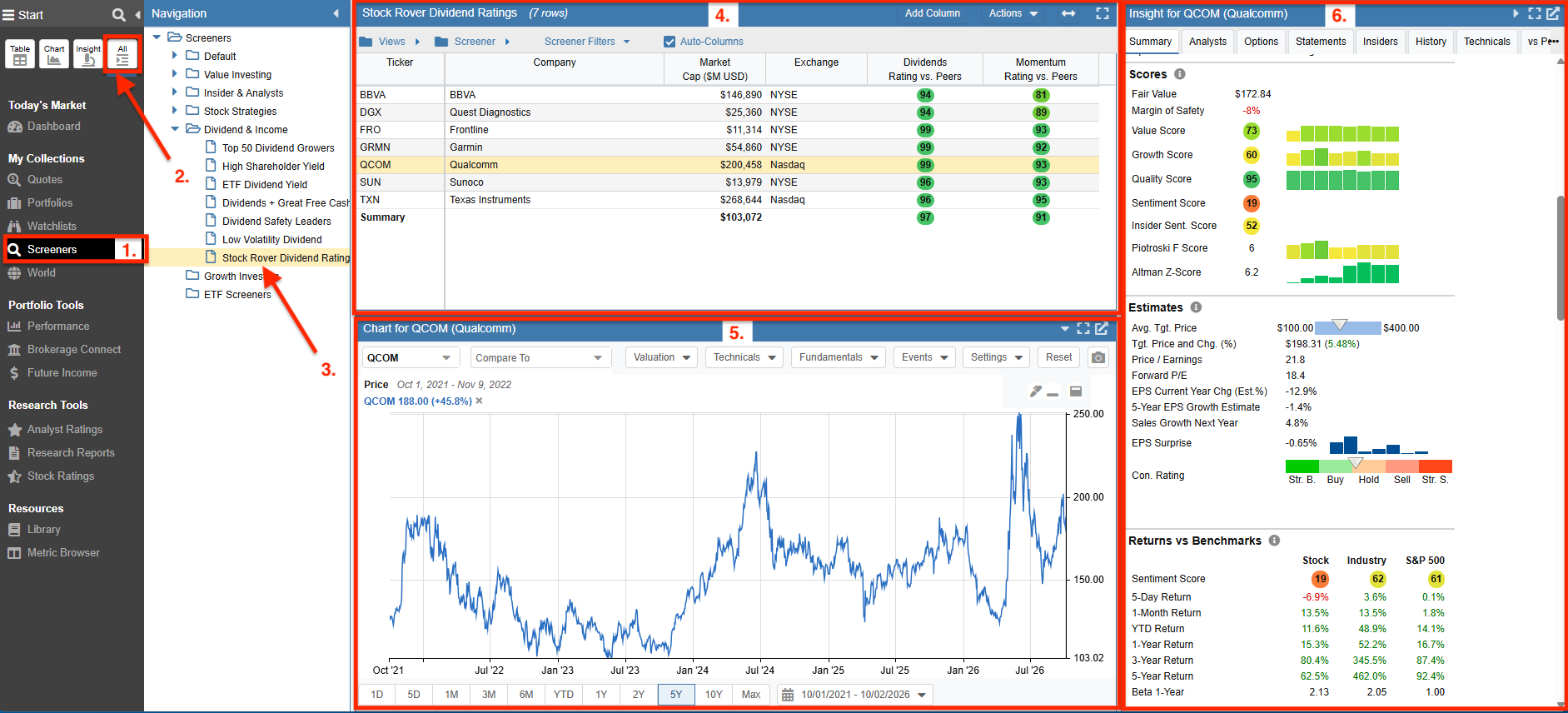
Below we see an example of performing research using the All Layouts display. We can also display the Table, Chart, or Insight Panel individually.
Each of the Layouts (Table, Chart, and Insight) presents fundamentals and quantitative metrics to help us identify and evaluate dividend stocks.
- Start Menu – We selected Screeners.
- Start Menu – We clicked on All.
- Selected the Stock Rover Dividend Ratings Screener.
- Table – Shows a comparative analysis of the passing tickers using the Screener Filters View.
- Chart – Graphs our ticker selected from the Table.
- Insight – Takes a deep dive into our selected ticker.
Table
The Table provides a flexible spreadsheet-like paradigm for viewing tickers and their data. In our example below, each row in the Table corresponds to a ticker that passed our screener, and each column corresponds to a dividend-centric metric that we are interested in evaluating.
Viewing Dividend Metrics
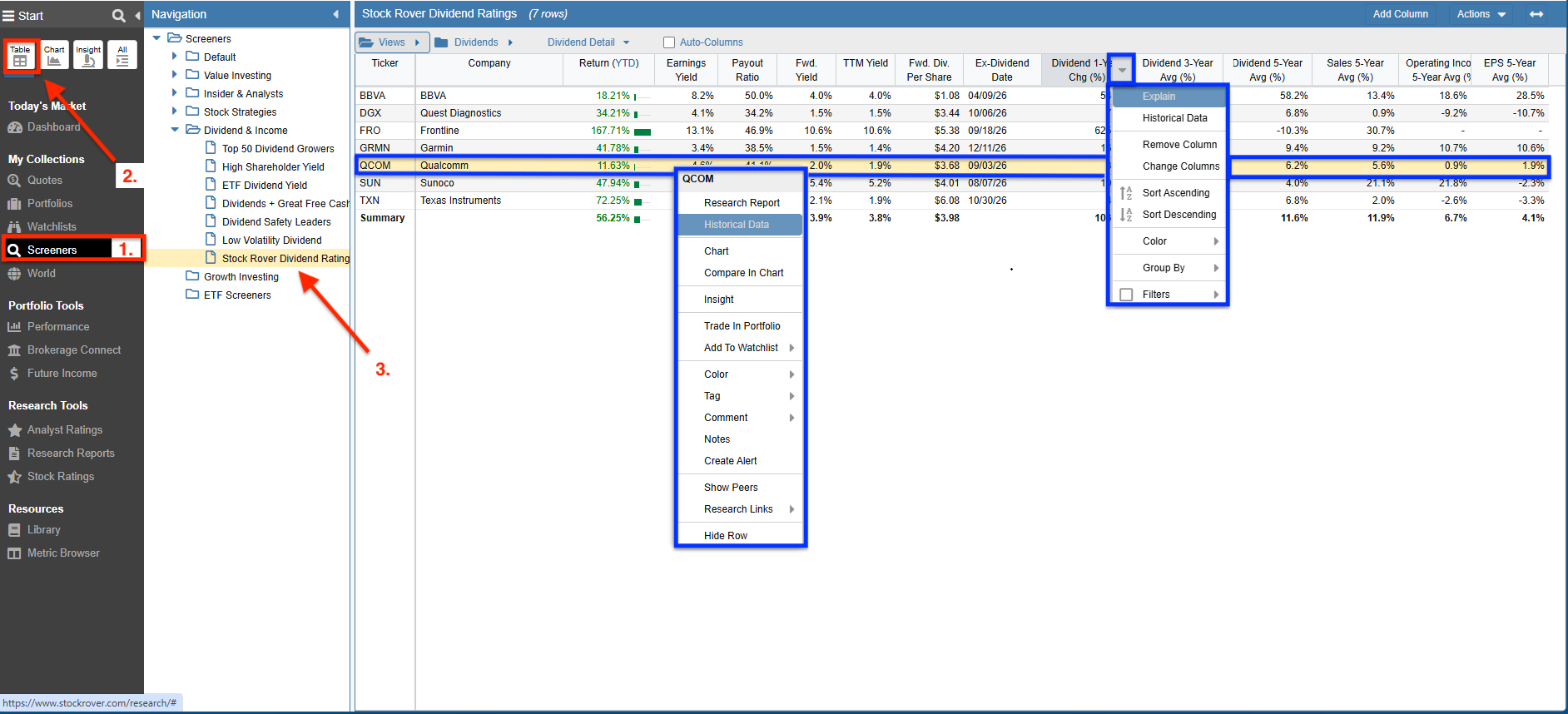
Below we loaded the Table with the results of our Stock Rover Dividend Ratings screener.
We selected the Dividend Detail View, one of the many dividend-centric views available for import from the Investor Library.
- Start Menu – We selected Screeners.
- Start Menu – We clicked on Table.
- Selected the Stock Rover Dividend Ratings Screener.
- Views – We selected the Dividend Detail View from the Dividends folder.
Clicking on a column header in the Table reveals a number of options, including the ability to sort and group the rows in the Table. For example, we could group by sector and then sort by dividend yield.
We can also right-click on a row for row actions. For example, we could add the ticker to a Watchlist, trade it in a Portfolio, or show Historical Data.
Displaying Historical Data
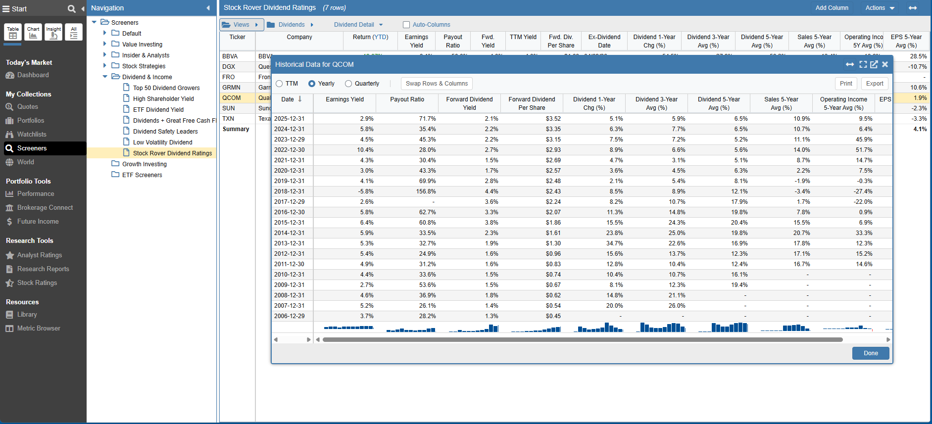
Below we right-clicked on the row corresponding to Qualcomm (QCOM) and chose Historical Data.
We now see the Historical Data window showing yearly data for each of the metrics in the Dividend Detail view – including Earnings Yield, Payout Ratio, Dividend Yield, and more.
Showing Dividend-Adjusted Returns
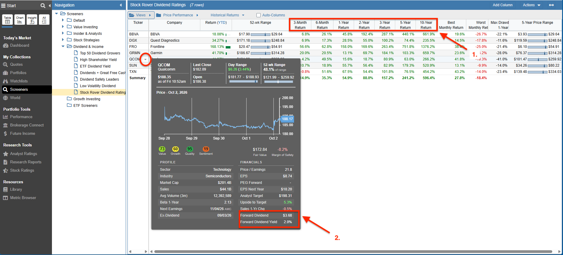
The Table below is displaying the dividend-adjusted returns of the tickers that passed our Stock Rover Dividend Ratings screener.
We are referencing the Historical Returns view and we also moused over Qualcomm (QCOM) to expose the ticker’s Tooltip.
A few things we’ll want to take note of:
- Return columns that span more than one day are showing the dividend-adjusted return.
- The tooltip shows some great information, including Forward Dividend Rate and Dividend Yield.
Chart
Stock Rover comes with a powerful charting facility. In this section, we’ll cover some of the many different ways that you can chart dividend metrics.
Price
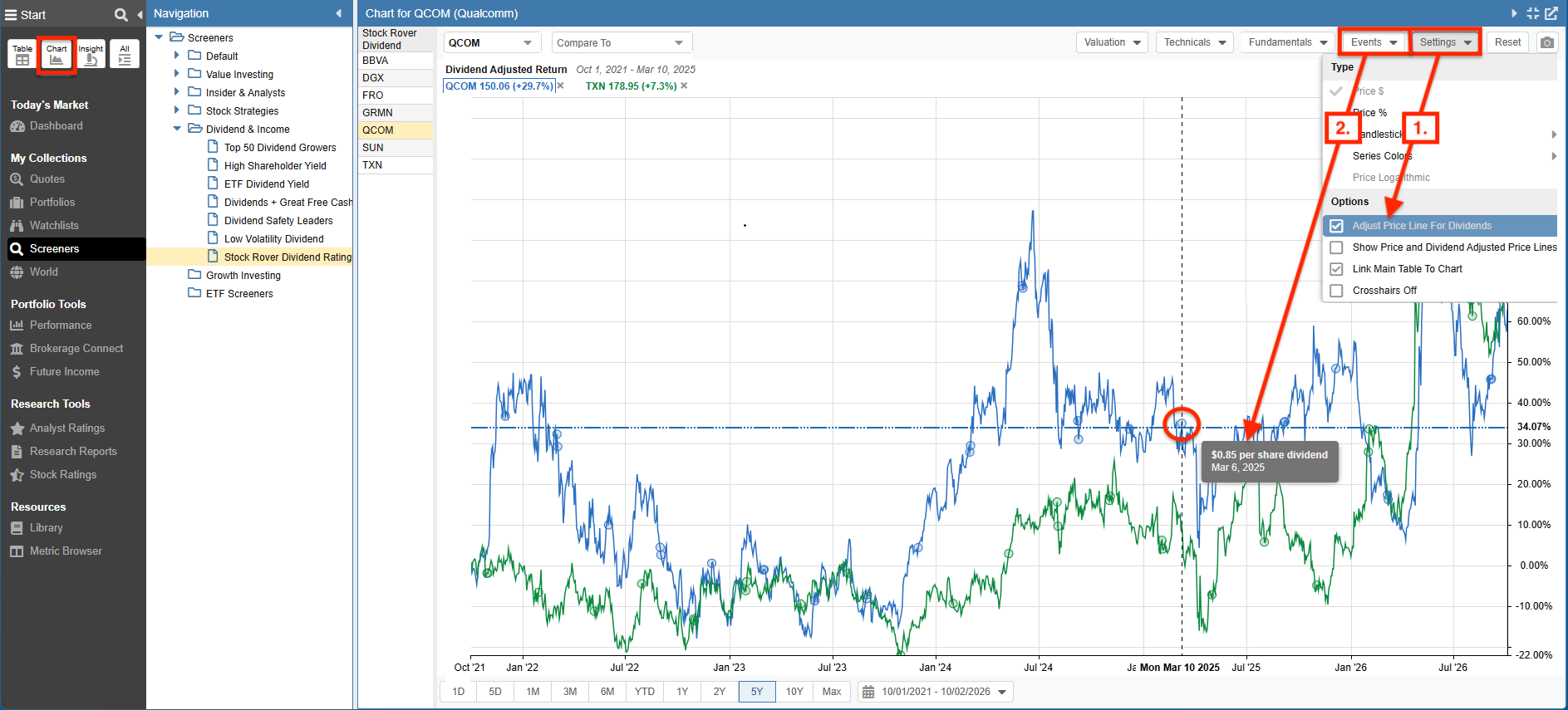
In the Price Chart below we are comparing the dividend-adjusted return over 5 years between two tickers – Qualcomm (QCOM) and Texas Instruments (TXN).
- We can adjust whether to plot the dividend-adjusted return or price return via Settings.
- We can also choose to display Dividend Events in the chart. In the example below, we hovered over the tooltip for a Dividend Event, and see that Qualcomm (QCOM) paid a $0.85 per share dividend on March 6, 2025.
Fundamental
With Fundamental Charts we have the ability to chart hundreds of fundamental metrics including those specific to dividends.
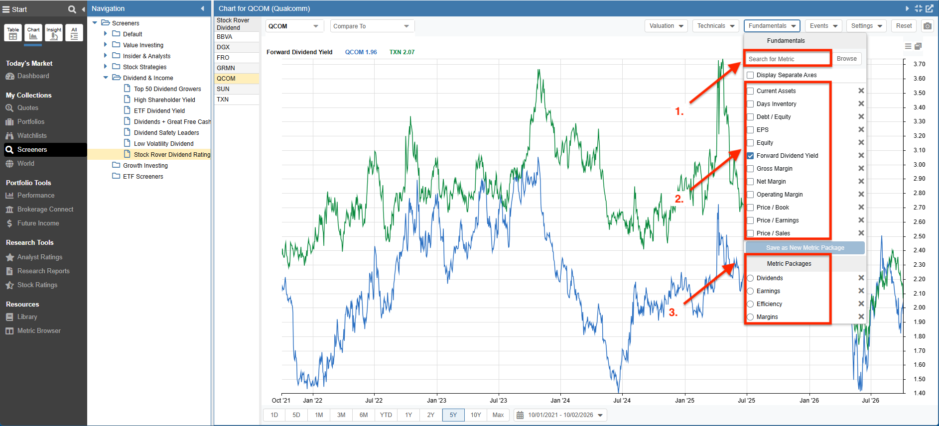
Below we are comparing the dividend yield between Qualcomm (QCOM) and Texas Instruments (TXN) over a 5-year period of time.
We can tailor the chart as follows:
- We can search for the fundamental(s) we’d like to chart.
- Select from recently charted fundamentals.
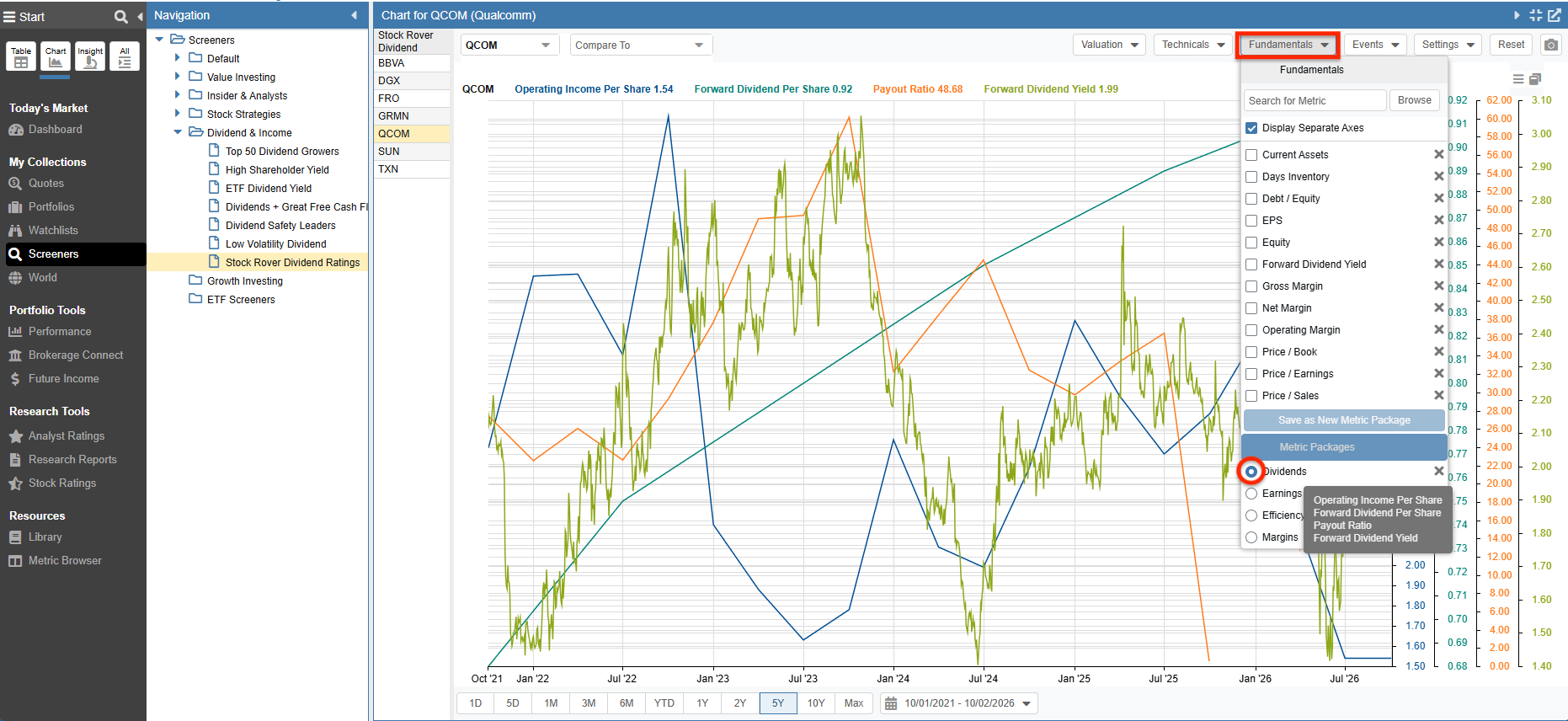
- Chart a Metric Package, which is a curated grouping of related fundamentals.
As an example, if we choose the “Dividends” Metric package, then operating income per share, dividend per share, payout ratio, and dividend yield would be displayed in a single chart.
The screenshot shown below is an example of the fundamental chart for the “Dividends” Metric package.
Price vs. Fundamental
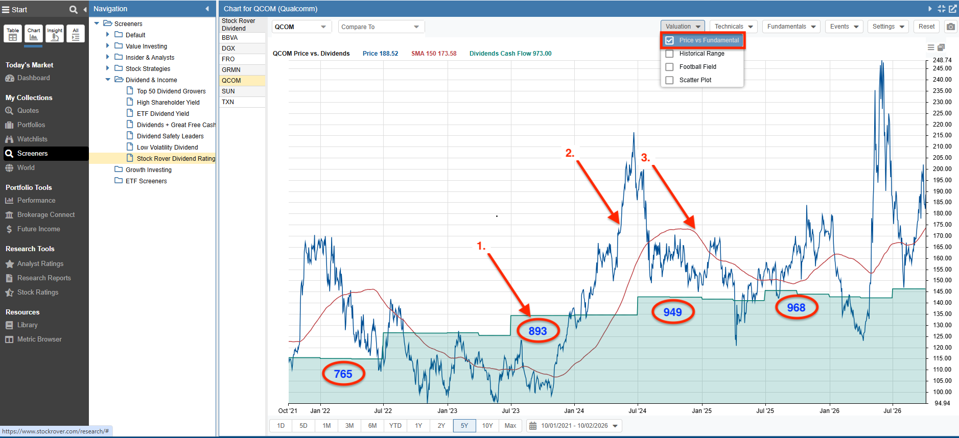
In a Price vs. Fundamental chart we are seeing how a fundamental varies over time relative to price.
In our example, we are charting Qualcomm’s (QCOM) price versus dividend cash flow, which is the cost of dividend payments to the company over the last twelve months in cash per share.
- The green area chart highlights the dividend cash flow values, demonstrating the relative change in the value of dividend cash flow.
- The ticker price is charted in blue.
- The simple moving average is shown in red.
Because both the dividend cash flow and price lines begin at the same point we can see how the dividend cash flow value varies over time relative to the price.
Historical Range
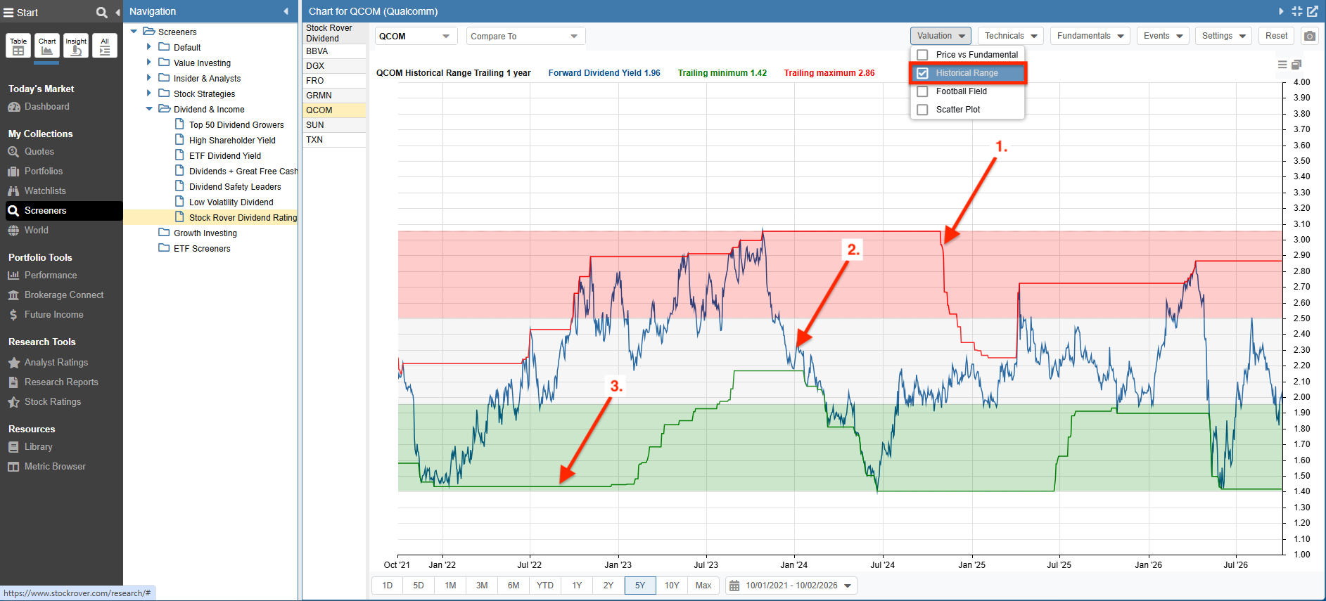
With the Historical Range chart, we can plot a metric over time relative to its historical range. The graph background is colored to show regions of undervaluation (green), normal valuation (white), and overvaluation (red).
Below we are plotting the dividend yield over 5 years for Qualcomm (QCOM).
- The trailing 12-month (TTM) maximum dividend yield values are represented by the red line.
- The actual dividend yield is represented by the blue line.
- The green line is plotting the trailing 12-month minimum dividend yield values.
Football Field
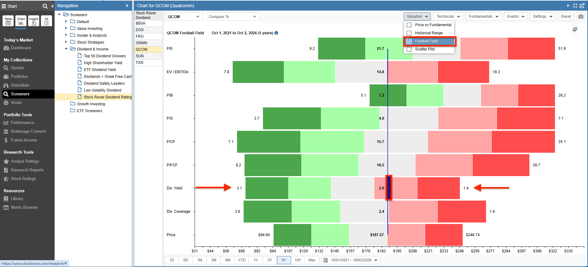
The Football Field chart shows key valuation metrics. Each horizontal bar represents the minimum and maximum value of the metric and is color coded into quintiles. The vertical blue line represents the ticker’s current metric value.
Below we see that Qualcomm’s (QCOM) current dividend yield is 2.0 – while its 5-year high value is 3.1 and its 5-year low value is 1.4.
Insight Panel
The Insight Panel contains tools for researching a stock in depth. As there is a wide variety of information, the research data is logically grouped into tabs.
Summary
The Summary tab includes an array of basic information about our selected company.
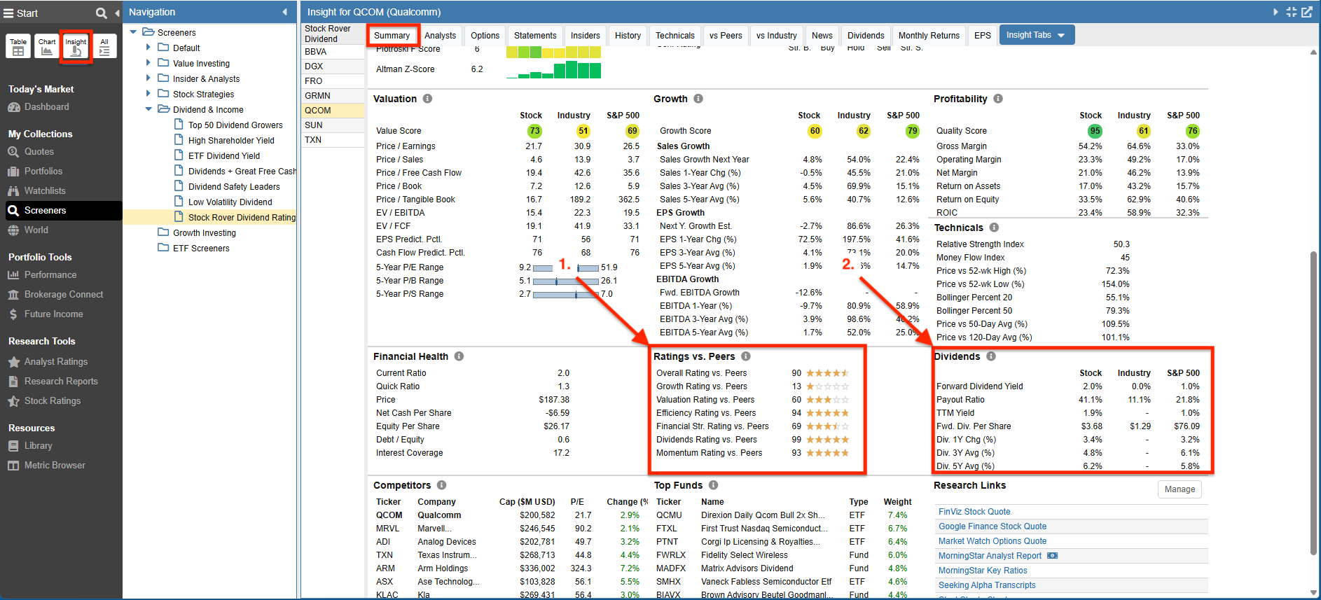
We are researching, and below we show the Summary Insight panel, highlighting two key sections that contain dividend information.
- Dividends Rating vs Peers – Shows Stock Rover’s dividend percentile rating of the stock, where a score of 100 is best. Qualcomm (QCOM) has a rating of 90, which indicates it is in the 90th percentile of companies that pay a dividend in the Semiconductors Industry Group. The proprietary algorithm compares the company to its peers and considers the consistency of key dividend metrics as well as their direction of change.
- Dividends – Displays comparative dividend information for the Company, its Industry, and the S&P 500.
Dividends
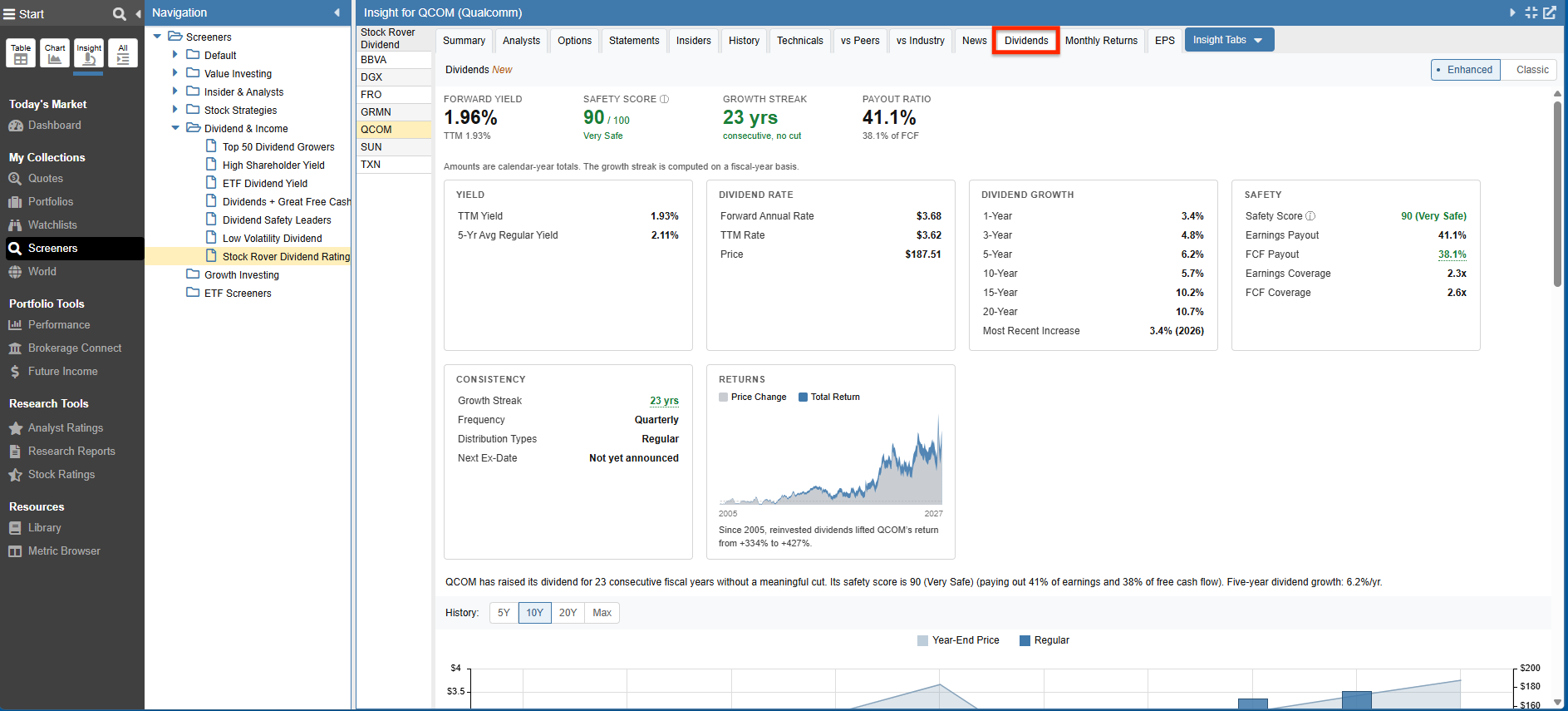
The Dividends tab provides comprehensive dividend information and analytics for a selected ticker.
The full Dividends display for Qualcomm (QCOM) is organized into comprehensive sections to help you visualize dividend performance:
- Comprehensive Dividend Dashboard – Provides an immediate snapshot of top-level metrics like Forward Yield, Safety Score, Growth Streak, and Payout Ratio, anchored by dedicated data cards that drill down into historical yield, dividend rate variations, and long-term dividend growth.
- Dividend Payments & Price – Displays the historical dividend payments as a bar chart with the stock’s price superimposed, showing exactly how the dividend and price interact over time.
- Yield Over Time – Scrolling down the tab reveals a charting feature that tracks the dividend yield over time alongside the stock price and the payout ratio, providing a visual gauge of dividend sustainability and value.
- Dividend Payment History – Further down, a comprehensive table details the company’s past dividend distributions, allowing you to track ex-dates, payment dates, payout amounts, and dividend types.
History
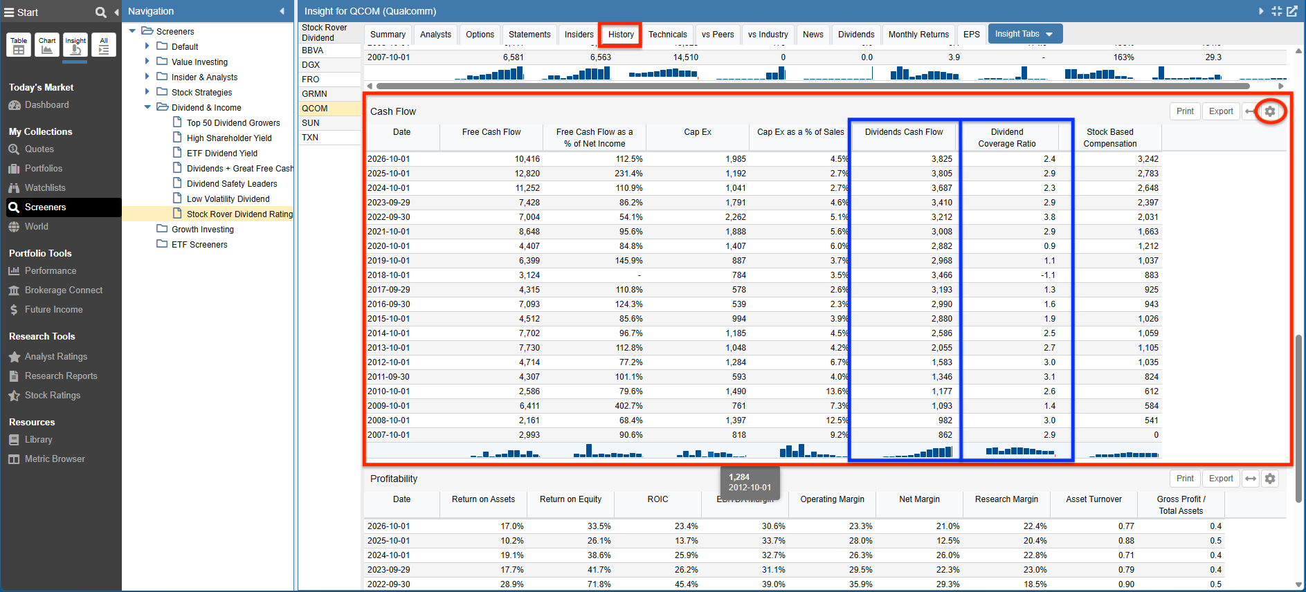
The History tab shows key data from both the Income Statement and the Balance Sheet, as well as metrics specific to Cash Flow, and Profitability.
Below we see Cash Flow metrics for Qualcomm (QCOM). The metrics specific to dividends include TTM values for the Dividends Cash Flow and the Dividend Coverage Ratio.
Note: If we click on the gear to the far right of this section we can change the display to show Quarterly or Calendar Year values.
vs Peers
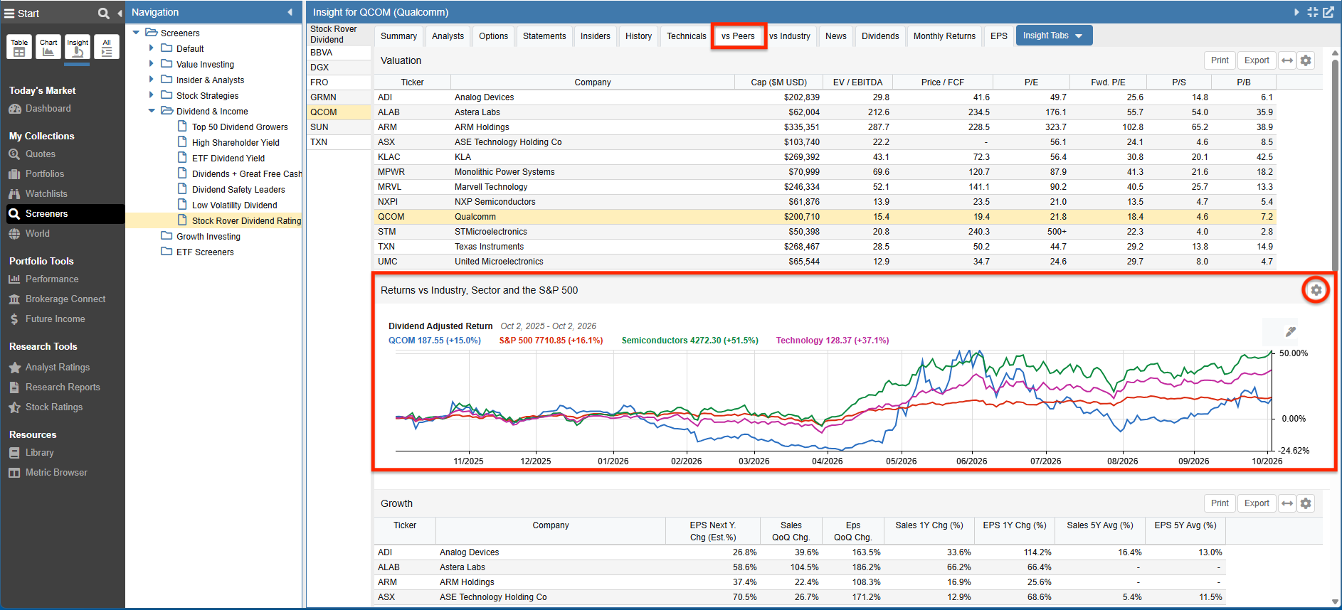
The vs Peers tab contains extensive information about a stock versus its closest peers. Categories covered include Valuation, Growth, Fair Value, Return vs Industry/Sector/S&P 500, and Price Strength & Drawdown Risk.
Below we see the Return vs Industry/Sector/S&P 500 chart. The display is charting the dividend-adjusted return of Qualcomm (QCOM) vs the S&P 500, its Industry – which is Semiconductors, and its Sector – which is Technology.
Note: If we were to click on the gear to the far right of the display we can change a number of chart settings, including the date range.
vs Industry
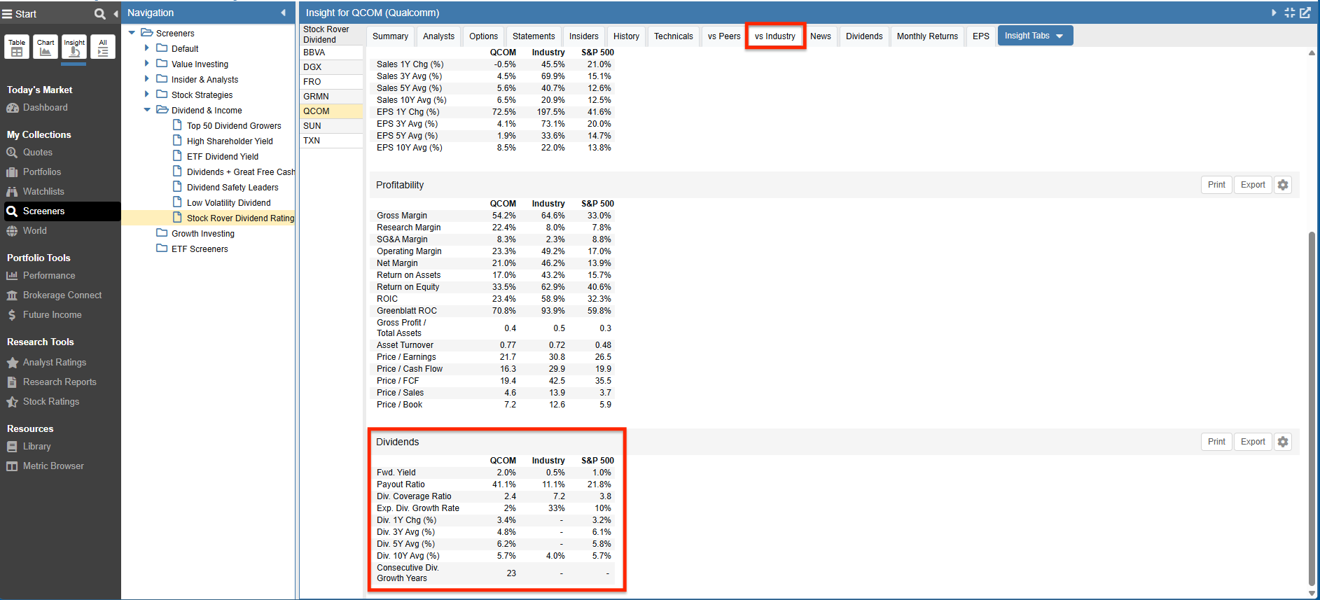
The vs Industry tab shows key information in a tabular form about a stock versus its industry and versus the S&P 500. Categories covered include Risk & Returns, Growth, Profitability, and Dividends.
The Dividends table below is showing us how Qualcomm (QCOM) performed as compared to its industry and the S&P 500.
Statements
The Statements tab contains data from financial statements.
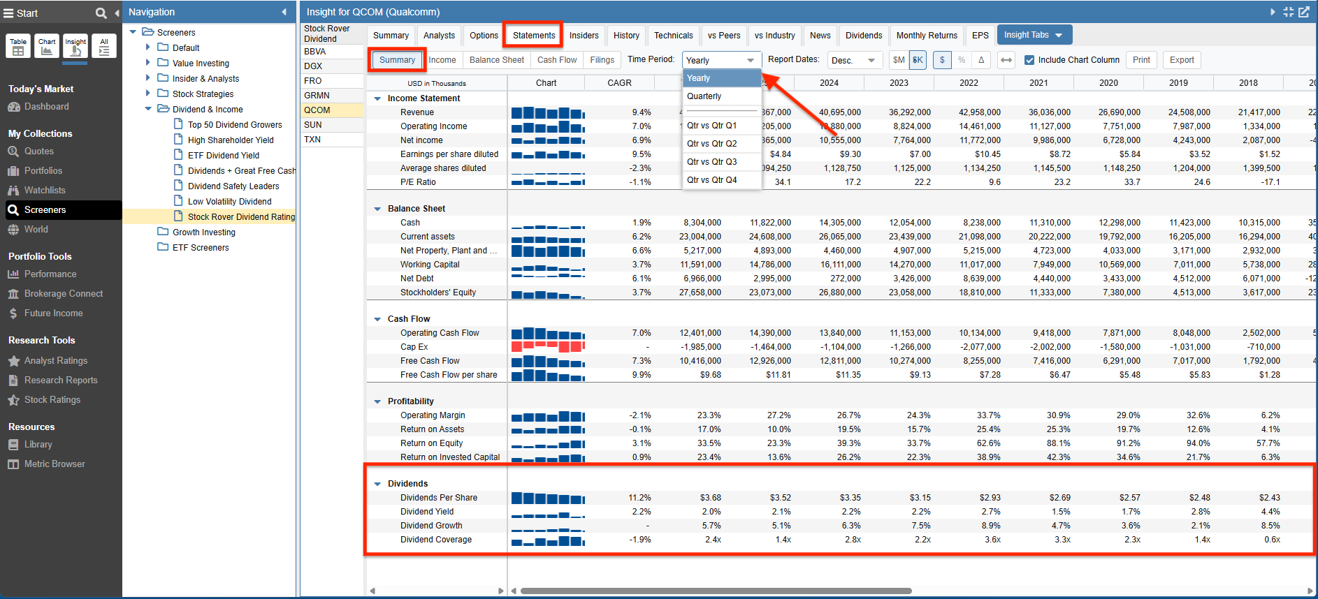
Clicking on Summary, Income Statement, Balance Sheet, Cash flow shows us the appropriate statement.
Clicking on Filings will list company’s filings with the SEC, each of which can then be clicked on to display the detailed filing.
Summary
Below we see summary data for Qualcomm (QCOM) including data from the Income Statement, Balance Sheet, and Cash Flow Statement – as well as additional information specific to Profitability and Dividends.
The Dividends section, highlighted below, includes the Dividends Per Share as well as the Dividend Yield, Dividend Growth, and Dividend Coverage.
The dividend data is represented as a bar chart, along with values for the compound annual growth rate, the TTM value, and the yearly values.
Note: We can choose to display Yearly, Quarterly, or Quarter versus Quarter data.
Cash Flow
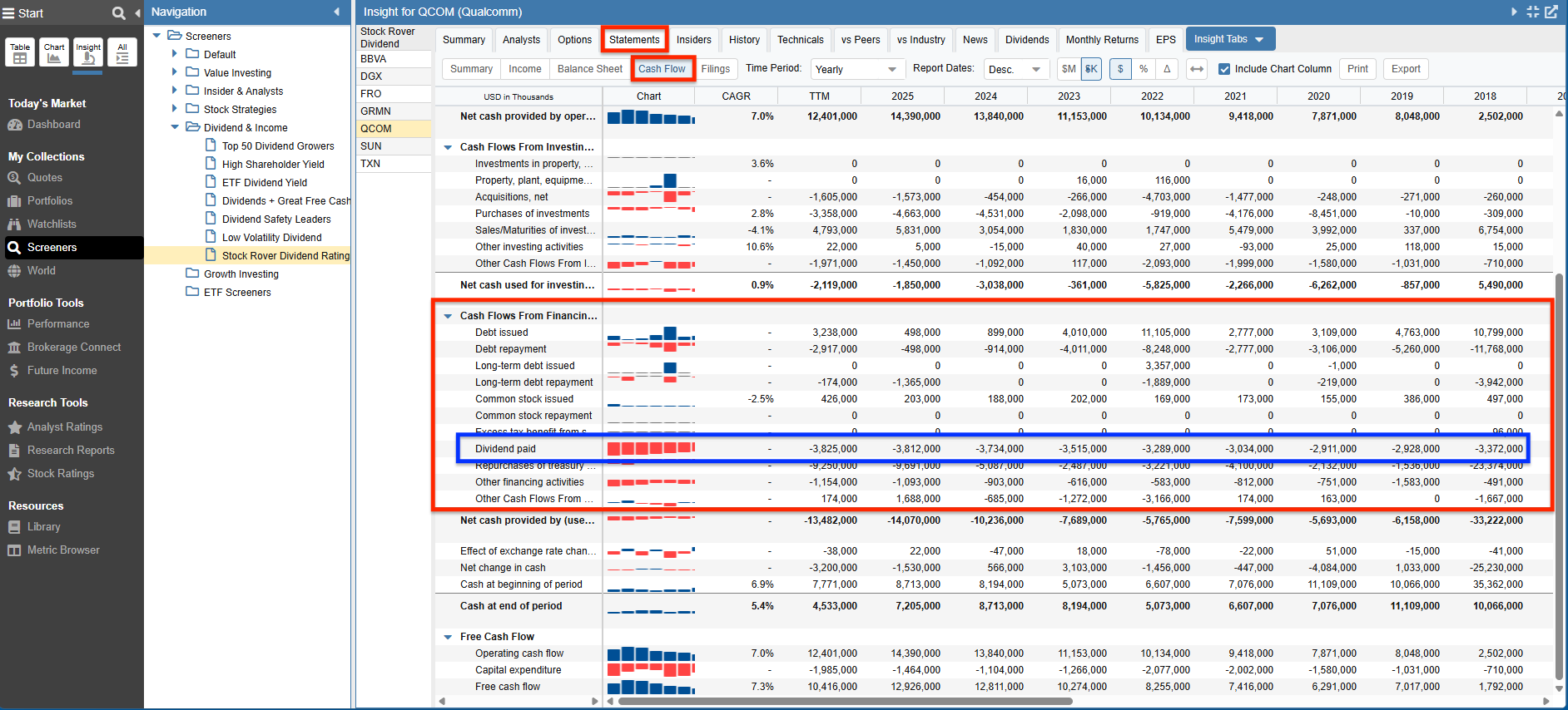
Below is the Cash Flow data for Qualcomm (QCOM).
Under “Cash Flows From Financing Activities” we see the Dividend paid represented as a bar chart, along with the compound annual growth rate, the TTM value, and the yearly values.
Stock Ratings
Stock Rover’s Stock Ratings facility, is a powerful capability that helps investors find and vet quality long-term companies to invest in.
For each of the six categories; Growth, Valuation Efficiency, Financial Strength, Dividend, and Momentum, Stock Rover selects the set of metrics that are critical to determining the performance of the stock in that specific category. Then for each metric in the category, Stock Rover looks at the value, trajectory, and the volatility of that metric and grades it against its peers. Using a proprietary algorithm it then calculates a percentile score. In addition, each metric is assigned a weight based on its importance.
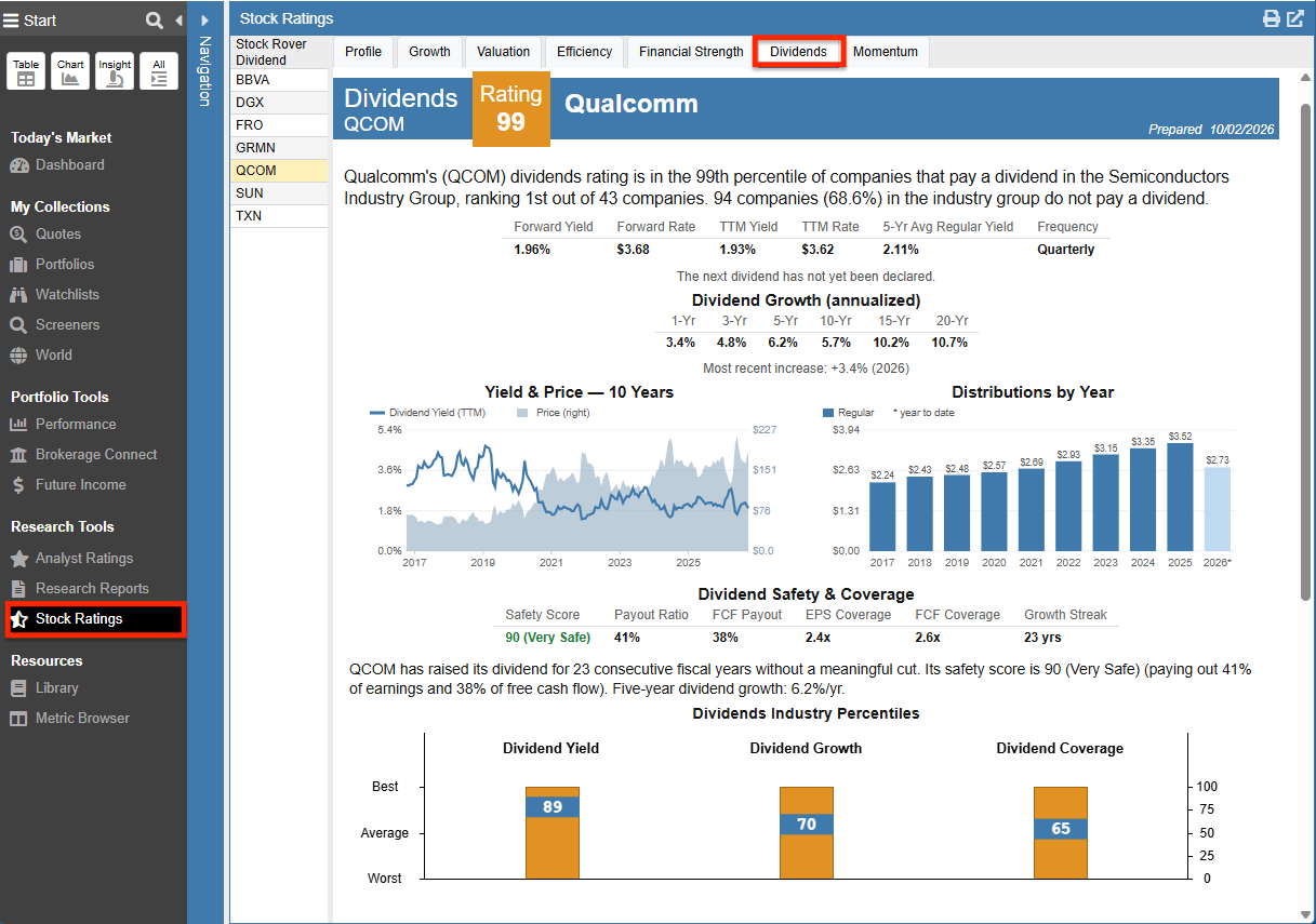
Looking at the Dividend category, we can see that Qualcomm’s (QCOM) dividends rating shows it in the 99th percentile of companies that pay a dividend in the Semiconductors Industry Group, ranking it 1st out of 43 dividend paying companies.
The display is packed with supporting dividend analytics. We see metrics for annualized Dividend Growth, a 10-year “Yield & Price” chart, and a historical “Distributions by Year” bar chart. Below that, Stock Rover evaluates Dividend Safety & Coverage and displays bar charts showing where Qualcomm’s (QCOM) Dividend Yield, Dividend Growth, and Dividend Coverage rank within its industry.
While not entirely visible in the screenshot below, scrolling further down the page provides even more depth, including additional charts that compare Qualcomm (QCOM) directly to its closest peers, as well as a comprehensive tabular Peers Analysis.
Research Reports
Note: Research Reports are included with Premium Plus plans and higher, and can also be purchased as an add-on for Premium subscribers. Please see Compare Plans for details.
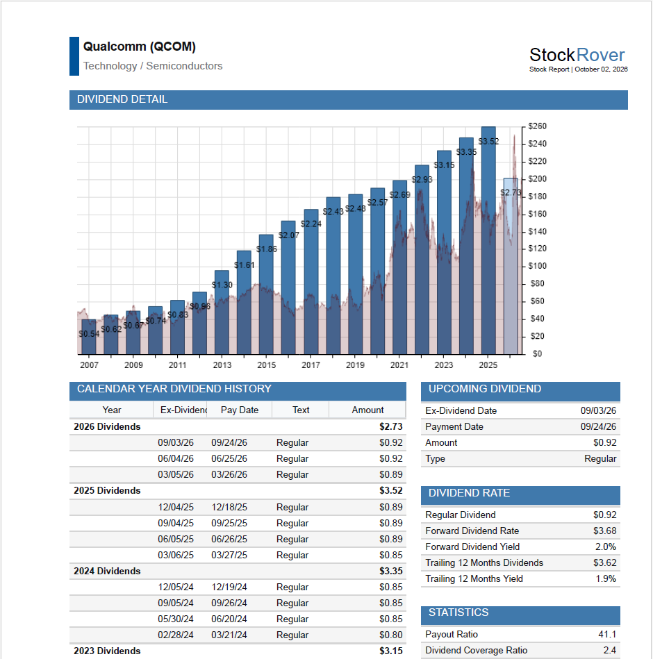
Research Reports deliver an on-demand comprehensive summary in PDF format for our selected ticker.
When we request a Research Report, the research and analytics are performed at the very moment we make that request.
The report is packed with information that is displayed in a clear and well-structured way.
Below we see the Dividend Detail page for Qualcomm (QCOM); there are additional dividend-centric analytics throughout the report. To see the entire research report for Qualcomm (QCOM) in PDF format, click here.
Summary
We began by first showing two key Stock Rover investor resources: the Investor’s Library and the Metric Browser.
We then demonstrated how the Stock Rover Table, Chart, and Insight Panel present a comprehensive set of dividend-centric fundamentals and quantitative metrics, helping us research and vet dividend stocks.
Lastly, we saw how the Stock Ratings facility helps us compare a company versus its peers. And we demonstrated how to use Research Reports to get an on-demand research report for a company.
In the next segment of this series, we’ll take a closer look at how we can quickly and easily track dividend income in Stock Rover.
Frequently Asked Questions
What resources does Stock Rover offer for dividend research?
The Investor Library includes pre-built Screeners, Portfolios, Watchlists, and Views tailored for dividend investing.
Where can I see a company’s historical dividend payment history?
The Insight Panel’s Dividends tab provides a comprehensive view of a company’s dividend track record. It includes a dashboard with a historical dividend payment bar chart, yield over time, and a detailed table tracking past ex-dates and payout amounts.
Can I chart dividend yields and historical payments?
Yes, Stock Rover’s charting facility allows you to plot dividend-adjusted returns, display specific dividend events directly on price charts, and use Fundamental Charts to compare metrics like dividend yield over a selected time period.
Can I get a PDF report for dividend stocks?
Yes, Stock Rover Research Reports provide an on-demand, comprehensive PDF summary for any selected ticker, including detailed dividend analytics and history.
How does Stock Rover rate dividend stocks against their peers?
Stock Rover uses its Stock Ratings facility to grade companies against their industry peers. It assigns a percentile score (1 to 100) for the “Dividends” category by analyzing the consistency, growth, and yield of a company’s dividend compared to its competitors.
Top