

Meet the New Stock Rover Dashboard
 Printer Friendly
Introduction
The Dashboard is one of the most popular and heavily used components of Stock Rover, serving as a powerful home base for your daily research. While our Classic Dashboard has long been a reliable tool for monitoring your portfolios, we saw an opportunity to build an even more dynamic and consolidated experience.
Today, we are thrilled to launch an entirely redesigned Dashboard. This modernization provides a significantly cleaner layout, upgraded widgets, and a much more efficient use of your screen real estate, putting the exact data you need front and center.
Rest Assured: The Classic Dashboard is Staying for Existing Users
Before we dive into the exciting new features, we want to reassure our long-time users: the Classic Dashboard is not going away for existing users who prefer the legacy layout.
We know that muscle memory is real, and changing your daily workflow can be disruptive. If you want to take your time adjusting to the new features, you can easily toggle between the “Classic” and “New” views at any time using the buttons at the top right of your screen.
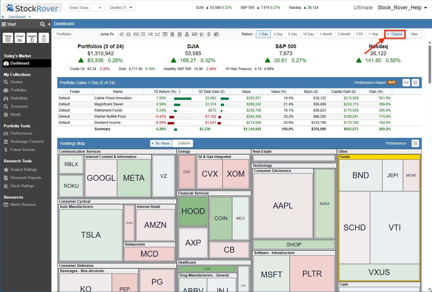
For existing users, the legacy Classic Dashboard remains fully accessible and can be toggled on with a single click.
Welcome to the New Dashboard
If you choose to switch over, you will immediately notice a crisper, more organized interface. The new layout is designed to dramatically reduce visual clutter while actually delivering more information. The modular, panel-based system allows you to effortlessly monitor broader market trends right alongside your specific portfolio performance in a single, unified view.
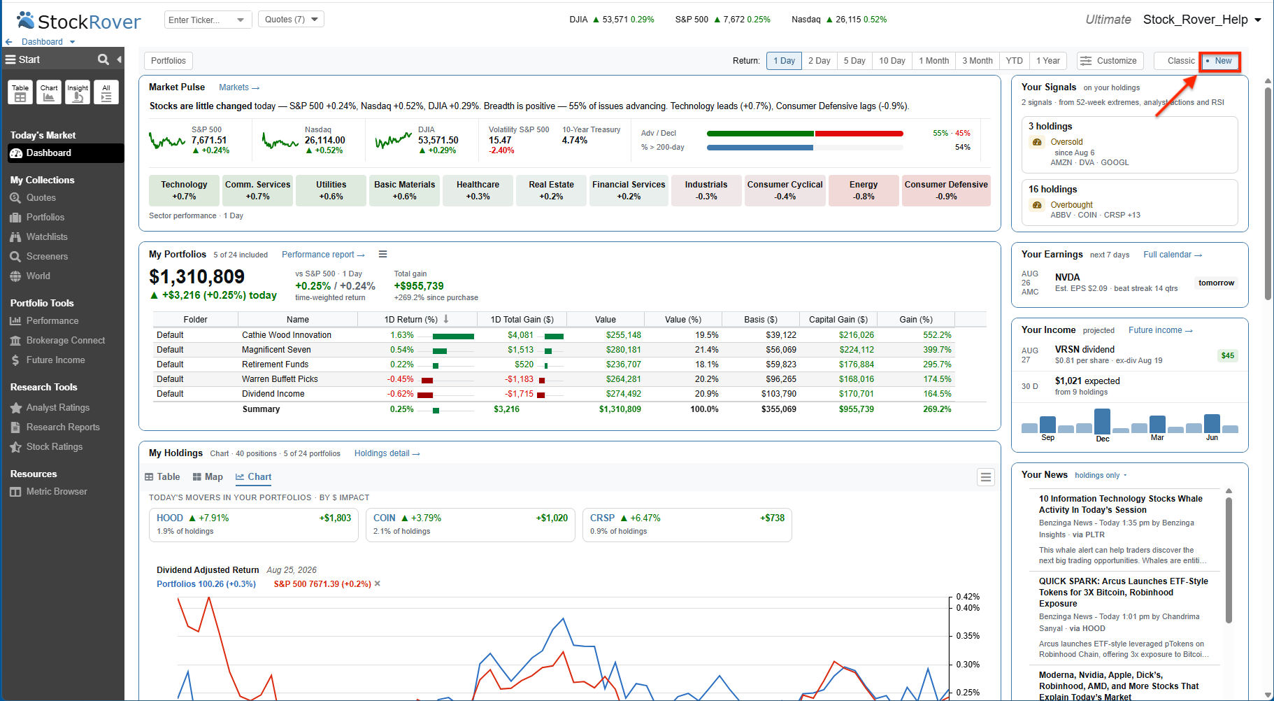
A modernized, wide-screen view of your portfolios, market pulse, and daily insights.
A Tour of the New Widgets and Panels
The true power of the new Dashboard lies in its specialized sections. We have broken down your essential daily data into clean, interactive panels.
Market Pulse & Sector Equities
At the very top, the Market Pulse and Sector Performance widgets give you an immediate read on the broader financial environment. We have expanded the Market Pulse to include critical market breadth metrics, allowing you to instantly track the Advance/Decline ratio, New 52-week Highs and Lows, and the percentage of equities currently trading above their 200-day moving average.
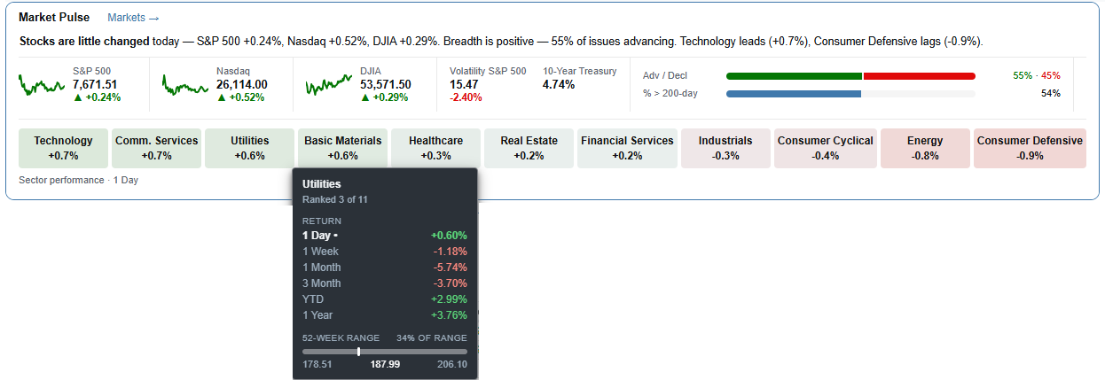
The Market Pulse features new breadth metrics and interactive historical tooltips.
My Portfolios: Your Wealth at a Glance
The My Portfolios panel gives you a comprehensive, immediate summary of your wealth creation over your selected time period. At the top, you can track your total overall value, compare your Time-Weighted Return directly against a benchmark, and view your total overall gain.
Directly beneath this top-line summary, a clean data table breaks down the specific performance, overall value, and capital gains of each individual portfolio, ensuring you always know exactly which accounts are driving your returns.
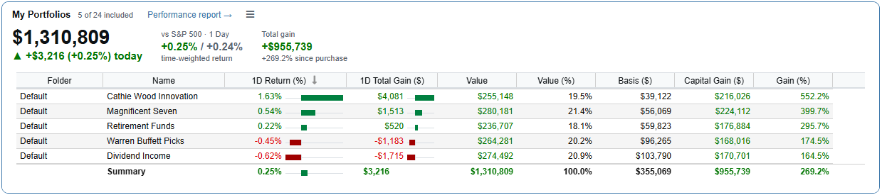
The My Portfolios panel provides a top-line summary of your total value and comparative returns, alongside a detailed breakdown of each individual account.
My Holdings: A Unified, Space-Saving View
In the Classic Dashboard, viewing your positions required multiple separate widgets that took up a large amount of vertical space. The New Dashboard cleverly collapses all of this into a single, unified My Holdings panel. This design lets you seamlessly investigate what is most important to you in one place, instantly toggling between a Table, Map, or Chart format.
Even better, your display preferences are completely sticky. If you gravitate to the Map tab and click on it, that is exactly what you will see the next time you access the dashboard.
- Table View: This isn’t just a static list. We have brought the powerful Value Over Time analytics directly into the Dashboard. This table uses the exact same flexible layout presets (Simple, Standard, and Detailed) introduced in our recent Portfolio Performance upgrades. It also highlights your biggest movers by impact right at the top.
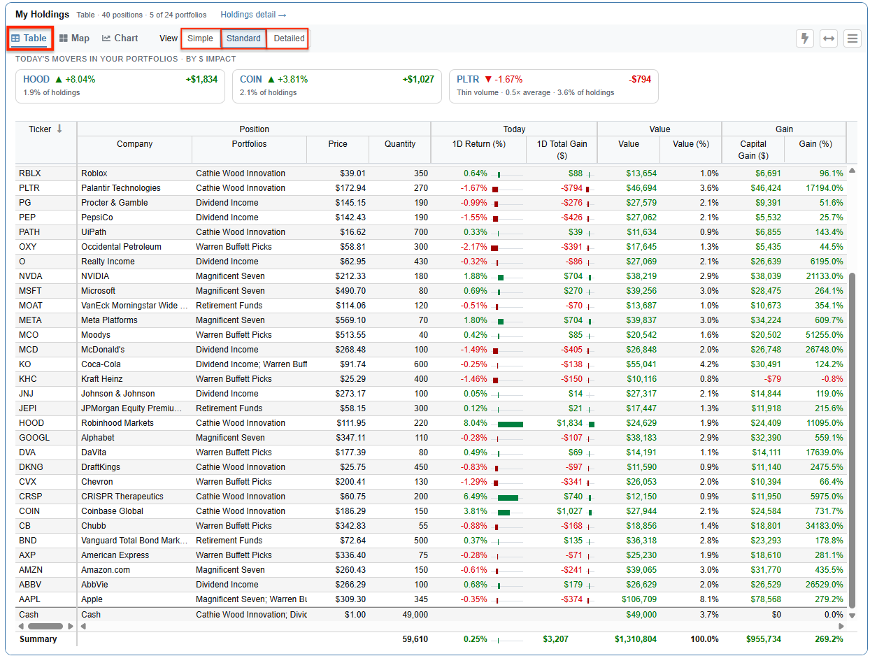
The Table view features customizable layouts (Simple, Standard, Detailed) and highlights your biggest movers.
- Map View: Toggle to the Map tab for an immediate heat map representation of daily performance and position sizing across your portfolios.
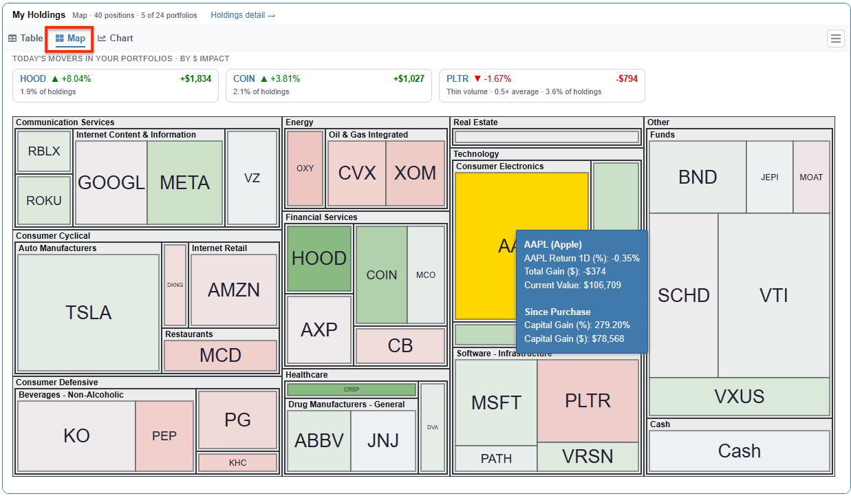
The Holdings Map view provides a striking visual representation of performance metrics.
- Chart View: With a single click, switch over to the Chart tab to visually trace the performance trajectory and Value Over Time of your holdings directly within the panel. This makes it effortless to spot trends without needing to jump to a separate reporting tool.
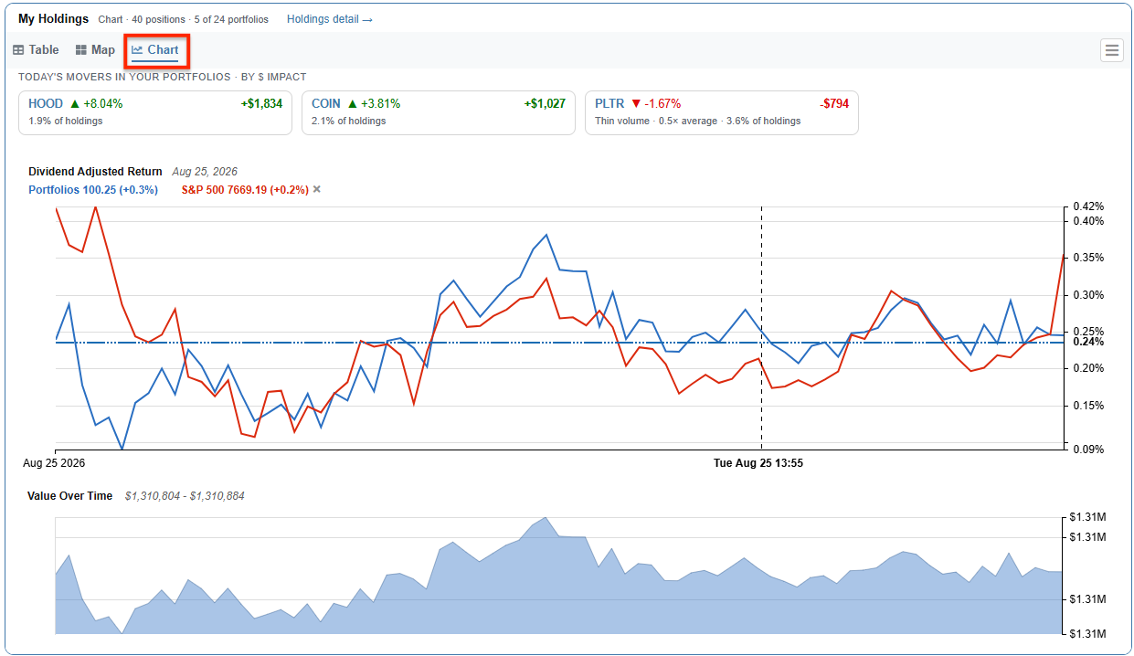
Dynamic Value Over Time charting is embedded directly into the My Holdings panel to save screen space.
Allocation Breakdown
Understanding your diversification is just as crucial as tracking your returns. The dedicated Allocation panel gives you a precise, interactive visual representation of exactly how your money is distributed. You can instantly see your weighting across different sectors, compare your sector exposure directly against the S&P 500, and review your overall mix of stocks, ETFs, and cash in one convenient spot.
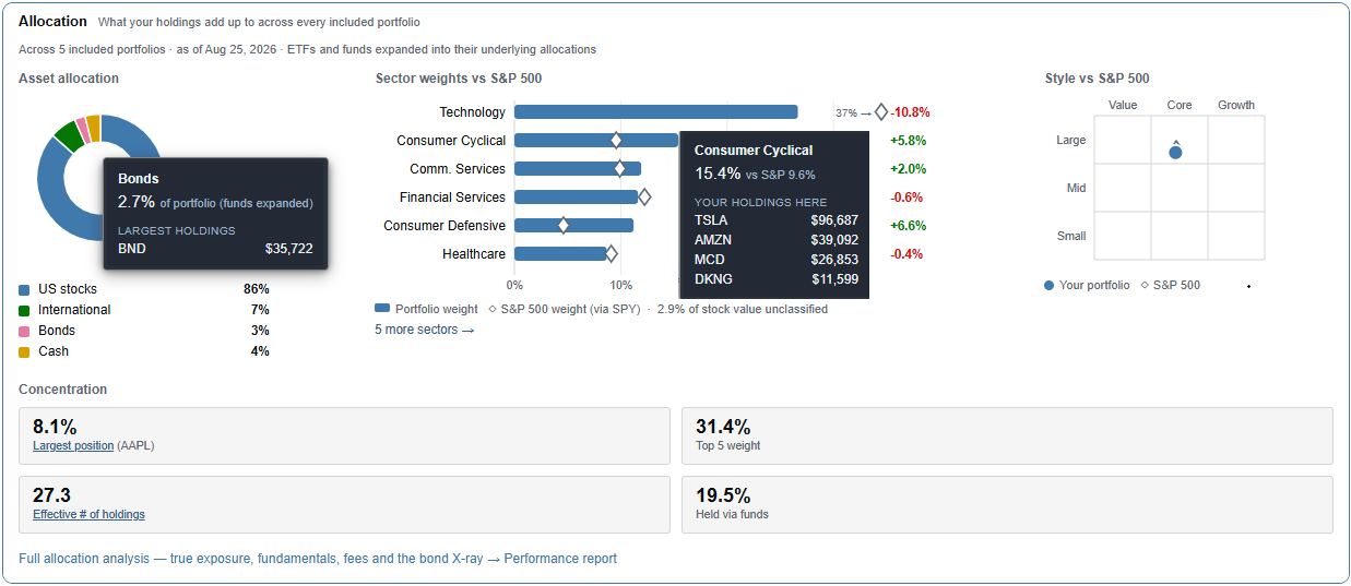
The Allocation widget provides an interactive visual representation of your diversification and sector weighting.
Insider Transactions & Analyst Ratings
For those who rely on tracking corporate insiders and Wall Street professionals, the Insider Transactions and Analyst Ratings panels are fully supported in the New Dashboard. While these sections function similarly to their Classic counterparts, they now benefit from the cleaner, modernized aesthetic of the new interface and fit perfectly within the modular column design.
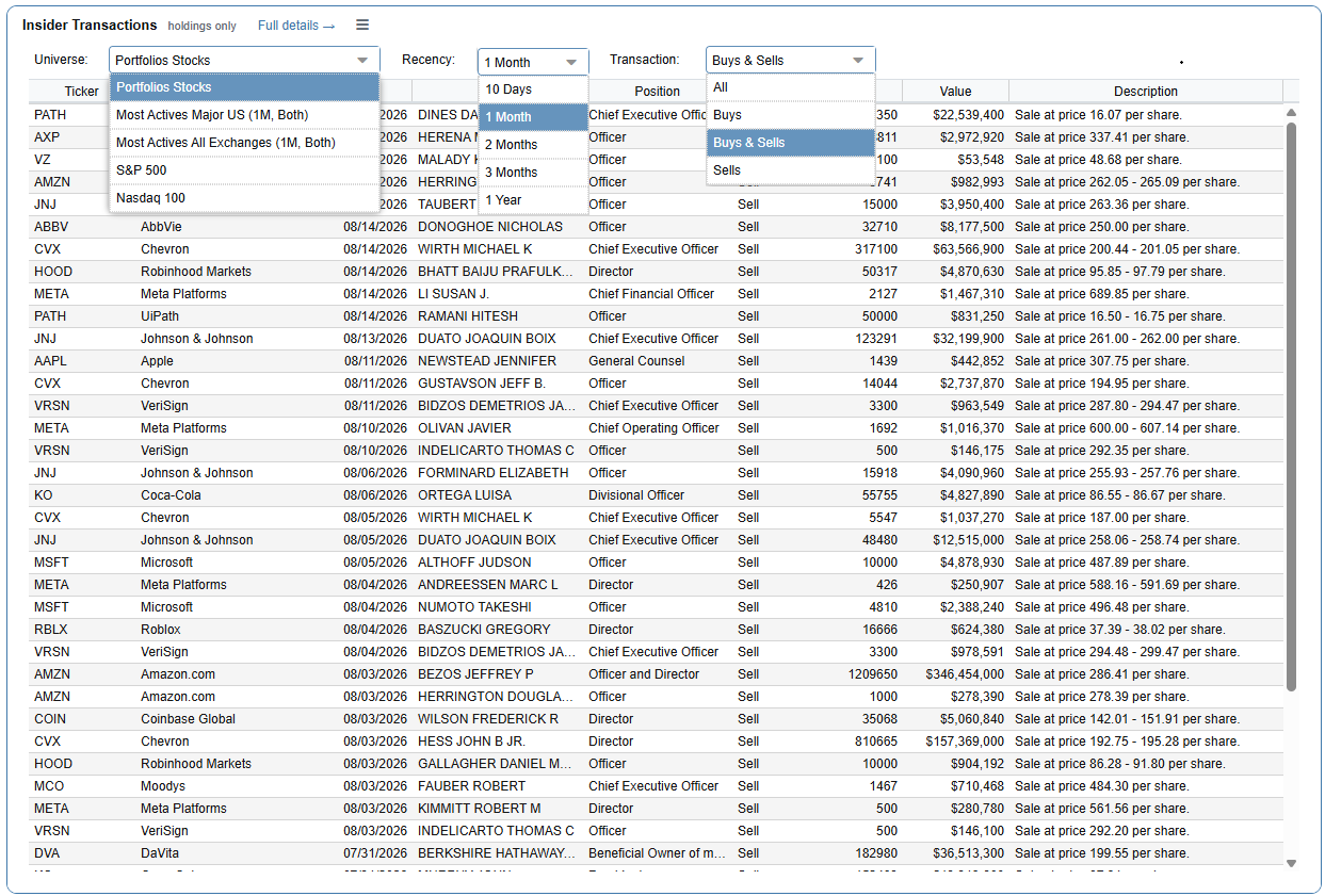
The Insider Transactions panel tracks buying and selling activity within your holdings.
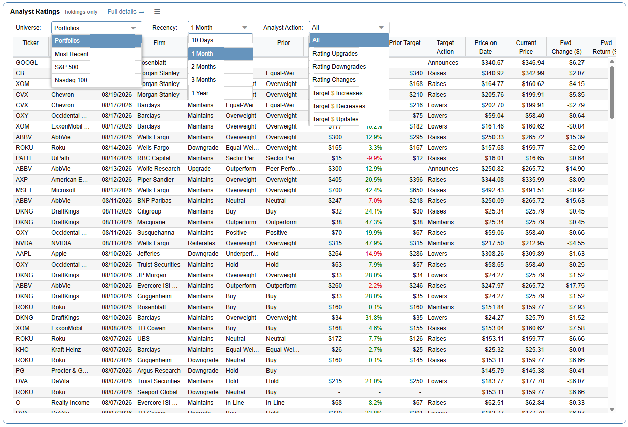
The Analyst Ratings panel aggregates Wall Street sentiment and target prices for your positions.
The Right Side Rail
We have consolidated actionable, time-sensitive data into a convenient right-hand side rail. These panels are ordered logically to support your daily monitoring workflow:
- Your Signals: This major new addition automatically alerts you to significant technical and fundamental events across your portfolios. The panel constantly monitors your holdings for seven specific triggers:
- New 52-Week High: Triggered if the security hits a new high today.
- New 52-Week Low: Triggered if the security hits a new low today.
- Analyst Upgrade: Captures upgrades applied within the last five days.
- Analyst Downgrade: Captures downgrades applied within the last five days.
- New or Resumed Coverage: Alerts you when a rating is initiated or reinstated within the last five days.
- Overbought: Alerts you when the RSI reaches 70 or above.
- Oversold: Alerts you when the RSI drops to 30 or below.
- Your Earnings: Directly beneath your signals, you will find a targeted panel tracking upcoming earnings report dates specifically for your holdings.
- Your Income: Next is a dedicated widget providing a beautiful projected breakdown of your upcoming dividend payments, keeping you fully informed on your future cash flow.
- Your News: Finally, the rail concludes with highly relevant news headlines curated exclusively based on the equities you own.
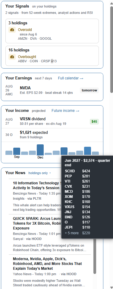
The Right Side Rail keeps your actionable alerts, earnings, projected income, and targeted news just one glance away.
Total Customization
Finally, we know that no two investors research exactly alike. The new Dashboard is fully modular. By clicking the Customize button, you can easily toggle any of these main column or side rail widgets on or off. If you don’t care about Analyst Ratings or Insider Transactions, simply uncheck them to reclaim that space for the metrics you value most.
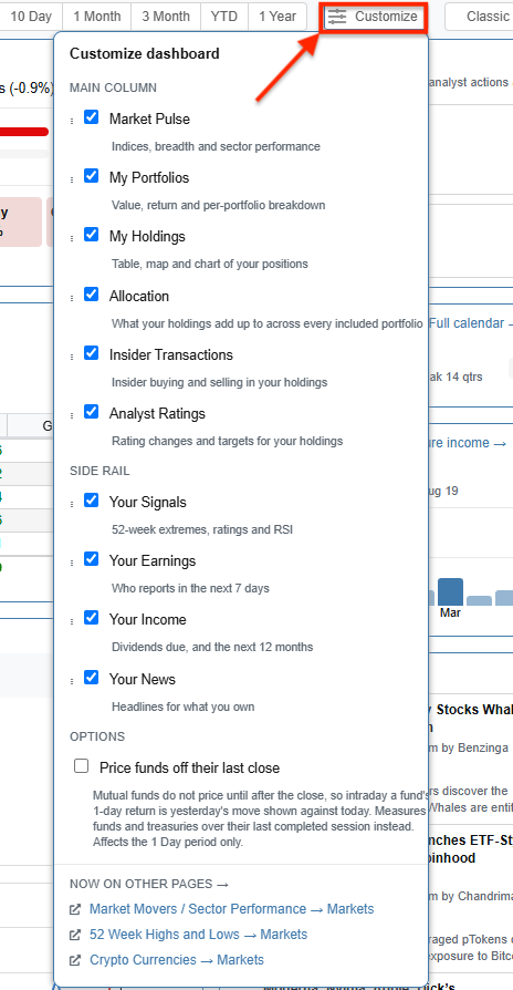
The Customize menu allows you to perfectly tailor the new layout to suit your specific analytical workflow.
Ready to Explore? The New Dashboard is live right now in your Stock Rover account! Log in today, click the New toggle in the top right corner of your screen, and experience a cleaner, faster way to analyze your investments. If you have any feedback on the new layout, we would love to hear from you at support@stockrover.com.
Top