

A Clearer View of Your Wealth: Upgrades to Portfolio Performance
 Printer Friendly
Introduction
Following the recent introduction of the new Portfolio Performance Report, we have continued to refine and upgrade the underlying analytics tools that power your Stock Rover experience. We know that analyzing years of historical data or diving deep into risk metrics can sometimes become a difficult task. As your analysis deepens, the sheer volume of raw data can quickly become overwhelming, making it a challenge to separate critical bottom-line results from the underlying details.
To solve this, we have fully restructured the tables within the Value Over Time, Risk and Reward, and Holdings Detail tabs. We have introduced categorized column groupings and added several new metrics to give you a clearer, more organized picture of your performance.
To access these updated views, simply click on Performance under Portfolio Tools in the Start Menu, select the portfolio or portfolios you wish to report on, choose your desired time period, and then select the corresponding tabs at the top of your screen.
Value Over Time: A New Logical Structure
The Value Over Time tab is your go-to destination for understanding how your portfolio balances have changed across specific periods. To make this data easier to digest, we have organized the table into four distinct column families:
- Period Value: Tracks the actual flow of your money, displaying the Start Value, Inflows, Total Gain, and End Value.
- Gain Breakdown: Dissects exactly where your wealth came from, separating Appreciation (in both dollars and percentage) from Income and annual Dividend Yield.
- Returns: Offers a comprehensive look at your performance methodologies, including ROI %, period IRR %, annual IRR %, TWR %, and the specific Timing % effect of your cash flows.
- Averages: Provides contextual data over the period, highlighting your Invested % average, Average Cash balance, and overall Average Value.
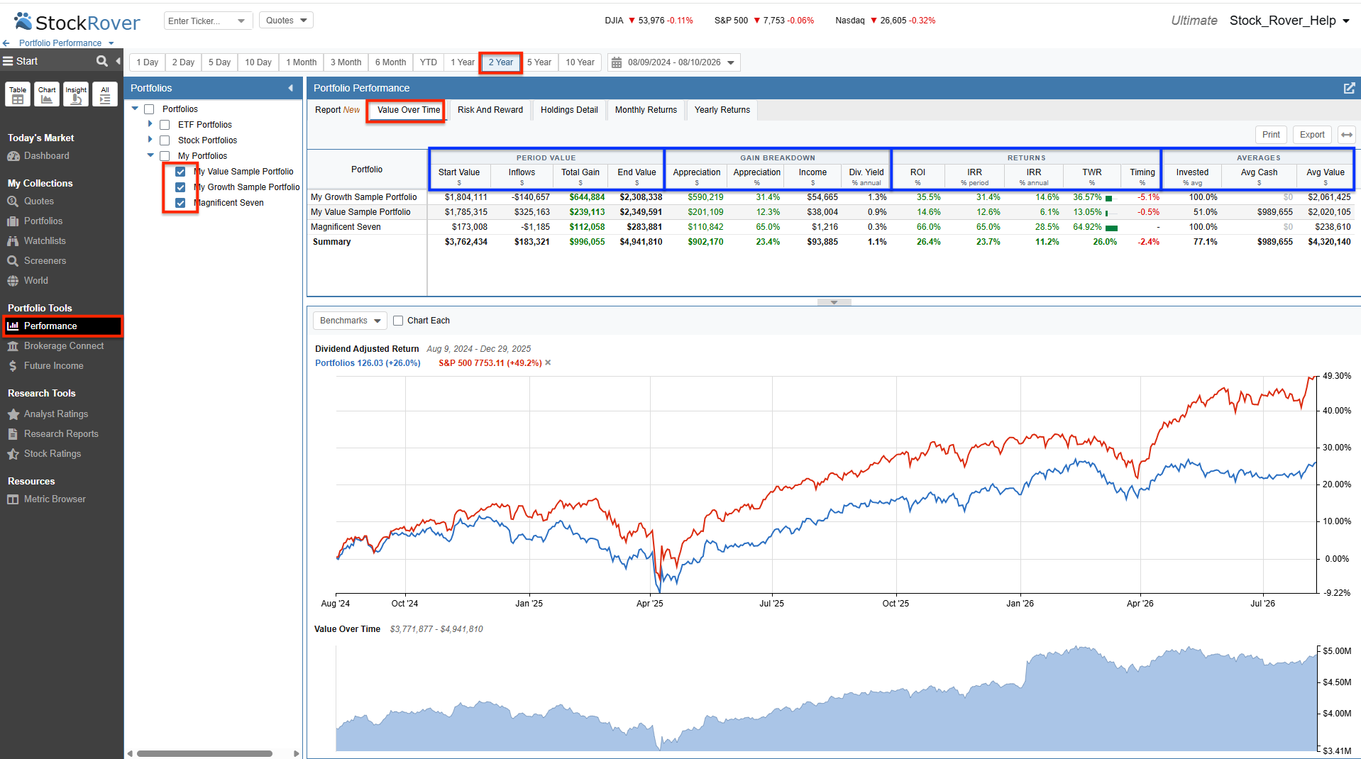
The newly structured Value Over Time table displaying intuitive column groupings for Period Value, Gain Breakdown, Returns, and Averages.
Risk and Reward: Streamlined Analysis
We applied the exact same philosophy to the Risk and Reward tab. Evaluating risk requires looking at multiple interconnected metrics, and our new grouping structure helps you analyze them systematically.
It is important to remember that when comparing your risk and return, your chosen benchmark is completely flexible. It can be a standard index, a specific ticker, or even another one of your own portfolios.
The Risk and Reward table is now organized into the following families:
- Returns: Displays the foundational performance numbers for the period, specifically your IRR % and TWR %.
- VS Benchmark: Compares your performance directly to your chosen benchmark, showing the Benchmark Return, your TWR vs the benchmark, and your Correlation to it.
- Risk: Details your raw risk exposure, displaying your average Invested %, Beta, Max Drawdown %, Volatility, and the benchmark’s Volatility side-by-side.
- Risk-Adjusted: Evaluates if the risk you took was worth it, highlighting your Risk-Adjusted vs Market % and your Sharpe ratio.
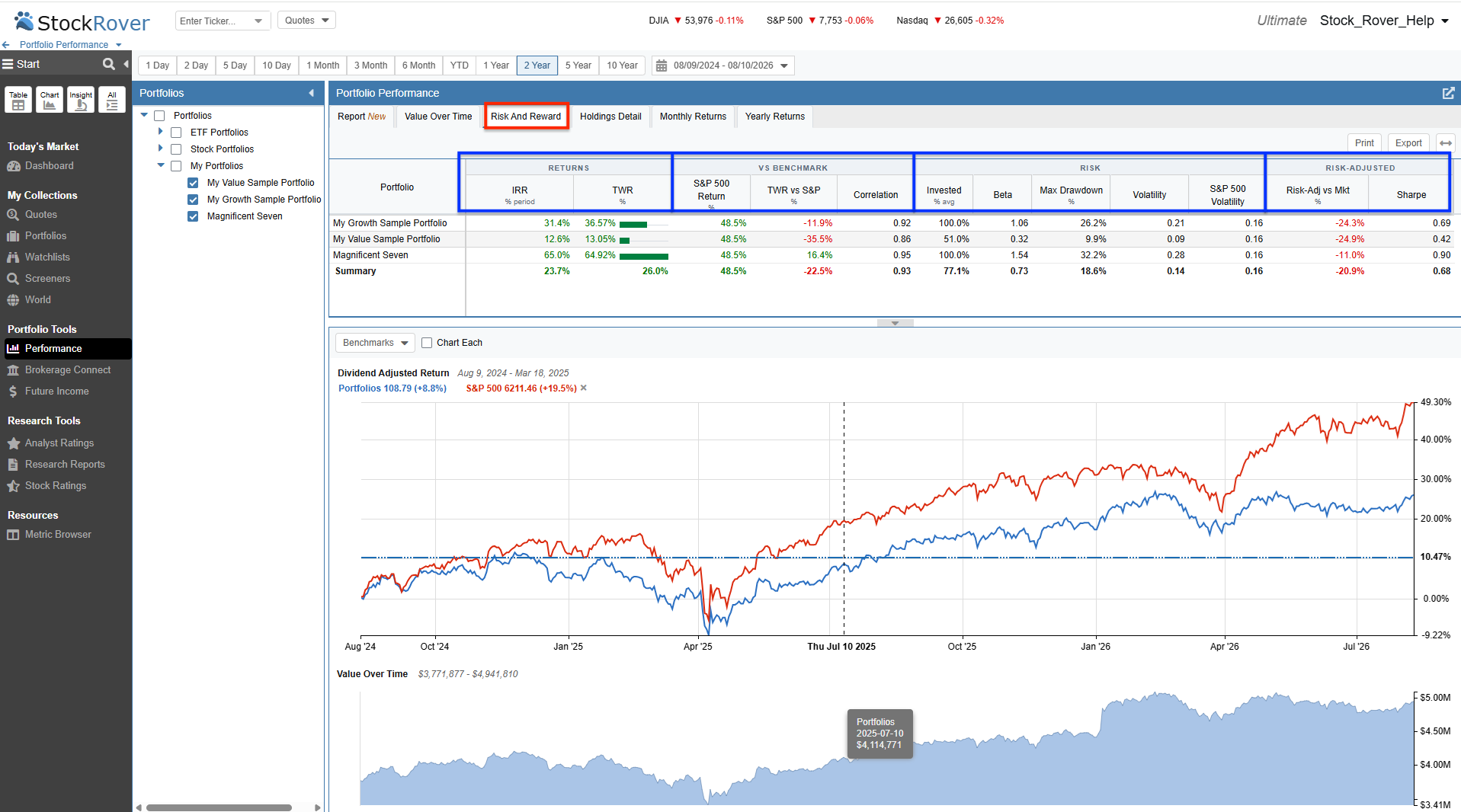
The Risk and Reward tab featuring categorized column families to easily compare your volatility and risk-adjusted returns against a benchmark.
Holdings Detail: A Unified Master Table
While evaluating your portfolio at a macro level is crucial, you also need to see exactly which individual positions are driving that performance. The Holdings Detail tab provides this granular, ticker-level analysis. Rather than jumping between entirely separate screens, this tab operates as a single master table. The Simple, Standard, and Detailed options act as quick presets, instantly hiding or revealing specific columns to give you the exact perspective you need.
Simple
The Simple preset cuts through the noise to give you a clean, quick glance at your bottom-line performance. It focuses strictly on revealing the most critical metrics: Total Gain, End Value, and your personal return (IRR) versus the Time-Weighted Return (TWR) for each holding.
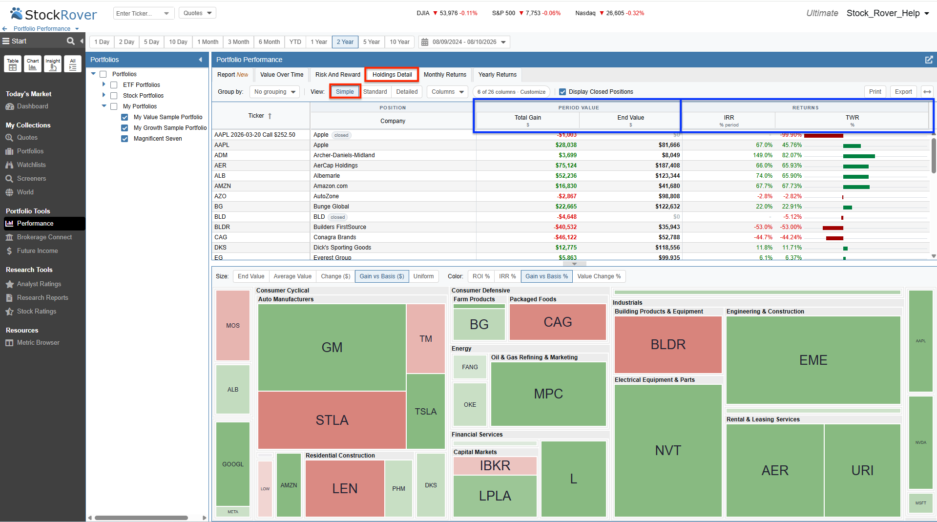
The Simple view provides a streamlined look at your bottom-line performance for each ticker.
Standard
The Standard preset expands the table by revealing more context around the flow of your money and your portfolio composition. It introduces columns for Start Value, Inflows, Income, Yield, and Portfolio Weight percentages to help you understand how each position contributes to the whole.
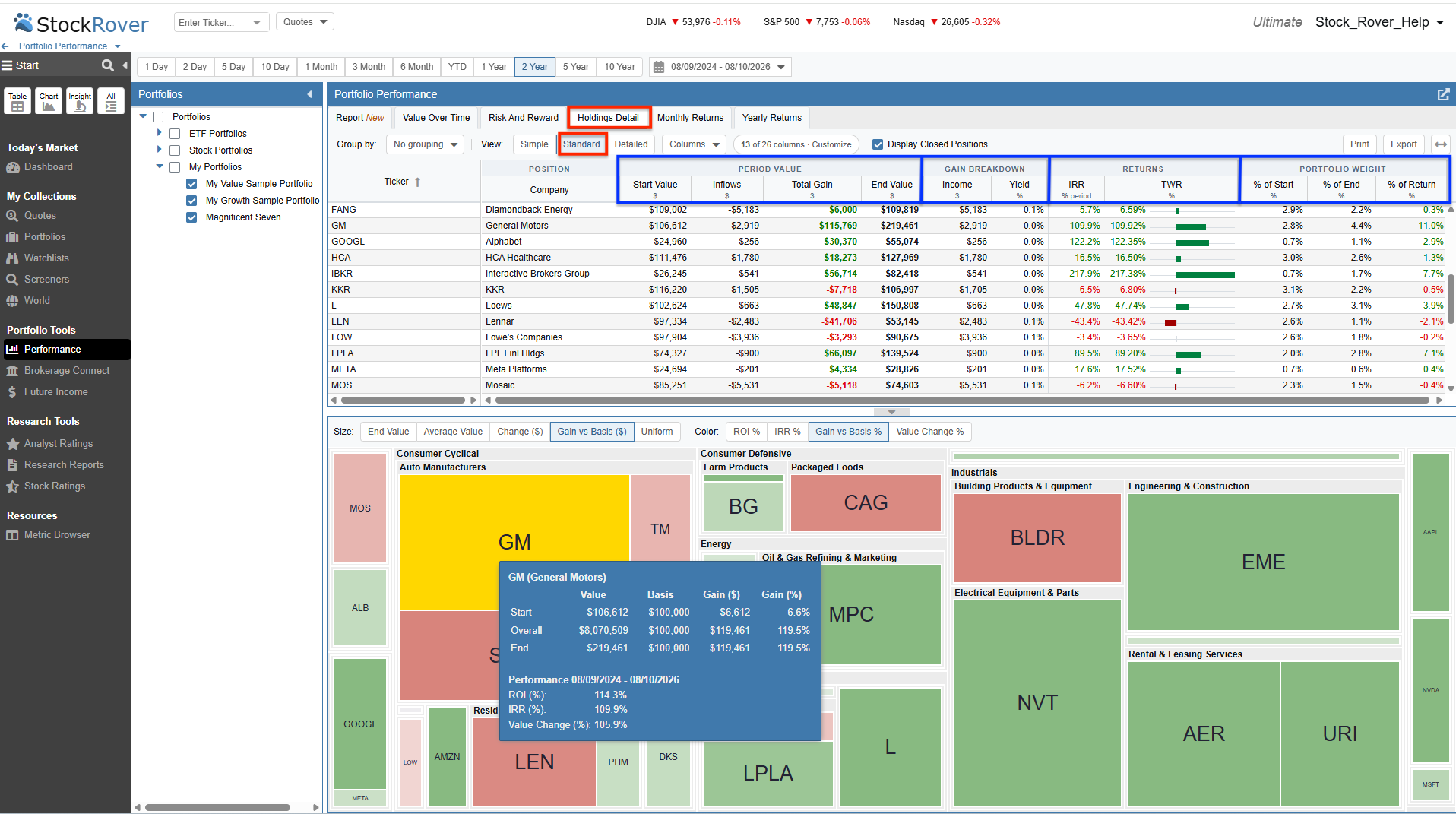
The Standard view incorporates capital flows, income, and portfolio weighting metrics.
Detailed
The Detailed preset acts as your ultimate analytical sandbox. It brings over 26 distinct columns into play, significantly expanding on the Standard setup by introducing granular capital gains breakdowns (realized vs. unrealized), deep comparative return metrics (TWR and IRR vs. your benchmark), and precise cost basis tracking.
We have also introduced a new Group by option called Split by Portfolio. If you hold the same stock or ETF across multiple accounts, such as a taxable account and an IRA, this setting groups your data by the individual security, and then reveals exactly how that ticker performed inside each distinct portfolio. It is an incredibly useful way to isolate specific cash flows and account weightings while still providing an aggregate summary row for the security as a whole.
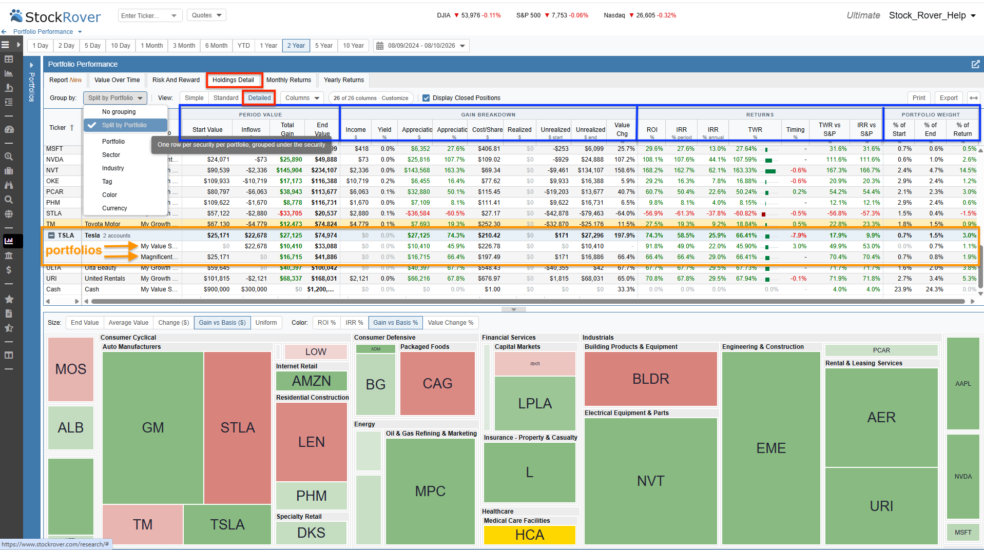
The Detailed setup utilizing the “Split by Portfolio” grouping to show how individual positions performed across multiple accounts.
Custom
Because the Holdings Detail operates as a single underlying table, you have complete freedom to configure it. Any time you manually add or remove columns, a Custom layout is instantly generated to save your unique arrangement. Because these options simply show or hide data on the master table, any unique columns you add or remove will persist even if you toggle back to the other layouts, ensuring a consistent and fully personalized analysis experience.
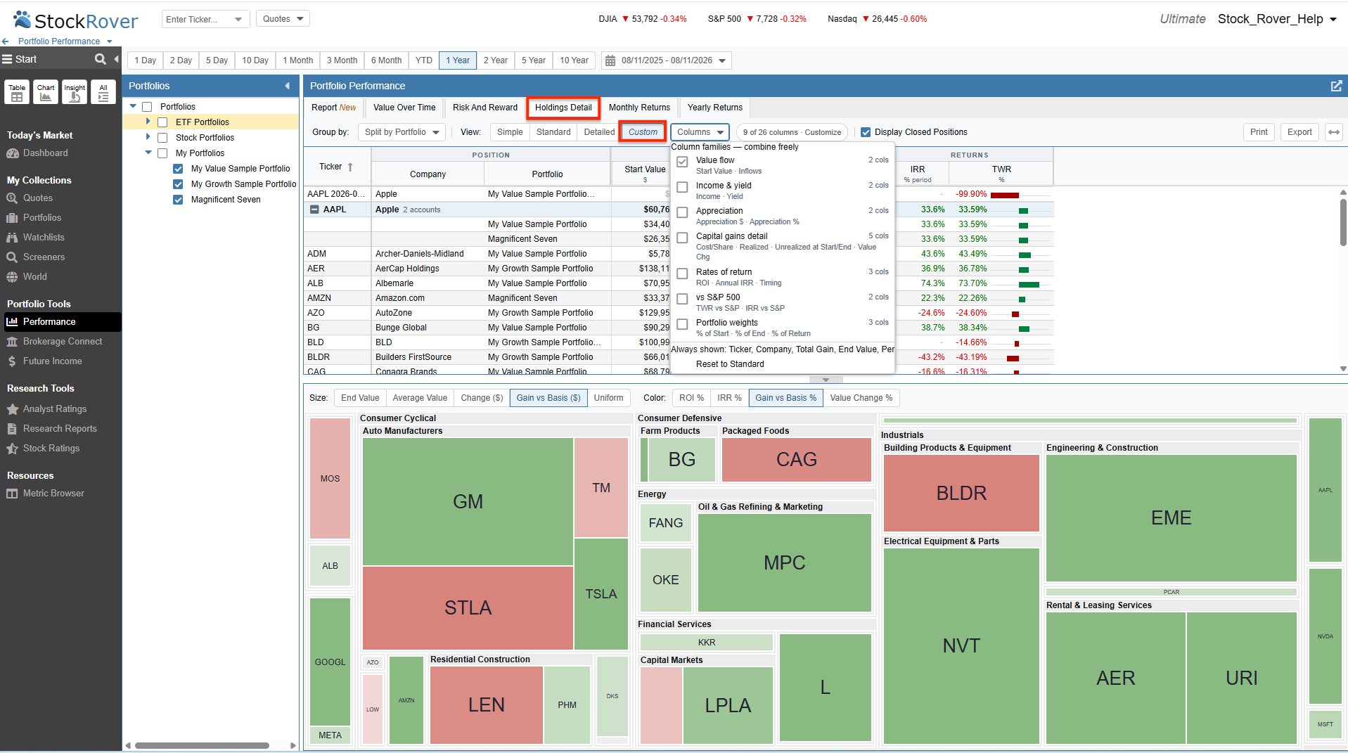
The Custom view is automatically generated to retain your personalized column arrangement when you add or remove specific data points.
Monthly Returns: Expanded Visual Insights
We have also enhanced the Monthly Returns tab to give you more control over how you visualize your historical performance. You can easily view your data as a traditional Heatmap or toggle to a dynamic Bar Chart format for a clearer comparative picture.
Most notably, we have added the ability to chart your Money-Weighted (IRR) returns in addition to the standard Time-Weighted Return (TWR). This is a fantastic addition, as it allows you to visually track exactly how the timing of your personal deposits and withdrawals impacted your monthly results.
And just like our other analytical tools, your comparative benchmark is completely flexible. You can measure your monthly returns directly against major market indices, individual tickers, or other portfolios you manage.
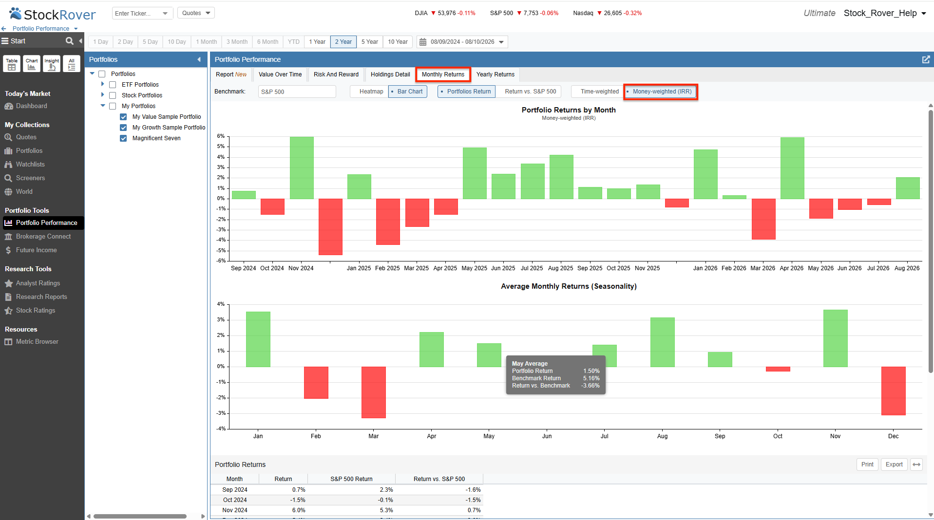
The Bar Chart view charting Money-Weighted (IRR) returns against an S&P 500 benchmark.
Explore the Updates: These new table structures and features are live right now in the Performance section of your Stock Rover account for Premium, Premium Plus, Ultimate, and Ultimate Pro users. Log in, select your portfolios, and check out the updated tabs to see your data in a whole new light. If you have any questions or feedback, email us at support@stockrover.com!
Comments
Leave a Reply
Top
Excellent tools. Easy to use and very detailed to check performance of my investments