Investing in Today's Market - Part 1
 Printer Friendly
This is part one of a two-part series of blog posts based off last month’s webinar of the same name from early November, and is meant to help you assess the current market situation in order to better inform your investing decisions. This post is more economics-focused than our other posts, but, as no one invests in a vacuum, understanding market conditions is vital to investment decisions.
The two key questions that we’ll be addressing in this blog post are:
- Is now a good time to invest?
- If so, given today’s market environment, what makes sense to invest in?
While no one can predict the future, we can look at what’s happened in the past and try to find trends and patterns that may help us discern some likely scenarios for what will happen in the future.
Contents
- First Question – Is now a good time to invest?
- 1.1 – Is the economy sound?
- Summary of 1.1 – Is the economy sound?
- 1.2 – Is the market expensive?
- Summary of 1.2 – Is the market expensive?
- 1.3 – Are interest rates low?
- Summary of 1.3 – Are interest rates low?
- 1.4 – What will happen if interest rates rise?
- Second Question – Given today’s market environment, what makes sense to invest in?
- Sum Up
First Question – Is now a good time to invest?
This question obviously is more complex than a simple yes or no. In fact, in order to answer this question, we first need to consider some other questions, such as:
- Is the economy sound?
- Is the market cheap, fairly priced, or expensive?
- Are interest rates low? If so, will they stay low?
- If interest rates rise – what happens? What assets classes would be good to own?
We’ll now explore some economic principles in order to shed some light on these questions.
1.1 – Is the economy sound?
While the economy and the market aren’t the same thing, they generally have a high degree of correlation: if the economy is doing well, the market usually does well, and if the economy is doing poorly, the market usually does poorly.
In considering if the economy is sound, we should start with recessions, which are very bad for stocks and will destroy a lot of investor capital very quickly. So in evaluating if the economy is sound, we should first determine if there is a near term recession risk.
According to a study done by Omega Advisors (Leon Cooperman’s company), recession danger is signaled when some or all of these factors appear:
- The yield curve is inverted (short term interest rates exceed long term rates)
- Unemployment claims are rising
- Personal income is down
- Consumer confidence is falling
- Industrial production is declining
- Inventories are increasing
Let’s look at each of these indicators and see if any of them are giving us a warning signal now.
The Yield Curve
The yield curve compares the interest rates paid by bonds that have the same level of risk (traditionally U.S. Treasury securities) but different maturities, from short-term to long-term. In the yield curve graph, the y-axis is the yield, and the x-axis is the maturity.
It’s important to note that from now on, when I use the term “yield” I’ll be referring to the bond’s “effective yield,” which is different from the bond’s coupon rate. While the effective yield and the coupon rate are equal at the time of issuance, they begin to diverge when the bond’s price fluctuates as it is traded on the open market. The coupon rate remains constant, but the yield (which is the percentage of the current price that interest payments account for) changes inverse proportionally to the price. So if the bond’s price falls, then the effective yield goes up, and vice versa. In a time of recession or slow economic growth, more investors may look to safer investments like bonds, driving the price up, and thus the yields down. The yield curve is closely watched by investors of all stripes, as it indicates general sentiment about the investing climate. The yield curve, then, becomes not only a product of investor speculation, but a driver of it as well.
A normal (non-inverted) yield curve is shown below:
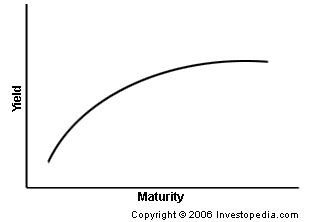
You can see that as the maturity increases, the yield increases asymptotically. There are a few different reasons the yield curve takes this shape: one reason is that a longer-term investment is usually considered riskier than a shorter-term investment due to uncertainty as to what will happen in the future (inflation, recession, etc.) In order to compensate for this added risk, the rates must be higher. A second reason that longer-term rates would be higher is that investors are expecting short-term interest rates to rise—if this is the case, they’d be able to lock in a better rate simply by waiting to invest. In order to incentivize investors to invest now instead of later, they are rewarded with a higher long-term rate.
An inverted yield curve, which is ominous, is when the shorter-term interest rates are higher than the long term rates, shown below.
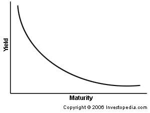
When the long term rates are below the short term rates, it usually means a few things (and none of them good). It signals that investors expect interest rates to decrease, and so they want to lock in the higher return by investing now in the higher-yielding shorter-term securities. It also means that investors and the Federal Reserve are fretting about inflation in the short term, and that investors are pessimistic about long-term growth and expect that the yields offered by long-term fixed income will continue to fall. All in all, these read as troubling signs for the economy.
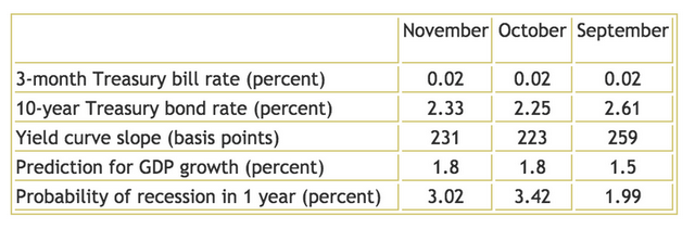
Good news, though! The yield curve is not inverted nor has it been since mid-2007. Currently the 10-year treasury is around 2.61% and the 3-month treasury is around 3 basis points 0.03%, so long term rates exceed short-term rates.
Below you can see the current short and long-term yields, the yield curve slope (it’s a positive number, which means the curve is not inverted), the prediction for the GDP growth, and the probability of a recession within the year for September, October, and November.
Current Short and Long Term Yields
 Source: Cleveland Federal Reserve
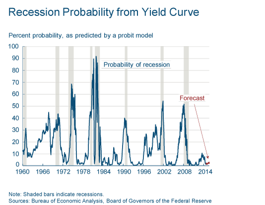
While the slope of the yield curve has gone up in the past month, it’s still down from September. However, the slope is still solidly positive and so does not give cause for concern. In fact, we can see this in the following chart, which shows the probability of a recession based on the yield curve from 1960 to the present day—the shaded bars show periods of recession, and the y-axis is the probability of recession. You can see that currently the percent probability of a recession is quite low.
All in all, the yield curve seems to be on our side, with no indication of a recession in the short-term. For more information on the yield curve, go here.
Unemployment Claims
The second factor that is used to predict recessions is rising unemployment claims. Increased unemployment can indicate that consumer demand is weakening, which can indicate a slowing of the economy and potentially a recession.
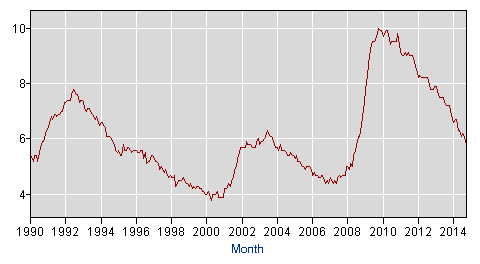
The latest statistics show that the national unemployment rate was 5.8% in November, according to theU.S. Bureau of Labor, and 321,000 new jobs were created during November.
The following chart shows the unemployment rate since 1990. While unemployment in the past fifteen years peaked in 2010 at nearly 10%, since then we’ve seen real jobs growth and the unemployment rate has been steadily falling, meaning that the probability of recession using this indicator is low.
The Unemployment Rate since 1990
 Source: U.S. Department of Labor
Personal Income
The third factor used to predict recessions is decreased personal income. According to the Bureau of Economic Analysis, in October 2014, personal income increased $32.9 billion, or 0.2%, and disposable personal income (DPI) increased $23.4 billion, or 0.2%. It has also increased every month thus far in 2014. The trend of increasing personal income, and the fact that it has stayed consistent, indicate that the risk of a recession in the near future is minimal.
Consumer Confidence
The fourth factor we’ll discuss is consumer confidence. Essentially, consumer confidence is how secure consumers as a whole feel about both the country’s economic situation, and their own personal economic situation. The index runs from 0 to 100, and high consumer confidence means that consumers are not worried about the recession. According to the Conference Board, which is the “go to” source for consumer confidence, while October saw a rebound in consumer confidence from September, November saw a decline. In September the index was 89.0, then it was 94.1 in October, and at last measure it was 88.7.
In a rather cyclic explanation, the Conference Board cites reduced optimism as the reason for the drop in confidence, though they later expand on that and cite the consumers’ assessment of the job market was less favorable, with the number of jobs appearing less plentiful and harder to get, and the assessment of the current business conditions had also worsened. Income expectations, however, were unchanged, and gas prices are falling, which should free up some money for more spending this holiday season.
Despite the recent fall in consumer confidence, the index still remains at the upper end of the range. Combined with the other reassuring indicators, the slight shift downwards alone does not call for concern.
Industrial Production
The Gross Domestic Product (GDP) growth rate is the standard measure of general economic health, and is reported by the U.S. Bureau of Economic Analysis. GDP expanded at a seasonally adjusted annual rate of 3.9% in the third quarter of 2014 over the previous quarter, which was above the estimate of 3.5% and also is slightly above the average of 3.27% between 1947 and 2014. Below you can see the quarter over quarter GDP since 2012.
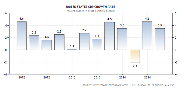
Despite the negative blip in 2014, (which was blamed, at least partially, on the very cold winter) GDP growth is for the most part in positive territory. From this graph we don’t see an imminent threat of a recession.
Inventories
The final factor that we’ll discuss is inventories. Essentially, if inventories at places like Wal-Mart or Target are increasing, it means that there is less consumer demand than was anticipated, and so consumers may be pulling back on their spending, which can be a signal that the economy is weakening.
Luckily, the U.S. showed a decrease in inventory in Q3 2014, meaning that we have another indicator that shows no risk of a near-term recession.
Summary of 1.1 – Is the economy sound?
After examining six factors that help foreshadow recessions, we can see that none of them are flashing red. In fact, the economy is currently in a solid stable growth mode and appears to be slowly improving. This is a good environment for long-term investors, and this knowledge will help inform our investment decisions. Now let’s explore some other relevant areas.
1.2 – Is the market expensive?
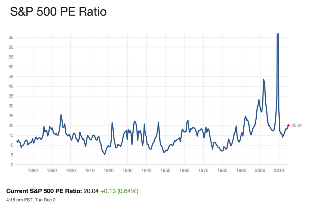
While it seems that the economy, and by proxy the market, are on solid footing, we still need to know more before proceeding, like if the market is priced expensively. Whether the market is expensive is often determined by looking at the P/E of the S&P 500 relative to historical norms. Note that mid-caps as proxied by the Russell 2500 and small caps as proxied by the Russell 2000 should also be considered to see if there are significant valuation differences between segments of the market (large cap, mid cap and small cap). Let’s start with the S&P 500 as it is the most commonly looked at indicator for determining the valuation of the market.
S&P 500 Historical P/E Ratio
The average S&P 500 P/E Ratio is normally around 15 to 16. Currently it is around 20, so by that measure, the P/E is a little higher than average.
S&P 500 Price/Earnings
Source: multpl.com
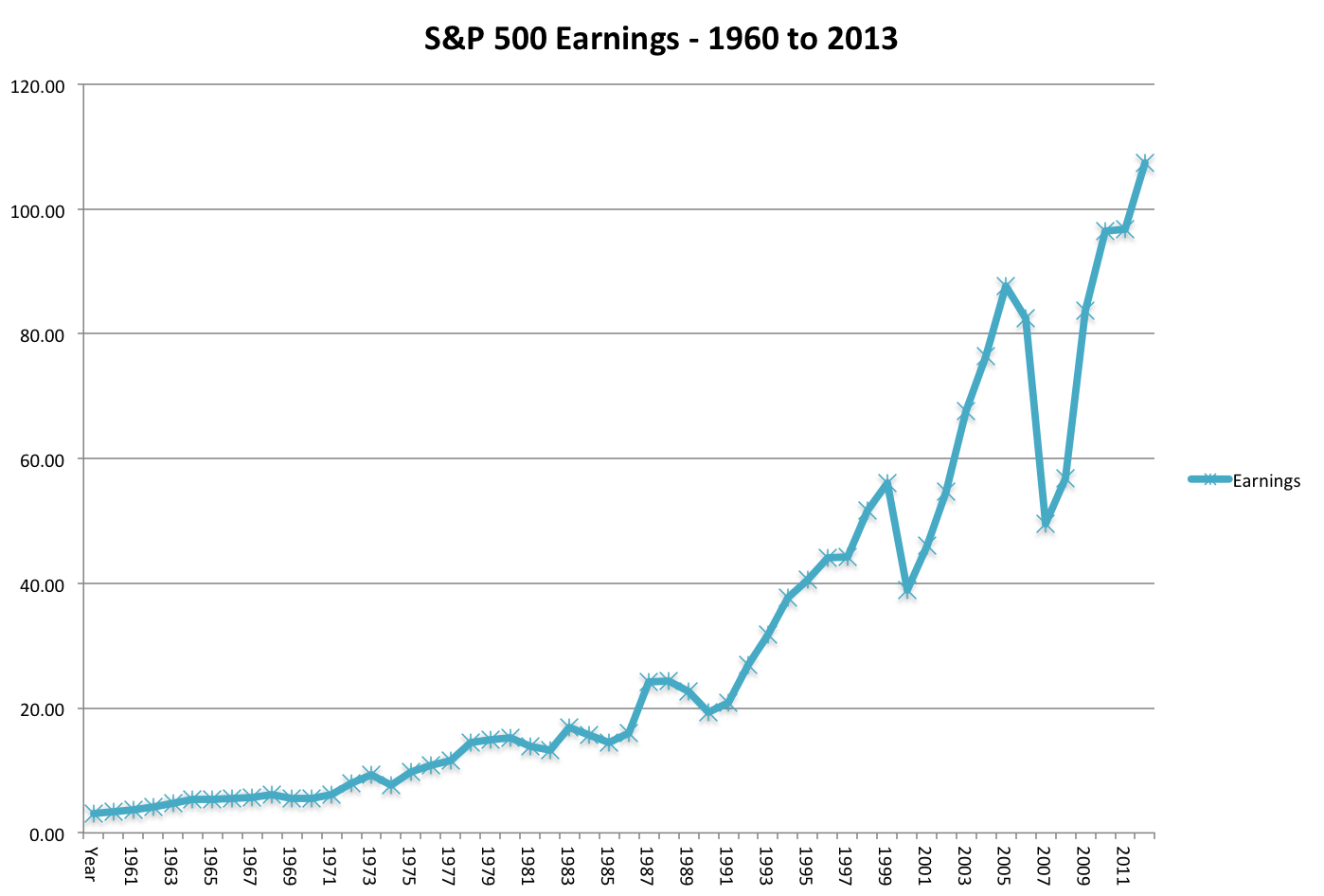
That off-the-charts spike in the above graph in 2008 was due to—you guessed it—the financial crisis. In that year earnings fell dramatically, which sent the P/E skyrocketing. Below you can see a chart of the S&P 500 earnings since 1960, and you’ll notice the huge dip downwards in 2008 (there was also a pretty big dip down in 2000 from the dot-com bubble.)
S&P 500 Earnings: 1960-2013
Source: NYU Stern Business School
But since then, earnings have rebounded nicely and, at least with this measure, seem to be in an upward trend.
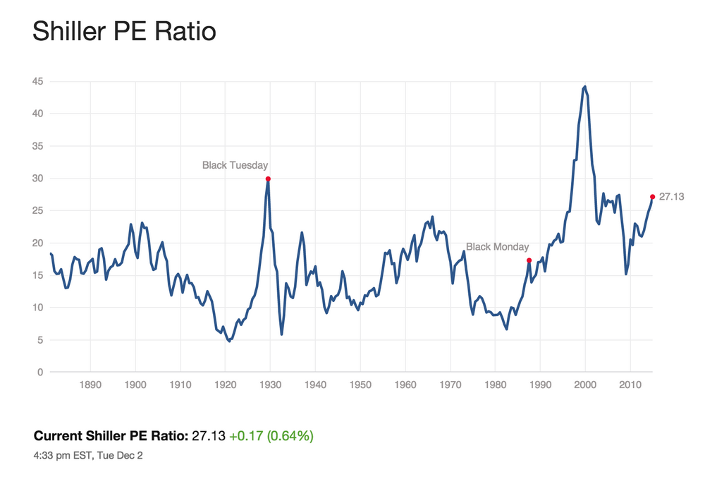
Shiller P/E Ratio
However, P/E is not the only measure of valuation. Robert Shiller, a Yale university professor, helped create the CAPE ratio, which stands for cyclically adjusted price-earnings, also known as the Shiller P/E. The Shiller P/E is the price divided by the moving average of ten years of earnings, adjusted for inflation.
The Shiller P/E for the S&P 500 over the last 10 years is shown below. The current value is around 27, which is quite expensive versus historical norms.
S&P 500 Shiller Price/Earnings
Source: multpl.com
One of the reasons that the CAPE is so high is because the last 10 years includes the exceptionally poor years of 2007 and 2008 (2006 and 2009 weren’t so hot either), so four of the last ten years were significantly below trendline with regards to earnings. If you view those years as anomalous, then you may feel more inclined to disregard the high Shiller P/E. Otherwise, you may take this as an indicator that the market is too expensive. For more on Shiller’s views, see this blog entry.
Until we have the 20/20 vision of retrospection, this boils down to a matter of well-reasoned opinion. For what it’s worth, we at Stock Rover believe that the market is indeed expensive, but we believe that the exceptionally bad years of 2007-2008 have distorted the Schiller P/E, making the market seem more expensive than it really is.
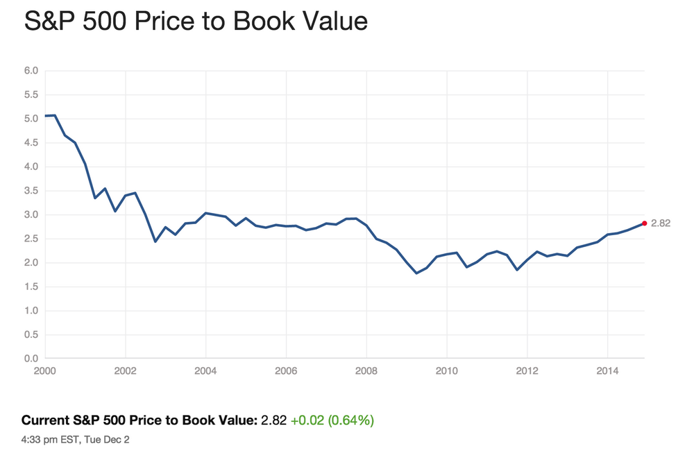
S&P 500 Historical P/B Ratio
Let’s briefly look at other measures of the S&P 500 valuation to see if they corroborate the story told by P/E, starting with the S&P 500 Price/Book ratio. We can see that P/B is just a tad above its 15-year median and mean, which is reasonable by recent historical standards.
S&P 500 Price/Book
Source: multpl.com
The P/E and P/B metrics are similar and it’s not strictly necessary to check them both, but it’s not a bad idea either. P/B is can be a more useful for the Financial and Industrials sectors, whose profitability is more closely tied to assets than it is in other sectors. Additionally, P/B is better able to compare companies that have negative earnings, and so can be a better equalizer across a range of companies, like those in the S&P 500.
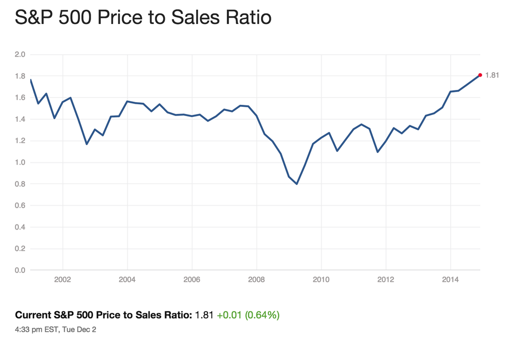
S&P 500 Historical P/S Ratio
Let’s also check out S&P 500 Price to Sales ratio. The P/S isn’t as widely used as the P/E and P/B, but it does have its place, particularly when you’re looking at cyclical stocks (or industries) that might not have posting any earnings in the last twelve months. Here we can see that it’s at the limit of the upper range in this time period, so with this metric the market looks expensive.
S&P 500 Price/Sales
Source: multpl.com
Summary of 1.2 – Is the market expensive?
Based on historical data of P/E, Shiller P/E, P/B, and P/S, the S&P 500 is slightly expensive to moderately expensive, depending on your perspective, compared to historical norms.
However, there’s a second factor that needs to be taken into account when appraising the market: interest rates. The “risk premium of equities” can help us figure out how the current interest rate environment should affect our understanding of the market’s valuation. The risk premium of equities is the earnings yield of the equities in question minus the “risk free” benchmark. The earnings yield is just the inverse of the P/E, and in this case you’d be looking at the earnings yield of the entire S&P 500 or other market proxy, and the Treasury yield is used as the risk-free rate. Because the current market P/E is a bit above average, this means the current market earnings yield is a bit below average; with normal interest rates, this would mean that the risk premium is low. But the Treasury yield is also much lower than it has been in the past (shown below), so all told the equities risk premium is at about an average level. So unless you are a disciple of Shiller, the common view is that right now stocks are roughly fairly valued.
10-Year Treasury Rate
Small and Mid Caps
For mid-caps and (especially) small caps, the valuation story is more convoluted. Both mid- and small caps trade at higher valuations (nearer to 20 for their aggregate P/E), and both have underperformed large caps this year. There is an article in Barron’s that discusses this more fully.
1.3 – Are interest rates low?
Interest rates act on financial valuations the way gravity acts on matter: The higher the rate, the greater the downward pull. – Warren Buffett
While we mentioned interest rates above, let’s dive a bit deeper, because this is a very important component of evaluating the investing environment. We’ve established that interest rates are lower than average right now, and so the key questions then are:
- Will interest rates stay low?
- If interest rates rise, what happens to the market? What kinds of stocks would be good to own?
Associated with the above questions are two primary concerns. The first is that if interest rates stay low, does that indicate a weak economic recovery and a low growth environment? Low growth means low profit growth, which would be bad news for stocks.
On the flipside, if interest rates rise, it would be indicative of economic recovery and growth, which is good news for stocks. However, rising rates have two main negative effects: first, it may mean inflation is on the horizon, and increased inflation is never good for investors, as it erodes capital. Additionally, higher rates will definitely slow growth, for a couple of reasons: it not only increases the cost of debt to corporations, but it also makes stocks less attractive, especially relative to bonds, which will be re-priced with higher coupon rates.
The above paragraph encapsulates the fact that the stock market always has worry, and worry is actually a good thing, it keeps the market in balance and it can dampen excess. So the question is what kind of worry should we engage in right now? To figure that out, we first need to look at the Fed.
The Fed
Let’s first start with what the Federal Reserve (the Fed) is trying to accomplish. The Fed actually has a very specific mandate from Congress laid out in the Federal Reserve Act of 1977, which is to promote maximum employment, stable prices, and moderate long-term interest rates.
The Fed’s Current Position
The Fed’s current position is that a normal rate of unemployment is between 5.0 and 6.3% (this was put forth in the FOMC’s (Federal Open Market Committee) most recent Summary of Economic Projections.) The current unemployment is at 5.8% and declining, so we are within the range of what the Fed considers normal.
As most everyone is aware, the Fed started a massive bond-buying program in 2008 called Quantitative Easing that has since supported U.S. economic growth as we recover from the financial crisis. Despite the recent stock market volatility and global economic troubles, last week the Fed agreed to end quantitative easing, marking a milestone in the five-year-old recovery. The market handled the news pretty well, with only slightly elevated volatility on the day of announcement (October 29th, 2014). You can see below the candlesticks chart in Stock Rover for the S&P 500 for that day:
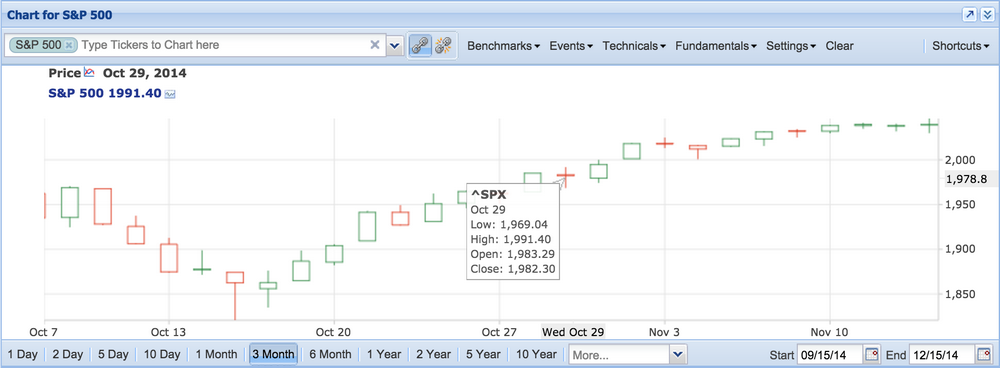
The shadows on either end of the body represent the trading range, and you can see they are a bit longer than on the days around them. While the index did close down (indicated by the red candlestick, instead of green), the body of the candlestick is actually very, very short, indicating that the index only closed slightly down from where it was. The tooltip gives the values for the low, high, open, and close for that day. After the day of the announcement, the candlesticks show that daily trading resumed in its normal pattern.
But easing up on bond-buying is not the only lever that the Fed can pull—it also controls the interest rate. Previously, the Fed said it would raise interest rates at the very earliest in mid-2015, but historically they have pushed this date out further and further as they approach the date, and so it’s likely that they will do so again. This means that an interest rate hike is not imminent and that rates will remain where they are until at least mid-2015, but more likely until even further down the road. The full press release is here:FOMC press release October 29, 2014.
Low Interest Rate Periods – Historical Performance
So we are solidly in a low-interest rate environment, at least for the next half year. Now that we know this, it would be beneficial to see how stocks do in low and/or decreasing interest rate environments. In order to find the data, we have to go back to the mid-century. Let’s quickly look at that graph of the 10-year treasury rate since 1870 again.
10-Year Treasury Rate
Since the early 80s interest rates have generally been declining (with some small upticks), but we haven’t really been in a low interest environment (below 3%) until the past few years. A similar period was the mid-1930s to 1956, charted below.
10-Year Treasury Rates: 1934-1956
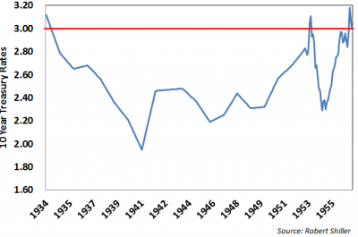
In the 1934-1940 period, interest rates decreased, and then in the subsequent periods (1940-1949 and 1950-1955), they increased ever so slightly.
While there is certainly a lot more to say about this period, what is relevant to our discussion is how the markets performed. There was plenty of volatility, and lots of ups and downs. Specifically, there were four recessions with an average contraction lasting eleven months. This translates to a recession roughly once every five years. However taking the longer term view, stocks performed quite well in this low interest rate environment. See the table below.
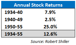
Despite the low growth in the war decade, stocks averaged a 12.6% increase in the 18-year period. There was plenty of volatility in that period, but with the long-term view the stocks performed quite well. While of course the current period could vary from this period in any number of ways, this is still useful because it shows that historically stocks have increased even in a low interest rate environment like the one we find ourselves in now.
Summary of 1.3 – Are interest rates low?
To summarize, the Fed has ended its bond purchases, but interest rates will be staying low for the foreseeable future, as the Fed does not want to hinder the trend toward lower unemployment. If interest rates stay low, the expectation would be that the stock market would continue as it has been, generally trending upward in an uneven way. However, assuming no further expansion of P/E multiples (and given that the S&P 500 has a P/E of 19, that’s a reasonable expectation), we’d have to achieve price appreciation from GDP growth, accrued dividends, and earnings growth that exceeds economic growth. When we calculate this out, we can expect mid- to upper single digits of growth as a longer term expectation, with the expectation that the same sectors leading that have led the last three years (Healthcare, Discretionary/Consumer Cyclical, Tech, Industrials).
1.4 – What will happen if interest rates rise?
Since interest rates won’t stay low forever, it’s important to know what to expect when they do rise.
Interest rates have been falling since September of 1981, so you have to go back 30+ years to find periods of rising interest rates. In fact, we can go all the way back to right after the period of falling interest rates that was discussed in the previous section. The period from the mid 50s to the early 80s was characterized by a sustained long term upward trend of higher interest rates, with a couple of small pullbacks in the 1960 and 1970 timeframes, but peaking at over 15% in the early 80s. So how did the markets do with these rising interest rates?
The following table shows the 10-year treasury yield changes in each decade along with the corresponding S&P 500 returns. The first column shows the 10-year treasury rate at the start of the period, the second column shows the 10-year treasury rate at the end of the period, and the third column shows the average annual stock returns.
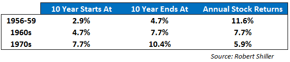
The table shows that stocks handled the rise in interest rates quite well in the beginning—the annual returns were just a tad under the 12.6% growth rate shown in the low rate period—but over time, as the interest rate goes up and definitely hinders returns, which went down in every consecutive time period. In the 1960s, returns fell to around 7.7% annual, and by the 1970s, inflation was running in the 7% range, so real returns were actually negative—it was an ugly decade, and Warren Buffett’s gravity comment was ringing true.
The good news is that if rates do rise, you will have plenty of time to decide what to do; a study by Omega Advisors showed that on average the market does not decline significantly until 29 months after the first rate hike. If rates do start to rise, markets should fare OK for quite a while, though there is likely to be turbulence. However, if the interest rate rise is sustained and prolonged, then look out—lower returns and higher inflation will likely make investing in the stock market unappealing.
Second Question – Given today’s market environment, what makes sense to invest in?
Now that we’ve looked at what happens when rates rise, and assuming that the Fed will allow the interest rate to rise gently, let’s drill down a bit deeper and look at how specific sectors are expected to perform in a rising interest rate environment.
What Sectors Work in a Rising Interest Rate Environment?
In general, rising rates mean a strengthening economy, and sectors that especially benefit from this are Financials, Discretionary, and Industrials. Financials benefit from margin expansion (their spread is bigger). In other words, while the cost of borrowing money goes up, the amount they can achieve by lending is even more. A strengthening economy also means that it’s more likely that the money they’ve lent out will be paid back, so they’ll have fewer non-performing assets, which helps the business. Discretionary and Industrials benefit from because a strong economy means increased consumer demand. Tech can also benefit as well, though it’s a bit iffy because Tech relies on capital purchases by companies, which can be stringent with their purchases. For more on this, see this article on Investopedia.
Cycles
The last piece we’ll touch on that effects the investing environment are investment cycles, and there are two cycles of note: the Presidential Cycle, and (for lack of a more succinct name) the “Sell in May and Go Away” cycle.
The Presidential Cycle
A study done at Pepperdine University in 2012 concluded that there is a propensity for the Dow Jones Industrial Average to rise during the second half of the four-year presidential cycle; the authors believe this pattern has been repetitive since 1950. The more favorable period (MFP) of the cycle begins on October 1 of the second year of the presidential term (this would then be this past October of 2014), and runs through December 31 of the fourth year, which will be December 31st 2015. Historically, this period performed much better than the unfavorable period, from January 1 in the first year of the presidential term through September 30 of the second year (this would be January 2013 through September 2014.) The link for the full study follows: The Four-Year U.S. Presidential Cycle and the Stock Market.
Currently, we have the presidential cycle on our side, at least through December 31st of 2015.
Sell in May and Go Away
The other cycle worth talking about is from the old saw “Sell in May and Go Away,” advising that stocks perform better in the period between Nov 1st and May 1st then they do between May 1st and November 1st. And this isn’t just a silly rhyme—there is historical truth to this cycle. CEO Howard Reisman wrote an entire article on this in May 2013, but we’ll sum up the findings here. We’ve looked at the SPY, which is an ETF proxy for the S&P 500, as well as ETFs for various sectors, between the years 2000 and 2013 and found the following:
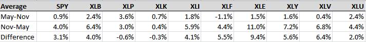 (XLB = Basic Materials, XLP = Consumer Defensive/Staples, XLK = Technology, XLI = Industrials, XLF = Financial, XLE = Energy, XLY = Consumer Discretionary, XLV = Healthcare, XLU = Utilities)
Note that for the S&P 500, the sell-in-May gain was 0.9% whereas the buy-in-November gain was 4.0%. Sector-wise we see that Energy has the biggest difference between the two periods (9.4%), but Health, Discretionary, and Financials also had big differences. Staples and Technology actually did better in the May-November periods. You could use this information to guide your sector allocation throughout the year.
Both Cycles Together
Right now, we have both cycles working together in our favor: we’re in the second two years of the presidential cycle and we’re at the beginning of the stronger November to May period, which is good news for investors.
For more information on these two effects, you can read the following blog post: The Incredibly Bullish Seasonal Period SPX Is Entering.
Sum Up
To sum up this blog post we have spent a lot of time looking at macroeconomic data to determine whether now is a good time to invest in stocks, and if it is, what makes sense to invest in given today’s environment.
In the course of our analysis, we have concluded the following:
- Most signs indicate that the economy is sound
- The market is slightly more expensive than usual, but not unreasonably so
- Interest rates will stay low until at least mid-2015, but probably longer
Assuming that interest rates will rise, we’ve conjectured that:
- Rising rates will cause returns will weaken, but it takes a while for that to happen
- Financials, Health, Discretionary, Industrials, and Tech would be good to own when rates do rise.
Armed with this knowledge about our current investing environment, we’ve assessed that it’s a favorable environment for long-term investors. In our next installment, we’ll look at how to go about finding stocks to fit this investing climate.
Top