Why You Should Buy Google In Advance Of Earnings And Hold It For At Least Six Months - a technical analysis of GOOG
 Printer Friendly
Google reports its second quarter earnings today, and while we can’t accurately predict what Google will do in the future, we thought it would be a good idea to show how Stock Rover can be used to take a historical perspective of this event, and see if we can glean any potential investment pearls of wisdom from it, at least from a technical standpoint (spoiler: we can).
Let’s put GOOG in the Chart and take a look at the past five years.
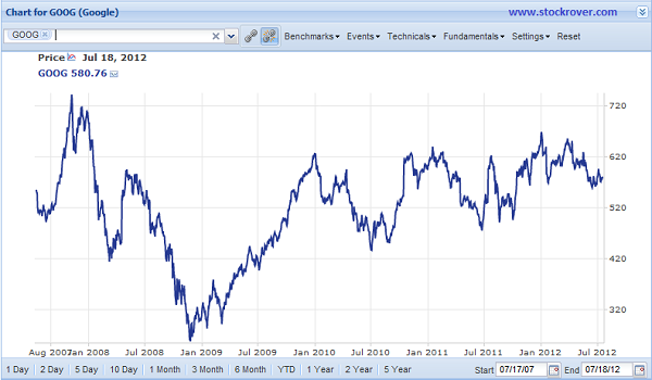
Besides the obvious effects of the 2008 financial crisis, which caused GOOG to reach its nadir in November 2008, it looks like the price is generally going up, but with some noise. Let’s put in the 200-day simple moving average to see the trend.
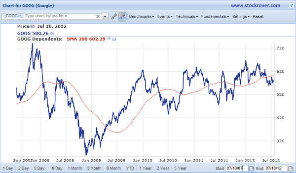
The 200-day Simple Moving Average makes it pretty clear that GOOG is indeed trending upward. Now let’s see if we can make any sense of the noise around the trend. Because we are focusing on Google’s upcoming earnings release, let’s go to the ‘Events’ menu and chart Google’s earnings events.
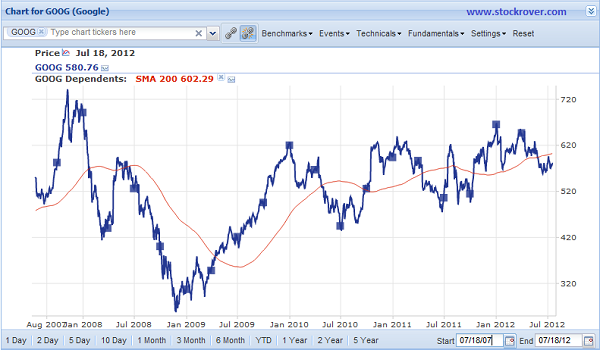
Now if you look carefully, this picture is a bit more telling, and we can actually suss out a pattern. Starting in July 2009, GOOG’s price rises from July to January, and then declines from January to July, reaching its local minimum right around the July earnings report. Furthermore, Google looks like it’s on track to continue that pattern—its price has been falling for the last few months, and its earnings report, which seems to be the turning point, comes out today. This quick technical analysis, assuming that historical patterns continue, would indicate that it would be wise to buy GOOG now and hold on to it at least through January.
But, to take it a bit further, let’s get rid of the trend, add the S&P 500 as a benchmark (from the ‘Benchmarks’ menu) and then set it as a baseline by clicking the small graph icon to the right of its label in the legend. This will flatten the S&P 500 at zero percent so we can easily see GOOG’s relative performance.
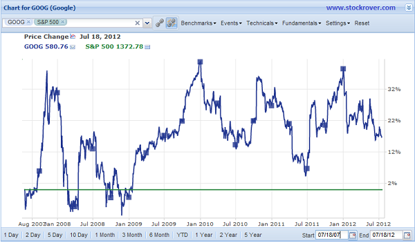
It’s obvious that GOOG has solidly outperformed the S&P 500 for the last two and a half years, but let’s break down the periods into six-month segments by entering in custom date ranges for the relevant periods.
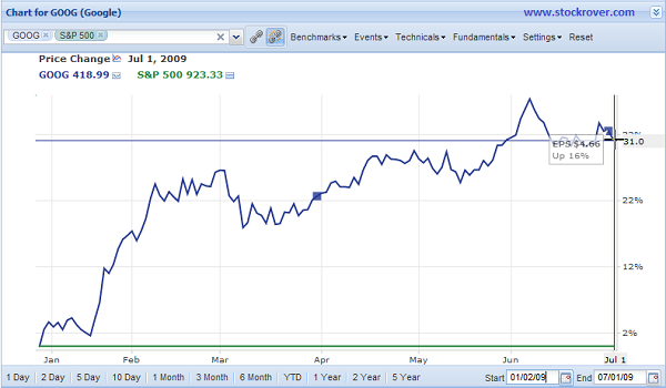
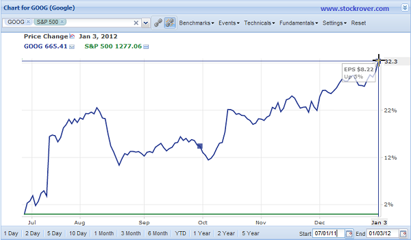
From January 2009 to July 2009, GOOG was still on its steady recovery from the financial crisis, and outperformed the S&P 500 by roughly 30% (shown below.) During this six month period, the absolute percent changes for the S&P 500 and GOOG were around -1% and 30%, respectively.
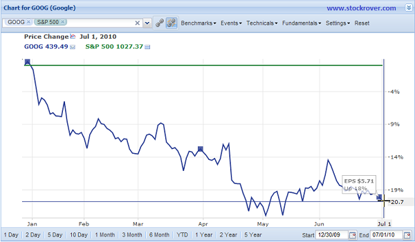
From July 2009 to January 2010, GOOG continued to outperform the S&P 500 by around 27% (shown below), which is made even more impressive by the fact the S&P 500 itself increased by about 22% in that period. That puts GOOG’s absolute percent change from July 2009 to January 2010 at a whopping 49%.

Now here comes the January to July downturn: GOOG’s price falls pretty far, and in fact it underperforms the S&P 500 and comes in at -20%. This picture is made even grimmer by the fact that the S&P 500 lost nearly 10% in this time period.
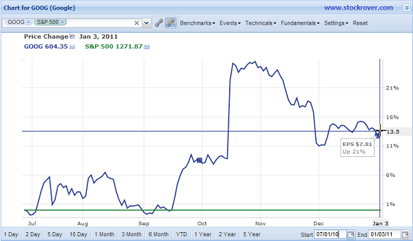
And just like that, GOOG showed itself to be a second-half stock, as shortly after the July earnings report its price rose again, outperforming the S&P 500 by about 13% (shown below) which is again made more impressive by the fact that the S&P 500 gained 23% over this period, meaning that GOOG netted an absolute percentage increase of around 35%.
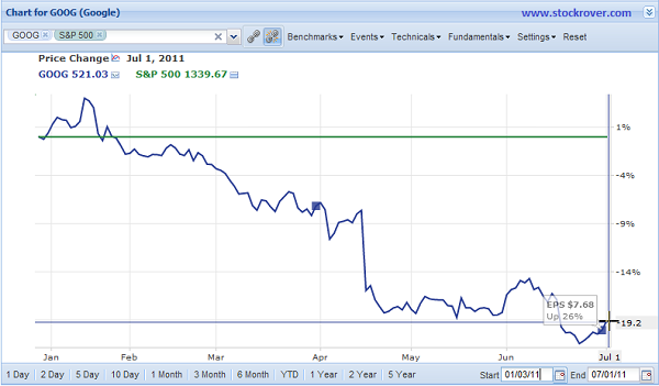
And down it goes again, falling underperforming by 20% below the S&P 500. While the S&P 500 had gained an absolute 5% over this period, GOOG is still down a total of 13% over the whole six months.
And yet! GOOG had another dramatic comeback in the second half of the year, outperforming the S&P 500 by an impressive 32%. It’s positively dizzying. During this six months, the S&P 500 had fallen near 5% but GOOG’s absolute increase was around 37%.
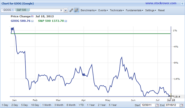
Finally, we’ve reached the last six months, where, right on cue, GOOG’s prices have underperformed that of the S&P 500 by a dismal 20% (shown below.) Combined with the S&P 500’s modest absolute gains of 7%, GOOG had an overall decrease by 13%.
But the earnings report comes out today, and if you believe that the past can tell us anything about the future, then we can expect to see GOOG’s price trend upward through at least January. Not only that, but from a fundamental perspective, GOOG is cheaper than it has ever been. If we take a look a quick look at the Price-to-Earnings Ratio in the chart, we can see that it has been steadily declining despite the upward trend in price.

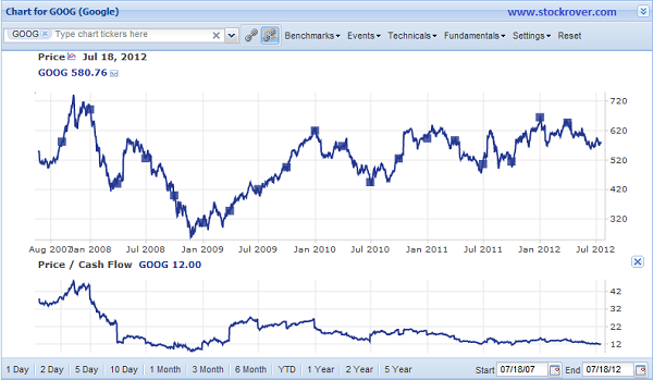
Or, if you’d rather use the Price-to-Cash-Flow ratio for tech companies, you can see that it follows a similar downward trend, and currently is even lower than the P/E ratio.
So there you have it. Even if you can’t explain it, you can’t ignore Google’s blatantly cyclical behavior over the past two and a half years; and with the release of its second quarter earnings it’s primed to start its annual six-month ascent. Timg/blog/2012-07-19-google-technical-analysis/2012-07-19-google-technical-analysis/hat, and its attractive P/E and P/CF ratios, and the fact that it’s comfortably above the market make it an all-around attractive buy. The amount of time spent researching this with Stock Rover: about 5 minutes. The percent gain over the next six months? Stay tuned, we’ll post again in January to report back on how this theory pans out.
Top