
Connect your brokerages or import your history, pick any set of portfolios — up to 50 or more — and get one plain‑English report covering your real return, risk, income, fees, and what actually drove the result.
See what’s inside ↓
No credit card required
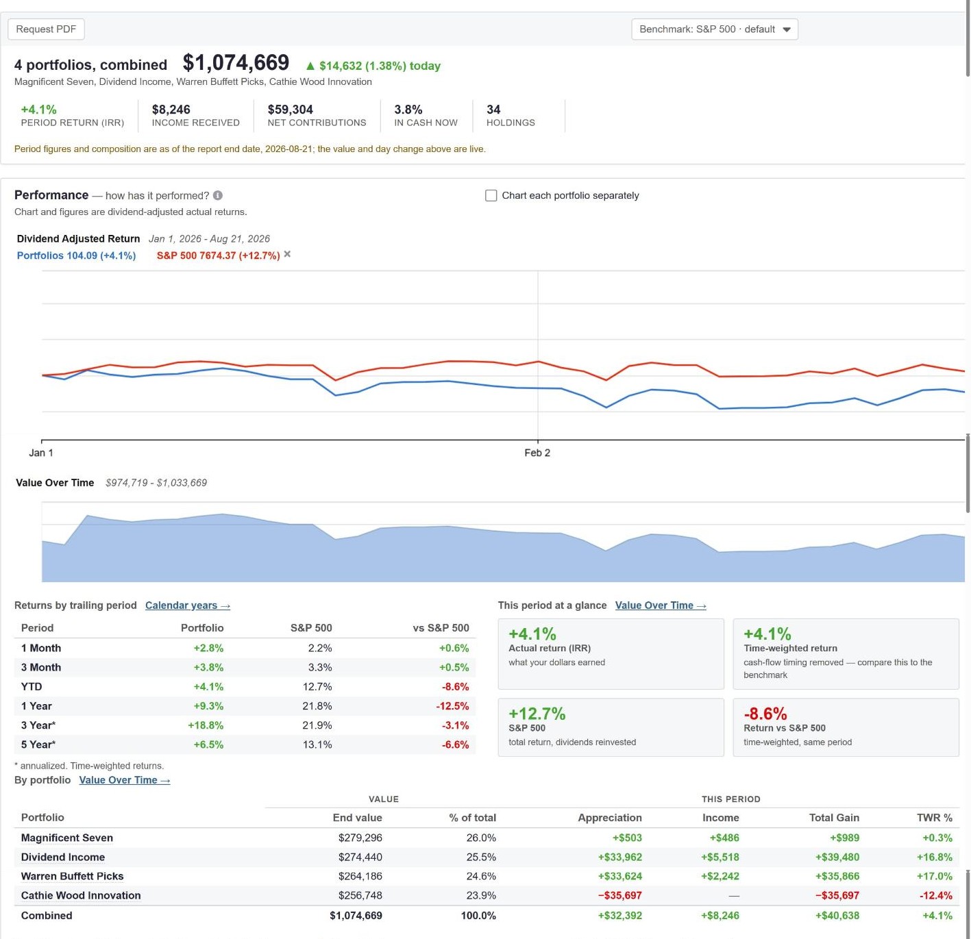
Most tools give you one number and let you guess what it means. The report gives you both answers to the two questions investors actually ask — and explains the difference in plain English.
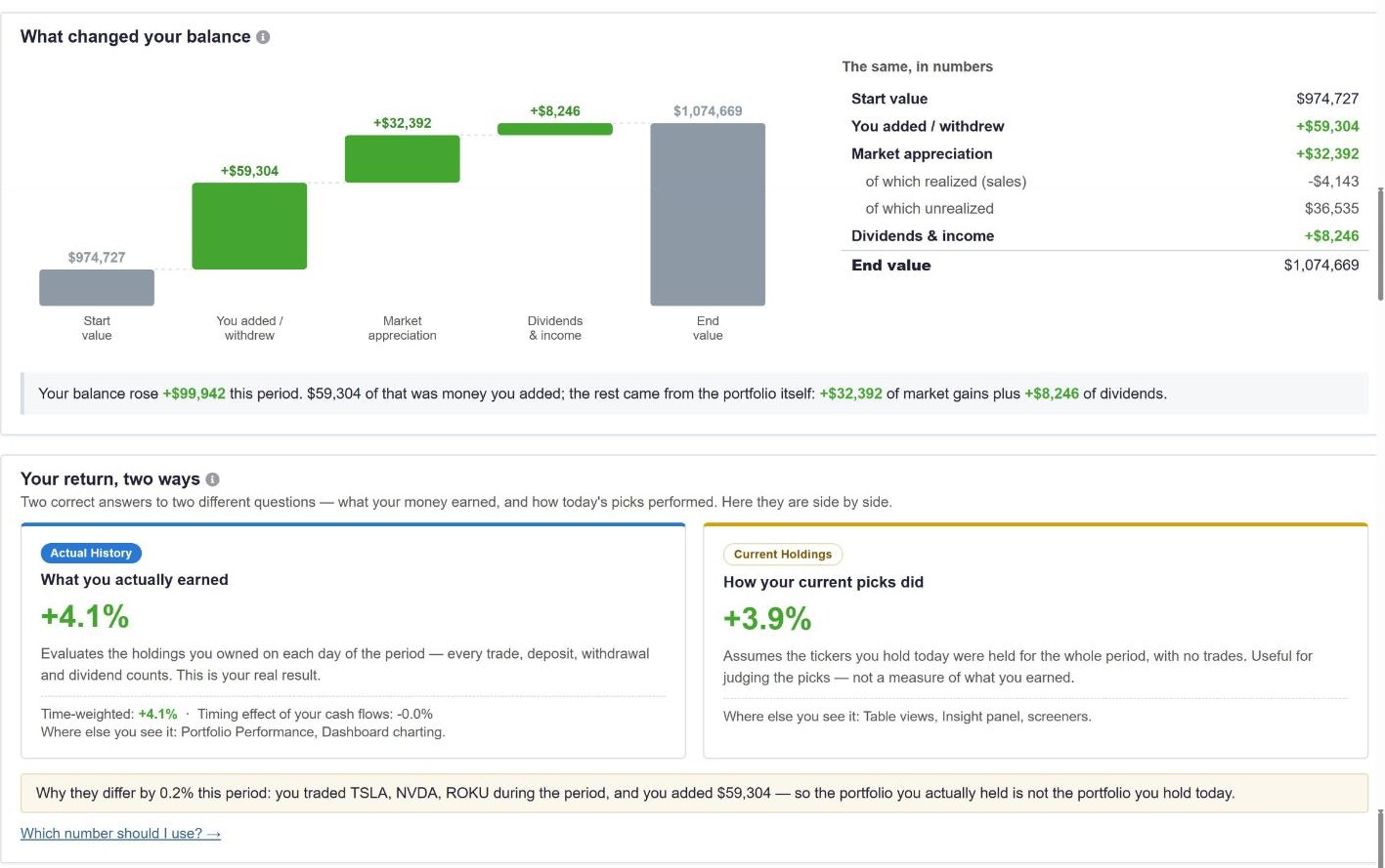
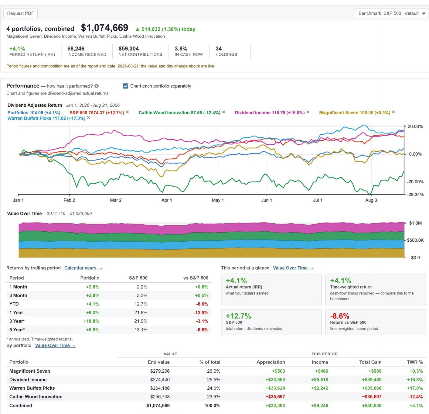
Taxable, IRA, 401(k), spouse’s accounts, the kids’ accounts — check any combination in the portfolio tree and the report rebuilds instantly, combined or portfolio‑by‑portfolio.
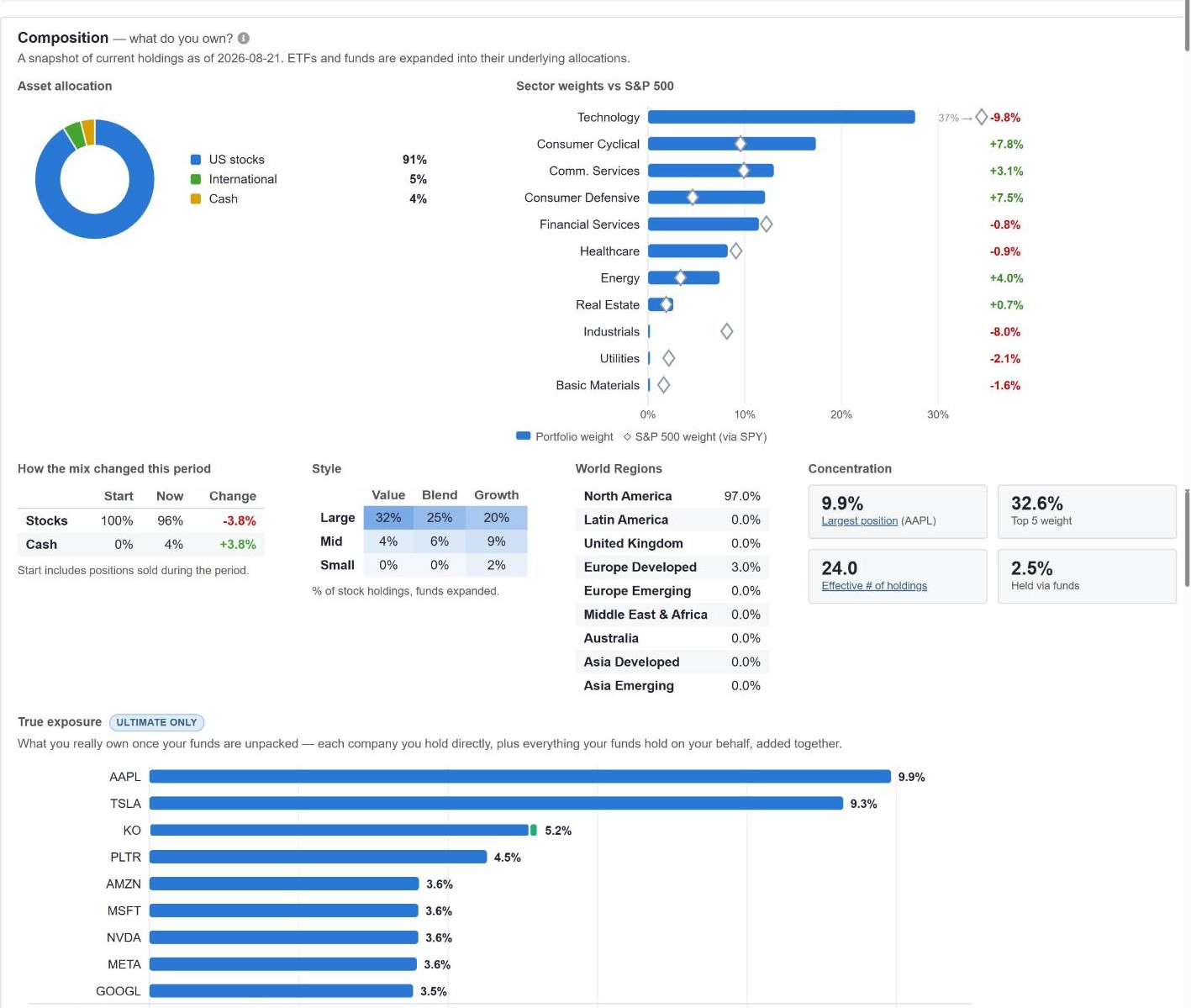
The composition section expands every ETF and mutual fund into its underlying companies, then adds it all up. Concentration you can’t see in a brokerage statement becomes obvious.
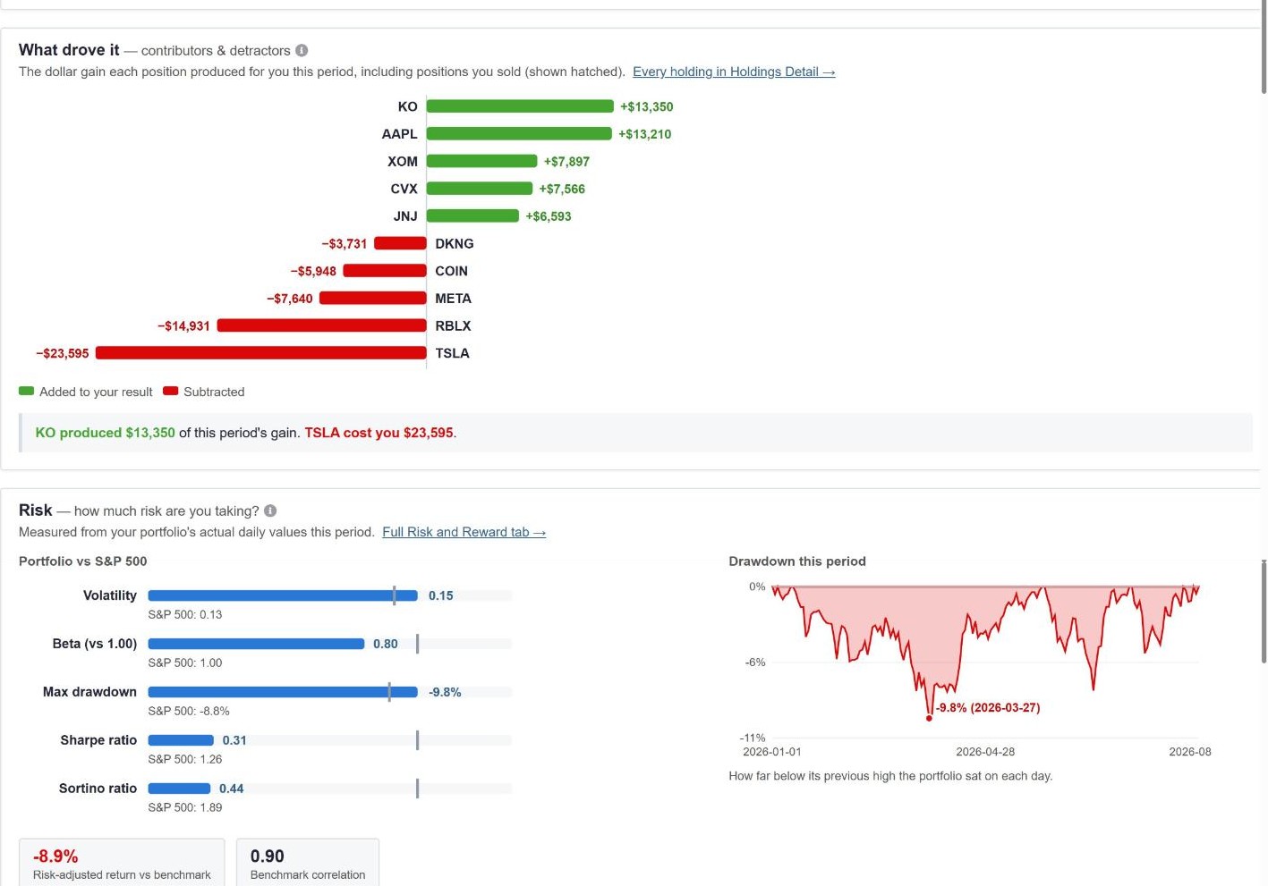
Dollar‑based contributors and detractors, including positions you sold mid‑period. Then the risk you took to get there, measured from your portfolio’s actual daily values.
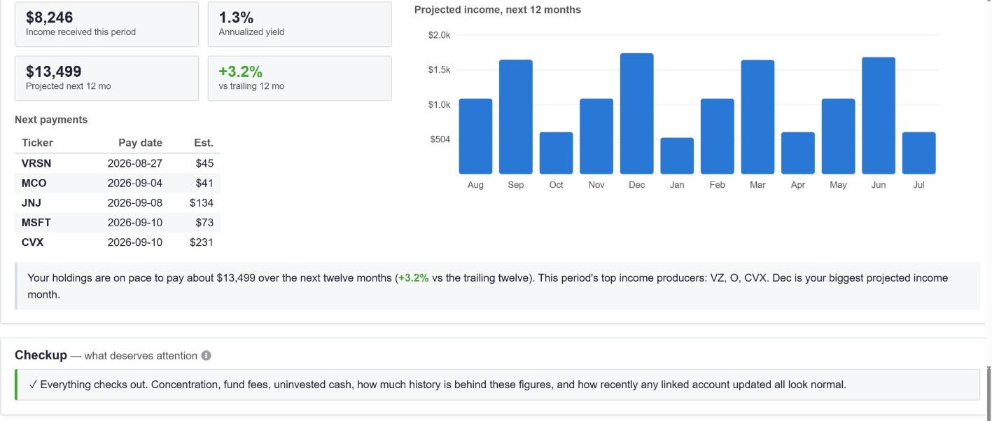
Dividends received this period, projected income for the next twelve months at announced rates, and the actual payment calendar — ticker by ticker, month by month.
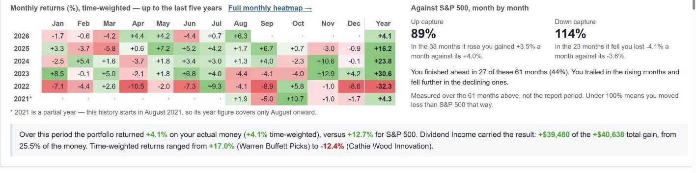
“Over this period the portfolio returned +4.1% on your actual money, versus +12.7% for S&P 500. Dividend Income carried the result… Time‑weighted returns ranged from +17.0% (Warren Buffett Picks) to –12.4% (Cathie Wood Innovation).”
The report narrates itself — sentences like these are generated from your numbers, on every page.
Plenty of tools track portfolios. Very few produce a report that measures your real return, unpacks your funds, prices your fees, and explains itself in plain English.
| Capability | Stock Rover | Empower | Sharesight | Morningstar | Koyfin |
|---|---|---|---|---|---|
| Trade‑history performance report (IRR & TWR) | ✓ | Partial | ✓ | ✗ | ✗ |
| Fund look‑through (true exposure) | ✓ | Partial | ✗ | ✓ | ✗ |
| Fee audit in dollars, with 10‑year cost | ✓ | ✓ | ✗ | Partial | ✗ |
| Dividend calendar & 12‑month projection | ✓ | ✗ | Partial | ✗ | Partial |
| Up/down capture, Sharpe, Sortino, drawdowns | ✓ | ✗ | ✗ | Partial | Partial |
| Plain‑English narration of your results | ✓ | ✗ | ✗ | ✗ | ✗ |
| Deep stock research in the same tool | ✓ | ✗ | ✗ | ✓ | ✓ |
| No wealth‑management sales calls | ✓ | ✗ | ✓ | ✓ | ✓ |
Comparison reflects publicly documented features as of August 2026. See our Why Stock Rover page for the full story.
Link a brokerage or import your history — your first Portfolio Performance Report is minutes away.
Screens shown use a demonstration account with illustrative portfolios; figures update with live market data and are not investment advice or a promise of performance. The Portfolio Performance Report is available in the Stock Rover trial — see plan comparison for details.