The exercises from Chapter XI on performance evaluation are:
- Chart the performance of a portfolio against a benchmark such as the S&P 500. How do they compare over the last month, 3 months, and year?
- Compare each of your holdings to their sector and industry over a 3 month period. Here’s how: open the portfolio so that you see all of its holdings in the Table. In the Chart, add the two dependent benchmarks (from the Benchmarks menu). Make sure the Chart and Table are linked, and then scroll through the performance of each holdings using arrow keys. Each time the chart will update with the performance of the stock versus its industry and sector. Setting the stock as a baseline will make the comparison even clearer. Which holdings perform best against their benchmarks?
- Look at the portfolio allocation. Is the portfolio well diversified?
- Open the Portfolio Performance view in the Table. Which holdings have the best and worst gains by percentage?
- Explore the Portfolio Analysis window to discover your appreciation, IRR, and risk-adjusted return. Portfolio Analysis is a Premium feature, but if you do not have a Premium subscription, you can activate a 14-day trial in order to try this feature for free (go here for more information).
- Based on these exercises, do you feel that you need to make any changes to your portfolio in the near future? Why or why not?
Here is where you can find the relevant information in Stock Rover.
Chart a Portfolio vs. Benchmark
To chart a whole portfolio, you can right-click the portfolio from the Navigation panel and select ‘Chart’ from the drop-down menu. Or, you can find it in the Benchmarks menu of the Chart, as below:
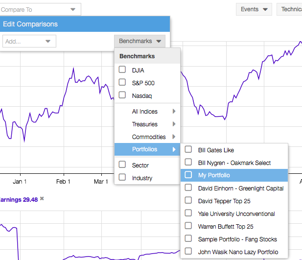
You can also use the Benchmarks menu to select the S&P 500 or a different benchmark to add to the Chart. Use the period buttons at the base of the Chart (below) to select different comparison periods.

Add Dependent Benchmarks for Primary Charted Stock
The dependent benchmarks are the sector and industry of the ticker that is the primary charted item (what appears in the box in the top left of the Chart). In the first image above, notice that the dependent benchmarks appear at the bottom of the Benchmarks menu. Just select these boxes to chart those items, and they will automatically adjust to whatever ticker is in the primary position.
You can use arrow keys to move through the rows in the Table and watch the primary ticker and dependent benchmarks change in the Chart accordingly. Make sure the Chart and Table are linked in the Chart’s Settings menu.
Find Sector Allocation
When you have a portfolio selected in the Table, the Summary tab of the Insight panel shows information about that portfolio, including an interactive sector allocation pie chart, top 5 movers, and an aggregated news feed for tickers in that portfolio. These items are boxed in red below.
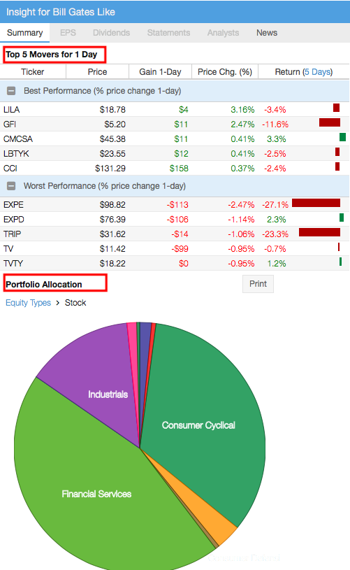
The portfolio pie chart will also be visible at the bottom of the Summary tab for individual stocks in a portfolio that is currently loaded in the Table.
Find Industry Allocation
The sector allocation pie chart does not include the industry breakdown. For that, load your portfolio in the Table as shown earlier and go to Actions> Group Table By > Industry, shown here:
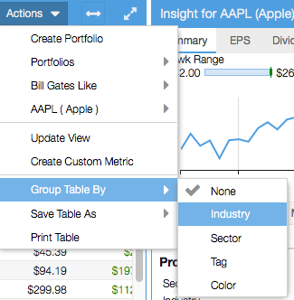
This will break the stocks in the Table into industry clusters, each with a summary line. Use the Value (%) column to see the allocation of each industry. In the example below, we see that stocks in the Travel Services industry together represent 0.2% of the portfolio’s total value.

The Group By action can also be accessed by right-clicking any column header.
Compare Gains of Portfolio Holdings
When you have a portfolio opened in the Table, head to the Portfolio Performance view tab, as pointed out in the image below, and find the Gain columns (boxed in red below).
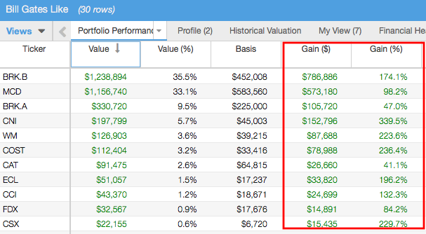
This allows you to see the gains/losses of each holding since the portfolio’s inception.
Explore the Portfolio Analysis Window
Portfolio Analysis is a separate window that contains detailed analytics about your portfolios. It is a Premium feature. If you are a free user but would like to try out the Portfolio Analysis window, you can activate a 14-day free trial of Premium (no payment information is required to do this)—instructions for starting your free trial are here.
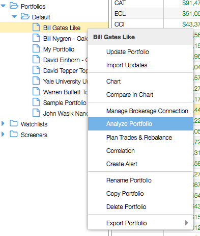
To open this window, find ‘Portfolio Analytics’ in the grey menu bar, or right-click a portfolio in the Navigation panel and select ‘Analyze Performance’ from the drop-down menu, shown below.
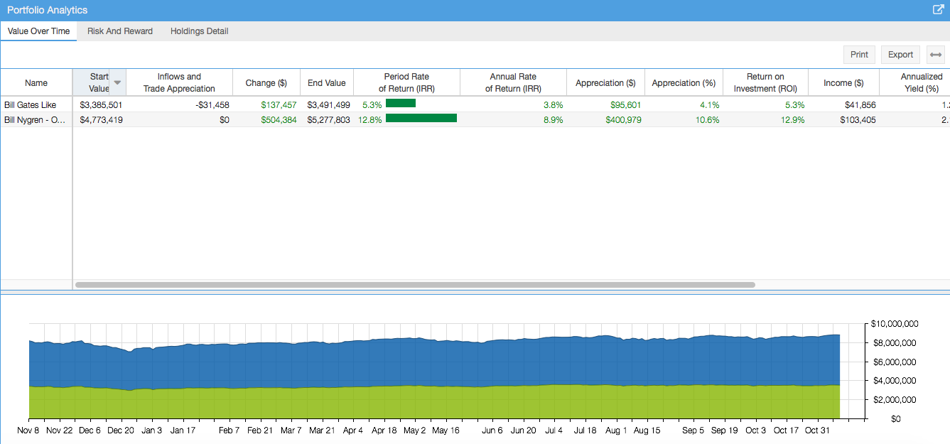
Below is a section of the Portfolio Analysis window that opens. Use the ‘Value Over Time’ and ‘Risk And Reward’ tabs to locate the IRR and risk-adjusted return.
You can also select the ‘Holdings Detail’ tab to see appreciation and IRR for individual holdings, as well as the percent of the total return that each holding accounts for.
You can right-click any column header for an ‘Explain’ feature that gives a definition of that metric. These definitions can also be found here.
At the top of the window are period buttons (similar to those found in the main Chart) that allow you to change the period of analysis.
For more information on using Stock Rover, see our Help pages or email our Support Team.