Each chapter of our our Introduction to Researching Stocks guide has its own appendix with the relevant information. This is the first appendix, for Chapter II: A Few Introductory Concepts.
First, Get Set Up in Stock Rover
Stock Rover is a web-based application for stock research where you can apply what you’re learning in these guides. You ll need to set up a free Stock Rover account if you haven’t already. (No credit card information is needed to create an account, and we do not share your email address.)
Once you sign in to your account, take a moment to get familiar with the program layout. Here’s a quick look:
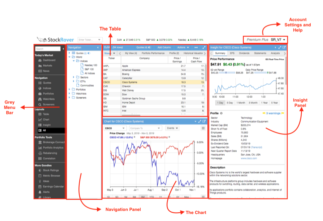
The selected row in the Navigation panel affects what rows are displayed in the Table. You can also use the Ticker Box to add individual tickers to the Table for further information on it. The selected row in the Table will appear in the Chart as well as in the Insight panel, where you can get a variety of detailed data and links. When in doubt, use the Search box to find a specific action. As you move through the program, you’ll also discover tooltips and drop-down menus that add information and functionality.
You can practice basic navigation in Stock Rover by:
- Adding a ticker (or several) to the Quotes List
- Selecting a different dataset in the Navigation panel. Try selecting ‘Quotes’ so that only the tickers in the Quotes List are displayed.
- Selecting different rows in the Table. Notice how the Chart and the Insight panel change according to the selected Table row.
For more screenshots and a deeper overview of how to use the program, see this introductory Stock Rover Overview or our online help.
Chapter II Exercises
Now for the exercises listed in Chapter II. They are as follows:
- Pick a stock, any stock. Determine what industry and sector your stock is in.
- Chart your stock against three benchmarks: its industry, its sector, and the S&P 500 (which can be used as a proxy for the market). How has it performed compared to its benchmarks over different periods, such as 1 month, 1 year, or 5 years?
- As seen in the earlier image, it is possible to set any line as a baseline (a zero line) in Stock Rover to see relative performance. Try it out! Has your stock been an outperformer, an underperformer, or an average performer compared with others in the chart?
Below you can find instructions for completing these tasks.
Find the Industry and Sector
There are several places to find a stock’s industry and sector.
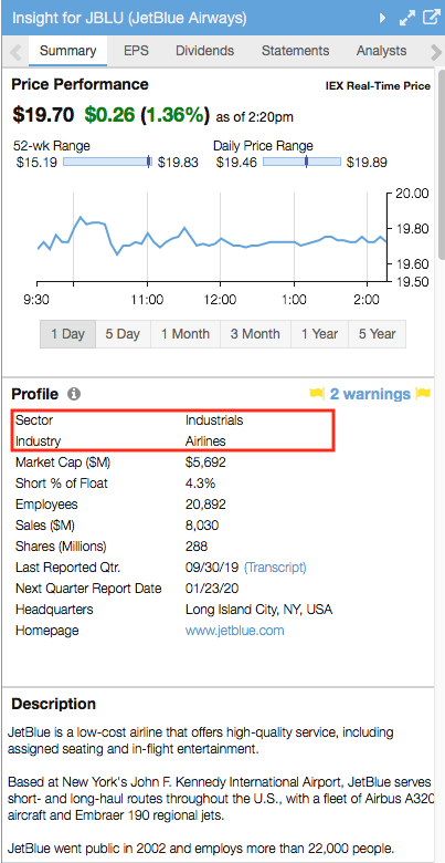
Insight panel, Summary tab: Once you have selected a stock in the Table, you will notice that it loads in the Insight panel (on the right hand side of your SR screen). Here is where industry and sector can be found:
Tooltip: Simply mouse over the ticker symbol (either in the Quotes list, Table, or Chart legend) to see its tooltip with helpful summary information on the stock. The industry and sector are called out below.
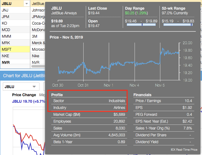
Table: Add the industry or sector columns to any view using the “Add Column” button. You can also open a view that already contains these metrics.

Chart Against Benchmarks
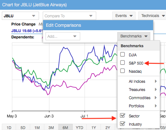
Once you have a ticker in the Chart (here are instructions on how to add a ticker), open up the Benchmarks menu, as shown below, and select the benchmarks that you’d like to compare. The ticker-dependent benchmarks sector and industry will automatically update based on the primary ticker being charted.
Change Periods in the Chart
To select a charting period, use the buttons or enter a custom period in the bar at the bottom of the Chart:

Set a Baseline
Setting a baseline charts relative performance, so you need at least two lines in the Chart in order to set a baseline.
When you have more than one item charted, set a baseline simply by clicking a ticker’s name in the legend, as circled below.

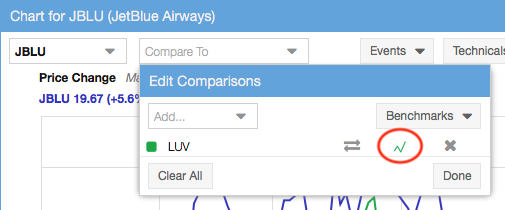
Or, open up the Compare menu and click the small chart icon, circled below. Simply click it again to get the chart back to normal.
Why use a baseline? To answer the question “By exactly how much has this stock outperformed or underperformed another stock (or benchmark)?” Let’s use an example. Here is a chart of JetBlue (JBLU) and Southwest Airlines (LUV) over the past 5 years:
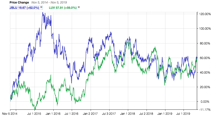
The above chart shows absolute performance. But then what if you wanted to know the difference in their performance? In other words, what is the distance between those two lines at any given point? Setting a baseline charts the difference between the lines, so it’s very easy to understand their relative performance.
Now here is LUV set as a baseline:
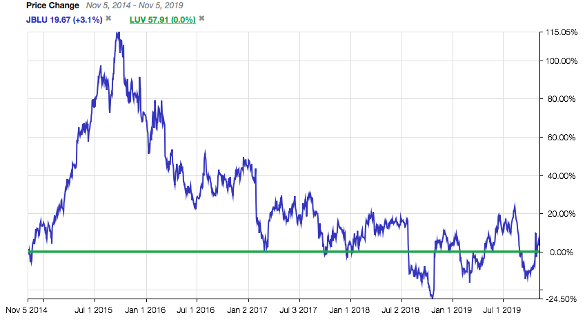
This makes it very easy to see that, over a 5 year period, JBLU has performed only 3.1% better than LUV. JBLU dramatically outperformed LUV from November 2014 to late 2015, but then lost all its relative outperformance to LUV by the fall of 2017. You can all calculate that from the original chart by hand, but the baseline function does it automatically for you.
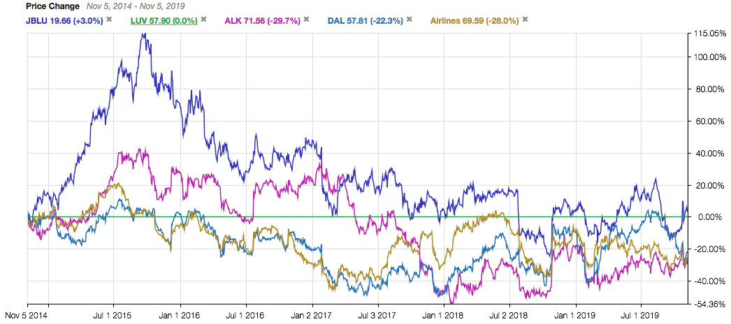
It can be even more useful when there are more than two lines charted. Below, you can see how Jet Blue (JBLU), Southwest (LUV), Alaska Airlines (ALK), Delta (DAL) and the entire airlines industry all compare to each other. Looking at the chart from LUV’s perspective, it’s very clear that LUV has outperformed all peers except JBLU over the last 5 years. LUV has also outperformed the airline industry as a whole.
For more information on using Stock Rover, see our Help pages or email our Support Team.