Introduction
Here at Stock Rover, our goal is to help you take complete control of your investments. We provide a comprehensive suite of tools designed to give you a clear picture of your holdings, understand your true performance and risk, forecast your future income, and keep your overall strategy aligned.
But while our robust research and planning tools give you the magnifying glass needed to analyze individual assets, sometimes you need a telescope. You need a 10,000-foot view of exactly how your portfolios are performing, where your risk lies, and how much wealth you are actually generating.
That is why we are thrilled to announce our newest feature: The Performance Report. Designed to act as an executive summary of your investments, this vertically scrolling report weaves the most vital metrics from across our platform into a cohesive story.
How to Access the Performance Report
Accessing your new executive summary is simple. First, please note that we have renamed the “Analytics” section in the Start Menu to Performance to better reflect its capabilities.
To view the report, click on Performance under Portfolio Tools in the Start Menu, and then select the new Report tab on the right side of your screen.
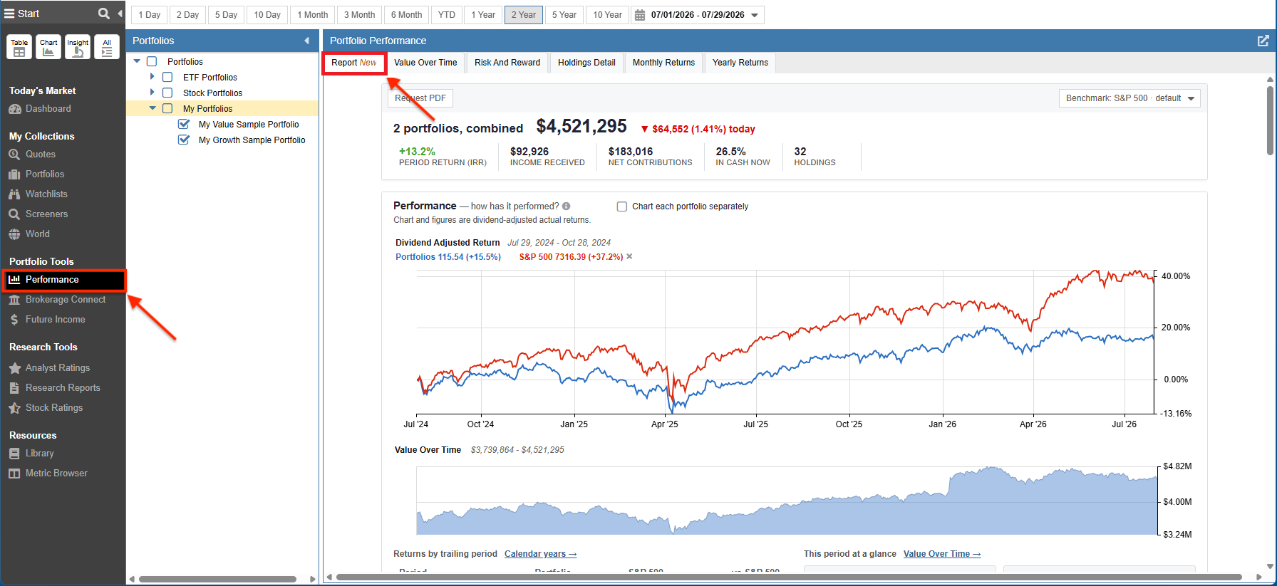
Navigation: Click Performance under Portfolio Tools, then select the Report tab.
The At-A-Glance Summary
We designed the very top of the report to give you an instant, bottom-line assessment of your portfolios’ health without requiring you to scroll. It provides a high-level aggregate snapshot of your current status, displaying the combined total value of your selected portfolios, today’s change, the period return, total income received, net contributions, your cash allocation, and the total number of holdings.

Drill-down: Interact with the benchmark dropdown menu to instantly adjust the comparative data across the entire report, or click “Request PDF” for a printable version.
Tracking Your Performance Over Time
Once you have a high-level view, it is time to dig into historical market performance. This section provides a comprehensive visual and statistical history, allowing you to easily identify seasonal trends or specific periods of outperformance. It plots dividend-adjusted actual returns against your selected benchmark alongside a shaded area chart showing your portfolios’ value over time.
To ensure absolute clarity, the metrics highlight both your Period Rate of Return (IRR), which is the money-weighted, personal return that includes your deposits and withdrawals, and your Time-Weighted Return, which eliminates the distortion of cash flows for a true apples-to-apples benchmark comparison.
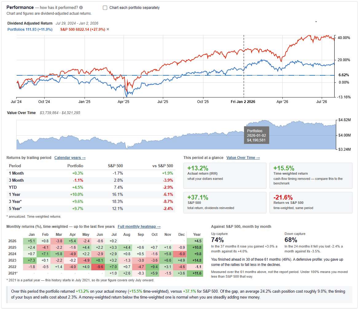
Drill-down: Use the direct links to access deeper analytics, such as the full monthly heatmap or calendar year breakdowns.
Visualizing Your Wealth Creation
Beyond simple returns, it is vital to understand exactly where your wealth is coming from. This highly visual waterfall chart decomposes the period’s change in your portfolios’ value into three distinct components: money you moved (net cash added or withdrew), market appreciation, and accrued dividends and income.
A supplementary table to the right further breaks down your market appreciation into its realized (sales) and unrealized components. The core value of this section is that it clearly separates your personal savings rate from actual market-driven wealth creation, showing you the exact stepping stones to your final balance.
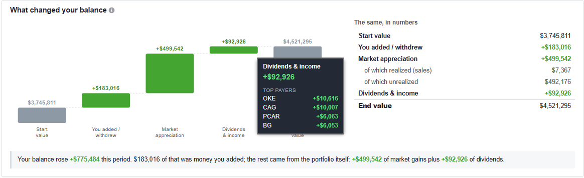
Drill-down: Hovering over chart elements, such as Market Appreciation, reveals a tooltip detailing the exact top contributors driving that specific change.
Two Honest Answers to “How Did I Do?”
When measuring your success, there are two honest answers to “how did my portfolios do”, and they are rarely the exact same number. This module presents two distinct return calculations side-by-side to clear up any ambiguity.
Actual History evaluates the holdings you owned on every day of the period, so every buy, sell, deposit, and withdrawal counts. Current Holdings assumes the positions you hold right now were held for the whole period with no trades. Comparing these side-by-side helps you understand if your trading activity actually helped or hindered your performance.
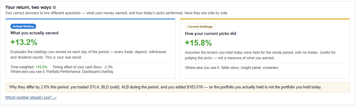
Drill-down: Includes a “Which number should I use?” link for further educational context on return methodologies.
Analyzing Portfolio Composition
Of course, your performance is entirely driven by what you actually hold. The Composition section acts as a comprehensive allocation summary that instantly highlights portfolio concentration risks and structural biases. It features a donut chart for asset allocation, an equity style box, geographic exposure, and a bar chart comparing your sector weights against the S&P 500.
We do not just look at the surface. If you hold ETFs or mutual funds, we look completely under the hood at their underlying assets to reveal your true sector and geographic exposure. We also calculate your Effective number of holdings, which tells you exactly how many equally-sized positions the portfolio behaves like. This is an incredibly helpful metric for understanding your true diversification, especially when evaluating multiple portfolios combined.
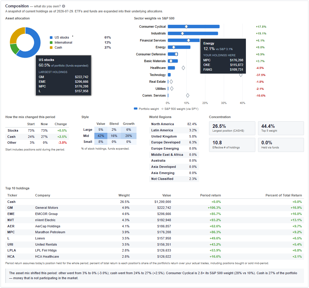
Drill-down: Tooltips provide expanded data upon hover, allowing you to see exactly which specific tickers make up a given sector weight.
Identifying Contributors and Detractors
Within your allocation, some individual assets will inevitably do the heavy lifting while others act as a drag. This horizontal bar chart cuts through aggregate percentages to show precisely which investments are driving your portfolios. It isolates the exact dollars of gain each position produced during the period.
Crucially, this is computed over all assets held during the period, not just current holdings. If you fully exited a position before the period ended, its result up to the sale date still counts and is shown clearly hatched on the chart.
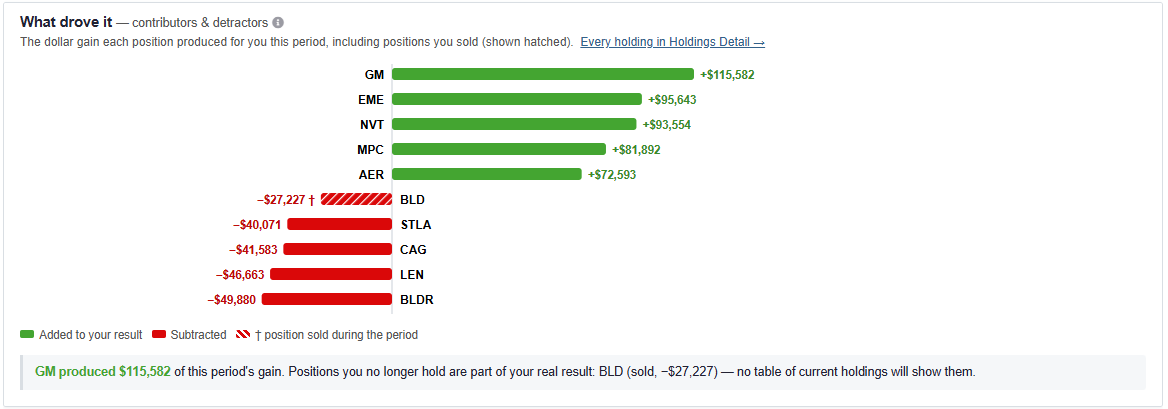
Drill-down: Provides a direct link to view “Every holding in Holdings Detail” for a full spreadsheet-style breakdown.
Measuring Your True Risk
Returns and top movers are only half the story, the other half is the risk you took to get there. This section measures risk from your portfolios’ actual daily values versus your chosen benchmark.
We present a clear view of your Volatility, Beta, Max drawdown, Sharpe ratio, and Sortino ratio compared directly against the market. It also includes a drawdown chart that illustrates how far below its previous high the portfolio sat on each day, along with a table detailing your worst declines and exactly how many days it took to recover.
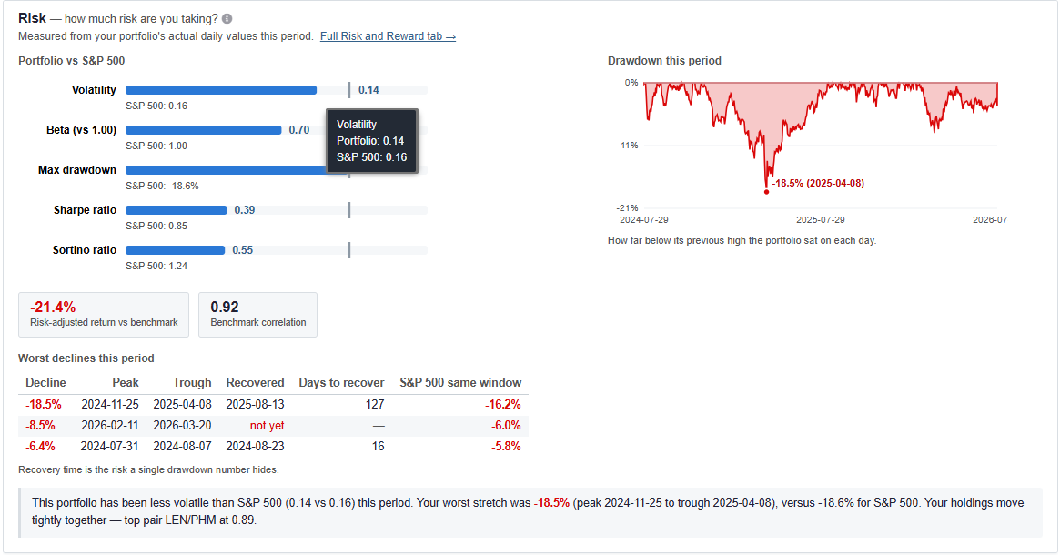
Drill-down: Click the “Full Risk and Reward tab” link for more quantitative risk analysis.
Projecting Your Cash Flow and Income
For retirees and dividend-growth investors, risk is often mitigated by steady cash flow. This section focuses entirely on the income side of your portfolios, detailing your actual accrued dividends (Income received) and calculating your Annualized yield.
Looking forward, the report forecasts your income for the next 12 months by applying announced rates and schedules to your current holdings. This is mapped out visually in a monthly bar chart alongside a convenient list of immediate upcoming payments.
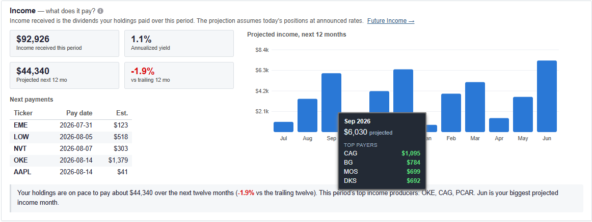
Drill-down: Includes a link to navigate to “Future Income” for further historical income tracking.
Automated Portfolio Checkups
Finally, to help you stay ahead of potential blind spots, we built an automated Checkup tool right into the report. Consider this your digital portfolio manager, running automatic rules against your holdings and flagging structural risks before they cause significant damage.
Warnings are color-coded (Red = serious, Amber = worth a look). The system looks for issues like Concentration (a single position above 15%), Sector Concentration (a sector above twice its benchmark weight), Cash Drag (less than 90% invested on average during a gaining period), highly correlated clusters, and high fund fees.

Drill-down: Every flag includes a contextual link (e.g., “Rebalancing”, “Value Over Time”) that opens the specific Stock Rover tool needed to address the warning.
Get Started: The Performance Report is available right now in your Stock Rover account for Premium, Premium Plus, Ultimate, and Ultimate Pro users. Log in, generate a report for your portfolios, and email support@stockrover.com [12] with any questions or feedback!
Sample Report: Want to see it in action before you log in? Click here [13] to view and download a complete sample PDF of the Performance Report.
3 Comments To "Introducing the Portfolio Performance Report"
#1 Comment By Noel Dunivant On August 8, 2026 @ 10:45 am
If it handles historical holdings as the post describes (in addition to current holdings), Portfolio Performance will be one of the most valuable enhancements to Stock Rover ever for me personally. Can’t wait to put it through its paces. Gratitude to the SR team for all you do.
#2 Comment By JimE On August 8, 2026 @ 11:48 am
This is an incredibly powerful feature. I happened across it while in Beta and was really impressed. A lot of the information may be available through different views and analysis, but this brings it all together giving a comprehensive view of the portfolios.
#3 Comment By Thomas J LeMay On August 9, 2026 @ 8:55 am
Excellent !!!