Contents
- Overview [1]
- Research Reports [2]
- The Insight Panel [3]
- Summary [4]
- Profile and Description [5]
- Warnings [6]
- Scores [7]
- Analysts [8]
- Dividends [9]
- Monthly Returns [10]
- EPS [11]
- Statements [12]
- Summary [13]
- Income Statement [14]
- Balance Sheet [15]
- Cash Flow Statement [16]
- Additional Tabs [17]
- History [18]
- Technicals [19]
- vs Peers [20]
- vs Industry [21]
- Roll Your Own [22]
- Summary [4]
- Conclusion [23]
- Frequently Asked Questions [24]
Overview
This is the first of a three part series designed to show you how to effectively use Stock Rover to research a stock. We will be using Microsoft (MSFT) as our example company.
The three part series focuses on researching a stock in the following sequence:
- Part 1 – Doing a deep dive on a stock using the Insight Panel
- Part 2 [28] – Comparison with peers using the Table
- Part 3 [29] – Price performance and technicals using the Charting facility
Research Reports
I should begin by mentioning that Stock Rover provides a Research Reports facility [30], which is designed to package much of the data available in the Insight Panel in an easy to read and portable PDF format.
You can see the current research report for Microsoft here [31].
Free weekly research reports are available to all users for the Dow 30. With a subscription to Research Reports, the rest of the 7000+ stocks in the Stock Rover universe are available and research reports are generated with current, up-to-the-second data, rather than weekly.
A Research Reports subscription is $49.99 per year if you have a Stock Rover subscription or $99.99 per year without an accompanying Stock Rover subscription.
And with that out of the way, let’s dive into researching Microsoft with Stock Rover.
The Insight Panel
The best place to begin stock or ETF research is with the Insight Panel [32]. The Insight Panel has eleven separate subsections: Summary, Analysts, News, Dividends, Monthly Returns, EPS, Statements, History, Technicals, vs Peers and vs Industry.
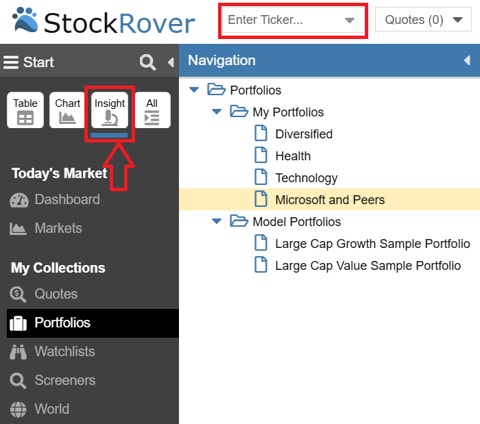
You can first enter your desired ticker in the ticker box and then you can fire up the Insight Panel by selecting the Insight Button at the top of the Start Menu as shown below.
Let’s start with the Summary section.
Summary
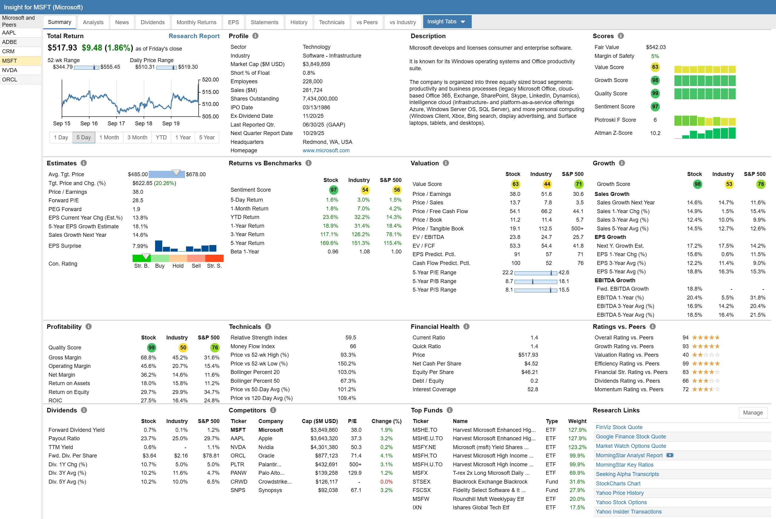
The Summary section of the Insight Panel displays many important things about a stock in a condensed and efficient form. As we view the Summary section we can see scores, analyst estimates, price performance, valuation, growth and more.
For many of these things we will use other parts of Stock Rover, such as the table and chart to delve more deeply in parts 2 and 3 of this blog series, but there is a lot here all in one place, as you can see in the screenshot below.
Profile and Description
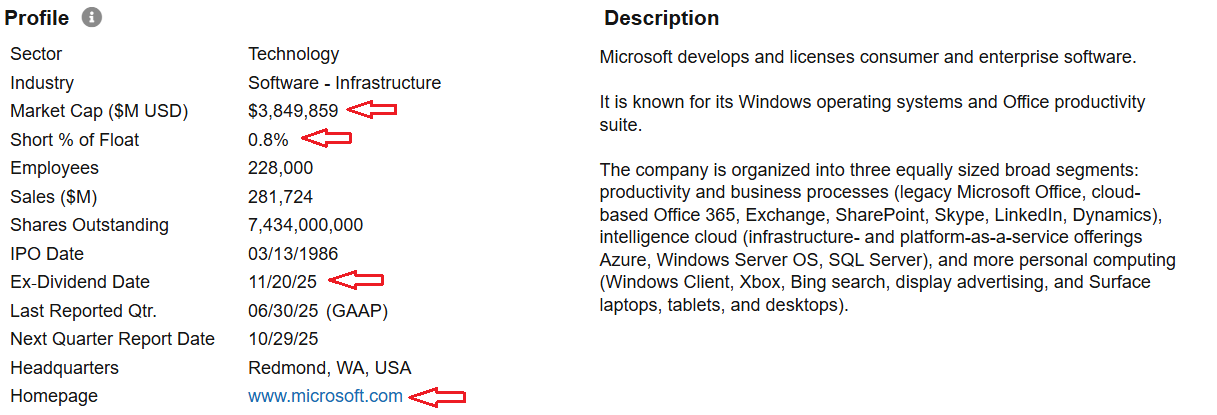
I always like to begin research on a company by looking at its profile and description. We can quickly get a sense of the of the company, what it does, its size, where it is located, whether it is a dividend payer or not, and whether the short interest in the stock is high or low. I can also take a quick look at the homepage to see how the company represents itself.
Warnings
Once past the profile, the next thing I focus on is Warnings.
The Warnings Facility looks at 29 separate issues of potential concern and indicates which ones a given stock is afflicted with (if any) and to what degree. The warnings cover a variety of issues concerning financial and operational performance, price technicals and analyst estimates.
The beauty of the Warnings facility is many of the things it detects would be difficult for an investor to spot on their own, without dedicating a lot of time and research. The Warnings facility does a great job of raising flags related to possible areas of concern.
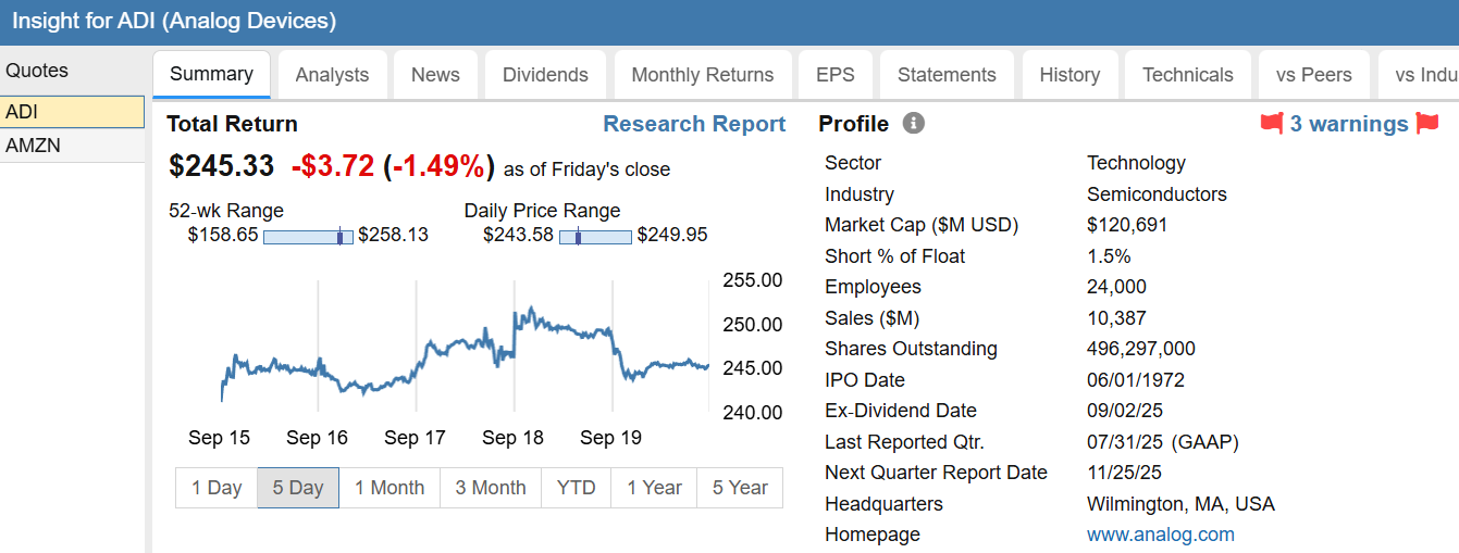
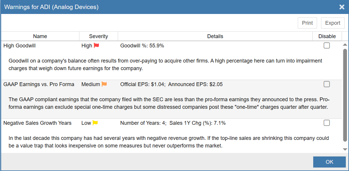
For Microsoft, there are currently no warnings, which is very good. To get an idea of what the facility can do, let’s take a look at Analog Devices, which has three warnings.
When we click on the warnings link, we get the following details.
The 3 issues of concern for Analog Devices are high goodwill amounts on the balance sheet (red = high severity), a differential between GAAP and Pro Forma earnings (orange – medium severity). It also has negative sales growth years (yellow – low severity). Together it all sounds a bit concerning.
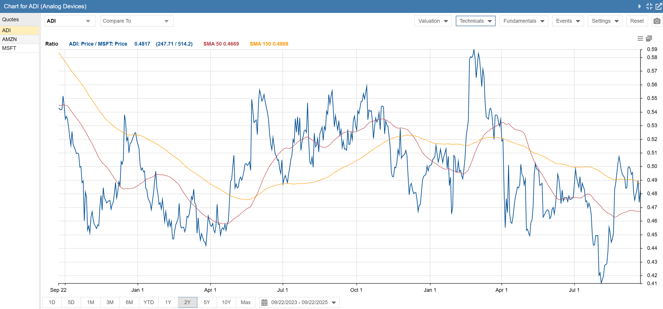
So does any of this correlate to real world performance? The short answer is it certainly can. Let’s take a look. We can use the ratio chart facility [38] and see how Analog Devices has performed relative to Microsoft.
In the above ratio chart, it is clear that Analog Devices has performed a bit worse than Microsoft with a recent downward trend. It’s impossible to know for sure, but it is reasonable to think that the issues raised by the warnings facility may have made a contribution to Analog Devices underperformance vs. Microsoft.
Scores
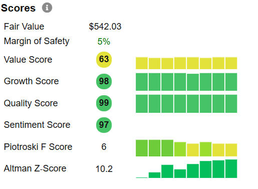
The summary scores tab uses Stock Rover’s scoring algorithms to score the stock vs. all other stocks across the North American stock universe. The nice thing about this panel is it shows not only the current scores, but how the scores are changing over time.
For Microsoft we can see that the value score is above average and has been pretty consistent over time.
Both the growth and quality scores are excellent, among the best vs. all other North American stocks. And the scores have been consistently good over time. Plus the sentiment towards the stock by investors is highly favorable.
The Piotroski score is used to evaluate financial health. The scale runs from 0 to 9. Companies under 3 are considered to be financially weak. Companies with a score of 8 or 9 are considered excellent. Average companies score in the 4 to 6 range. Here we can see that Microsoft is good, but not great, with a score of 6. We also note that their score has declined a bit over time.
Finally, we can look at the Altman Z score, which is a measure of a business’s credit strength. Microsoft has improved significantly over time and is currently at 10.2. Any value over 3.0 is considered to be a very sound business financially. Microsoft clears that bar by a wide margin.
Analysts
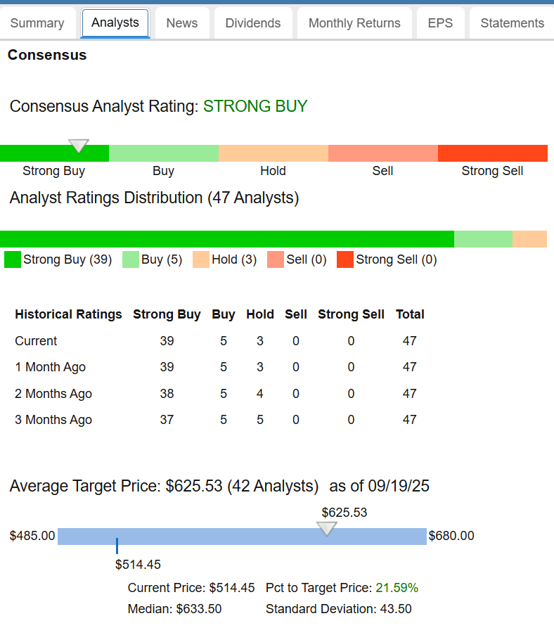
The Analysts tab provides a wealth of information about how the analysts are feeling about Microsoft. Unsurprisingly, we can see that Microsoft is a widely followed stock, with well over 40 analysts following the company. We will begin with the top half of the display, shown below.
The 12 month average target price for Microsoft is $625, which is over 20% above its current value. I would caution that analysts tend to be an overly optimistic lot. They are also slow to react to adverse news. So the real value of these targets is twofold: relative to other companies, and in relation to previous values of the target price.
An example of a relationship vs. a similar company is the analysts’ target price for Apple. Below is a snippet from Apple’s analyst estimate page.
We can see Apple’s current price is actually 5% over its target price, indicating the analyst community consensus is Apple is overvalued. This makes Microsoft the relative better value of the two in the analyst world.
Regarding changing price targets, a key thing to look for is analyst revisions up or down. Since analysts tend to be slow to revise targets, negative revisions are really negative in that they may understate the amount of deterioration in the outlook, and should be cause for concern. Conversely, positive revisions are a good thing for the same reason.
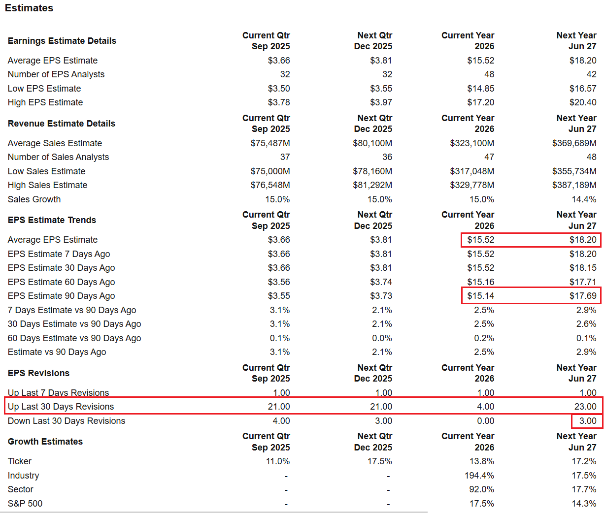
The bottom half of the analysts panel shows this information.
Here we see that for Microsoft, the revisions for both this year’s and next year’s earnings are higher than 90 days ago. We can also see the analysts’ revisions for the last 30 days have overwhelmingly been in the positive direction, with 23 analysts revising for higher earnings and only 3 analysts revising for lower earnings. Overall I would rate Microsoft’s situation as bullish for the stock.
Dividends
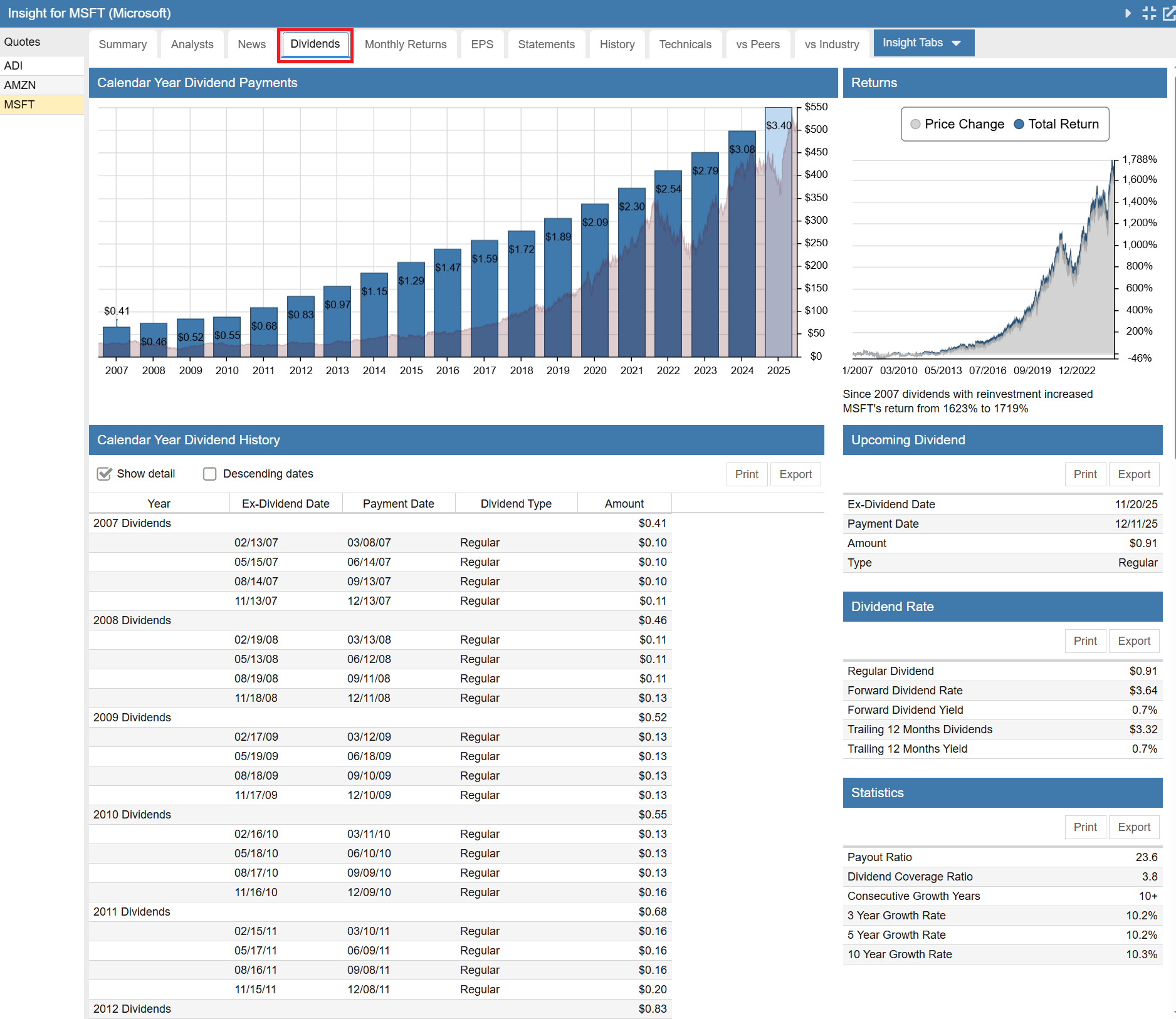
The Dividends tab shows that Microsoft is a steady and reliable dividend grower. The statistics panel shows that with a dividend coverage of 3.8x, confidence in Microsoft’s dividend safety is high. That coverage level, along with Microsoft’s earning growth, lends confidence in their ability to continue to grow their dividend at around 10% per year, which has been their historic rate.
Monthly Returns
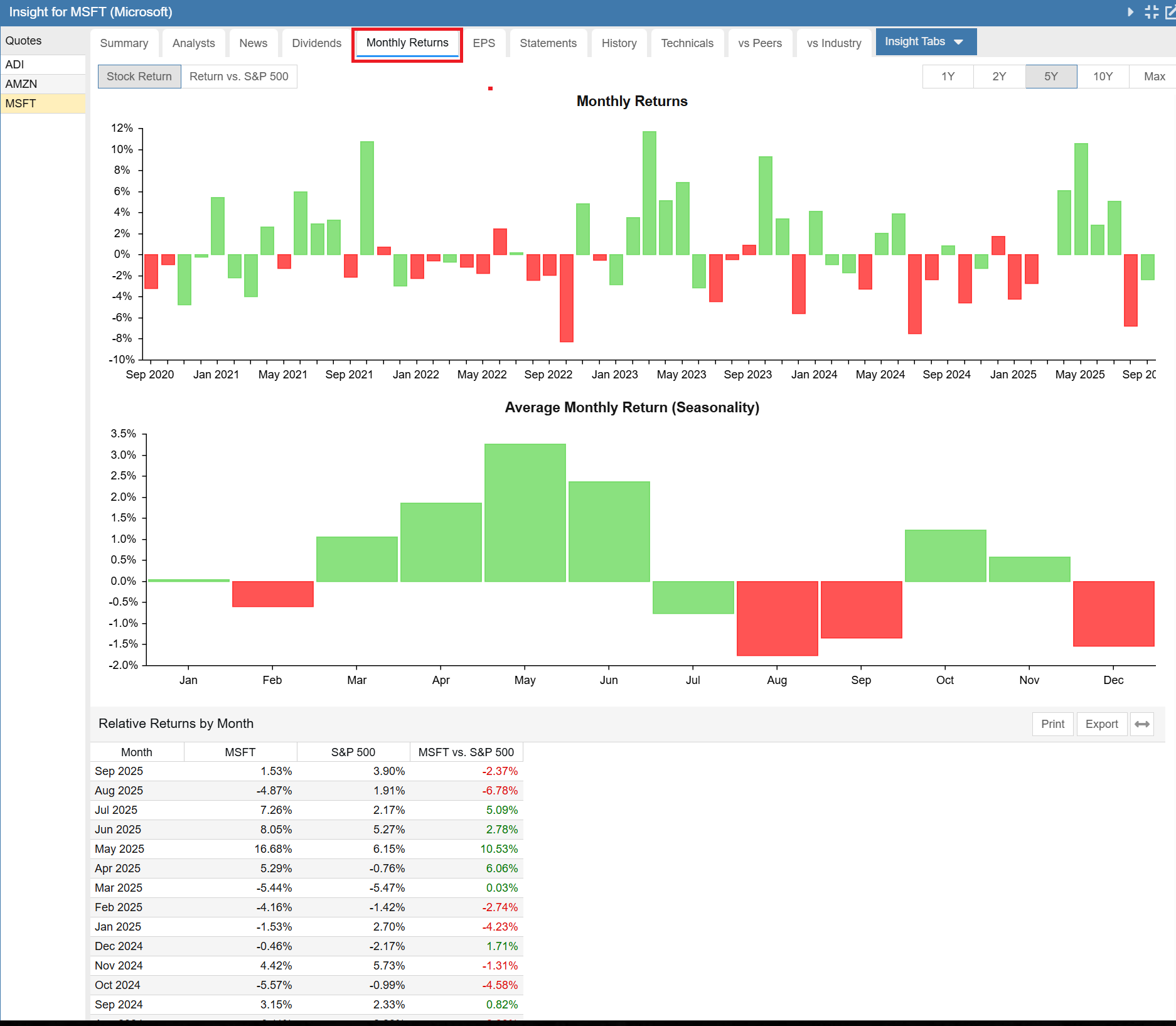
The Monthly Returns tab shows the performance of Microsoft across the months of the year. This is helpful to determine if there is any marked seasonality in a stock. Strong seasonality trends could be exploited to improve the timing of entry to, or exit from, a stock.
From an absolute return point of view, Microsoft is a good bet to buy most months of the year. However February, August, September and December have been less kind to the stock historically. On the other hand, October 1st or March 1st would be a great date to think about adding some capital, if you decide Microsoft is worthy of investment.
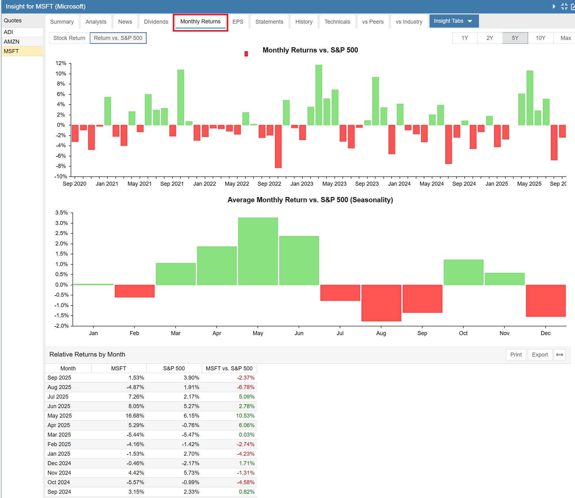
You can also see the monthly returns relative to the S&P 500 benchmark. We can see that Microsoft has historically outperformed the S&P 500 from March thru June, underperformed in the summer and then outperformed again in October and November, before switching back to underperformance in December.
EPS
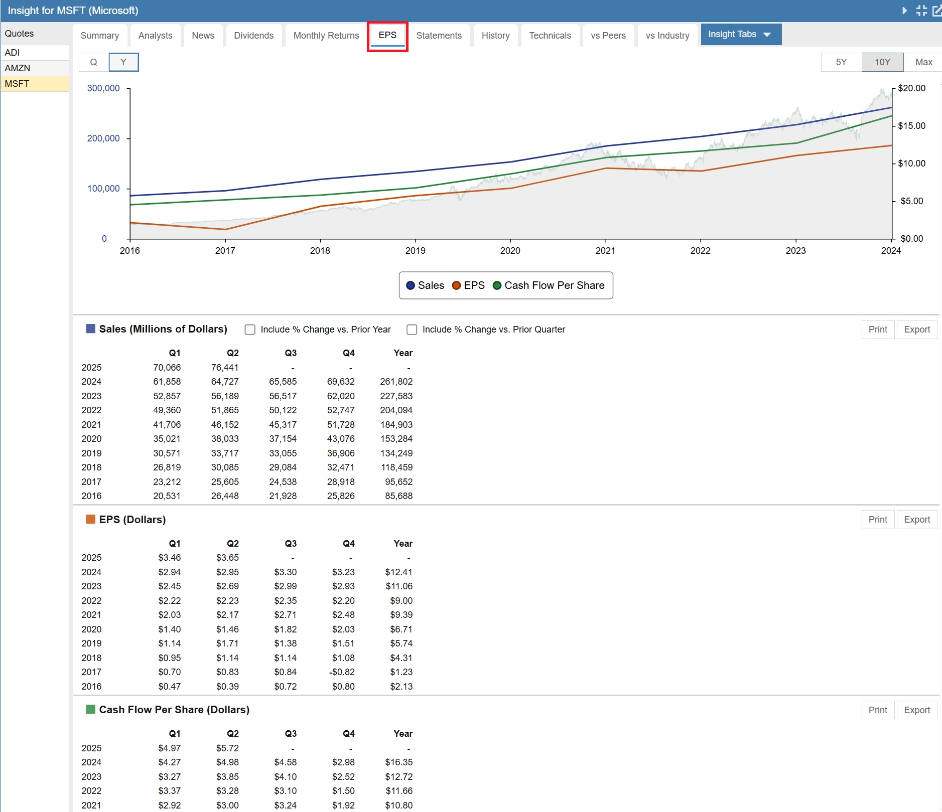
The EPS or Earnings per Share gives us a powerful view of historical sales, earnings and cash flow.
The chart portion of the display can show a 5 year chart, a 10 year chart or a max chart which goes back to 2007. We have selected 10 years. In the chart, Microsoft’s stock price is superimposed in the background.
Below the chart you see a concise display of sales, EPS and cash flow in chart form and in tabular form.
A quick look shows that Microsoft’s sales and cash flow were trending slowly upwards prior to 2017 and then accelerated further upwards in 2017 along with a sharp increase in earnings. The trends have continued forward for eight years running.
Price led the trend, turning solidly upwards in 2016. The price action shows that somehow the market knew good things were happening at Microsoft. Lately it seems price may be slightly ahead of sales and earnings growth.
There is a lot you can learn from this tab.
Statements
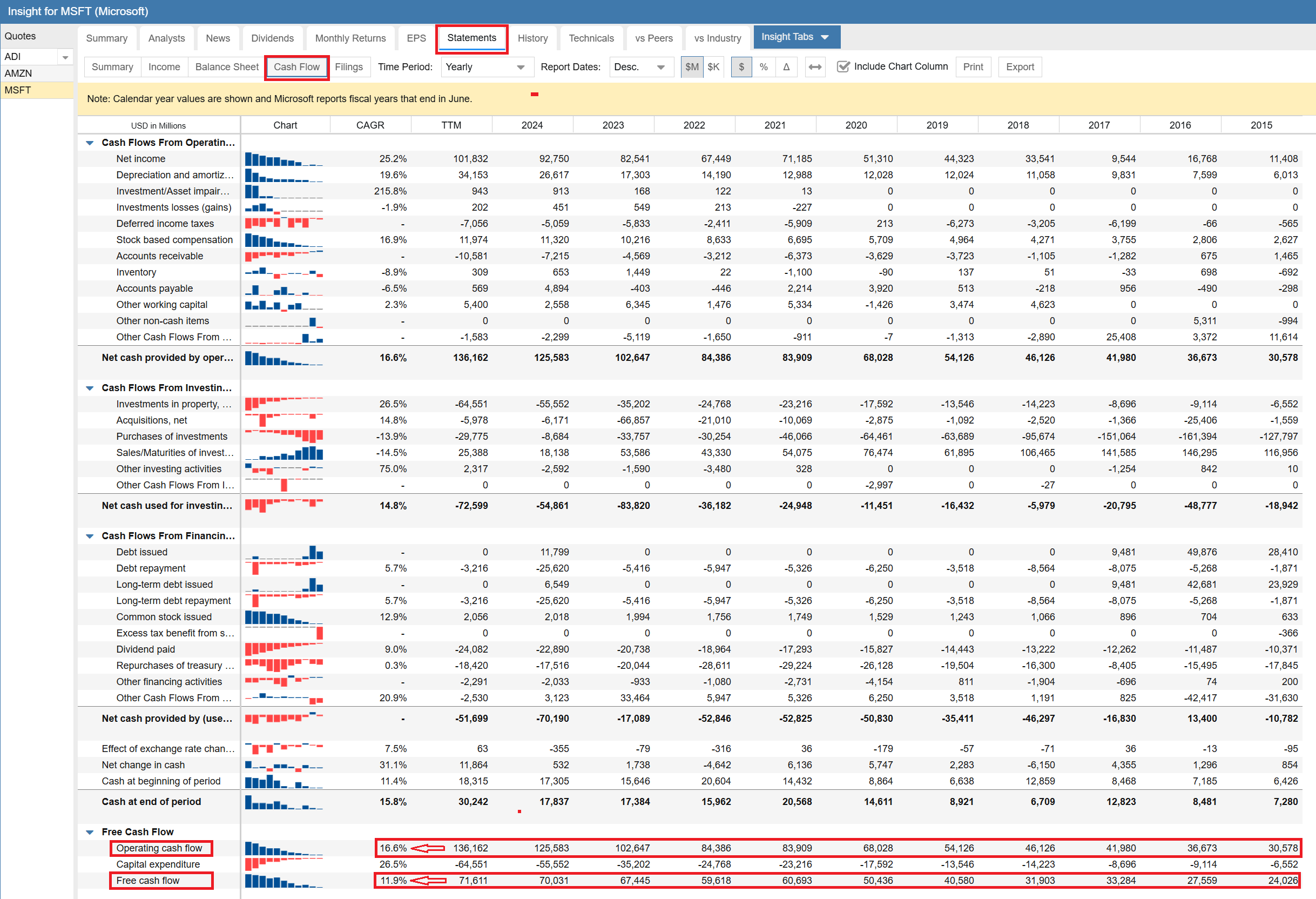
The Statements tab contains financial statement information in tabular form. You can look at annual or quarterly data. It can be viewed in ascending or descending date order. You can also look at statement data in percentage terms and in delta terms from the previous period. Finally, you can look at all of the company’s filings with the SEC from this tab.
Summary
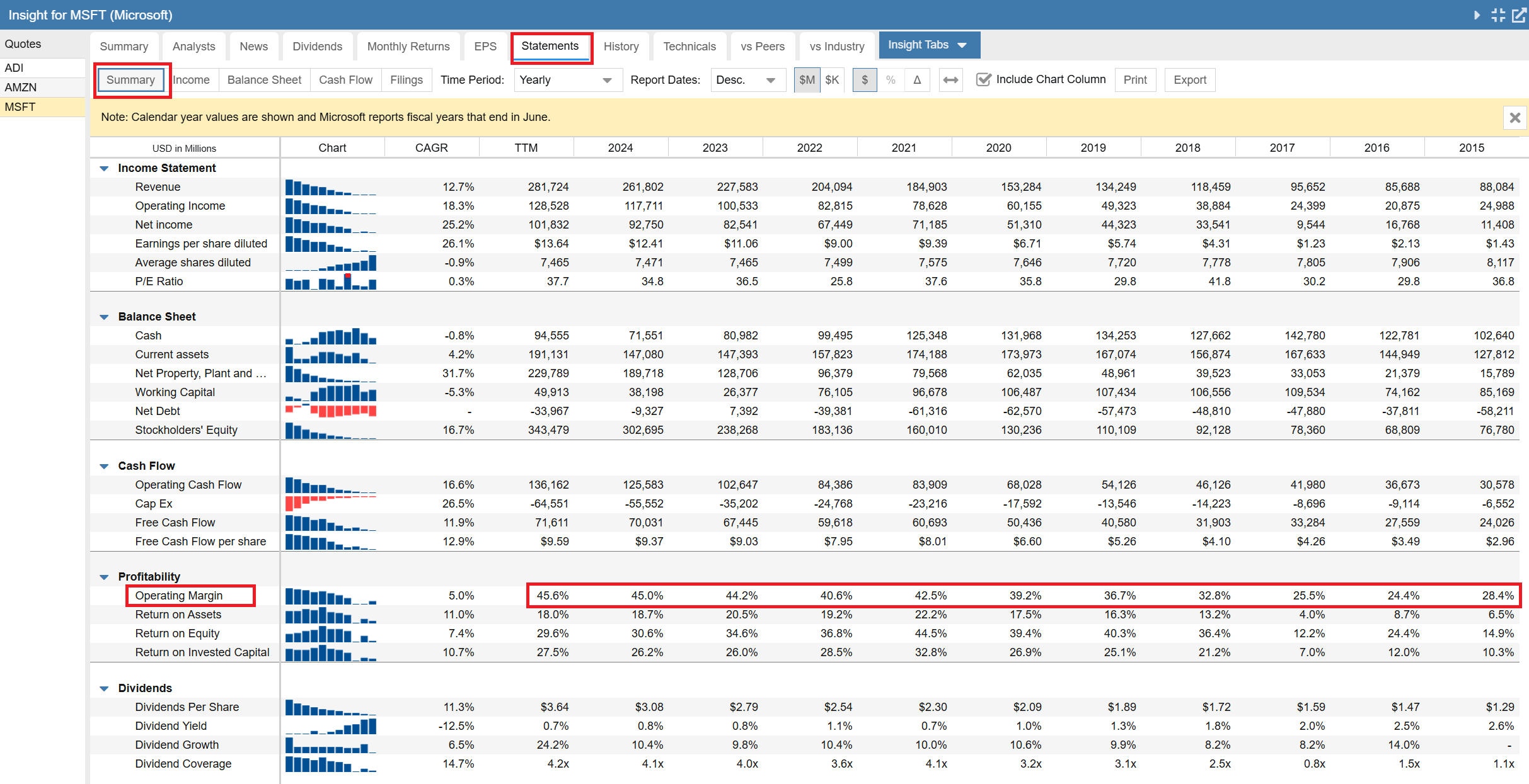
We will begin with the Summary subtab, which contains a concise look at the Income Statement, Balance Sheet, and Cash Flow Statement, as well as profitability and dividend information.
Note the yellow banner across the top indicates that Stock Rover is reporting on calendar years, even though Microsoft’s fiscal year ends in June. Stock Rover does this so that when you are comparing financial statement data across companies, you are always comparing like periods, that is, apples to apples.
Let’s focus on profitability. I am always interested to see how the key metrics of operational and capital efficiency evolve with time. I am looking for businesses that are continuously improving.
In Microsoft’s case we can see the Operating Margin dipped in 2016, started to rise in 2017 and then made a dramatic ascent from the 25% neighborhood to the 45% neighborhood. This is impressive.
Interestingly, Return on Assets, Return on Equity and Return on Invested Capital have all made similar journeys from 2017, but once achieving much high levels around 2021, have since fluctuated year to year.
Overall, this is clearly a business going the right direction.
Income Statement
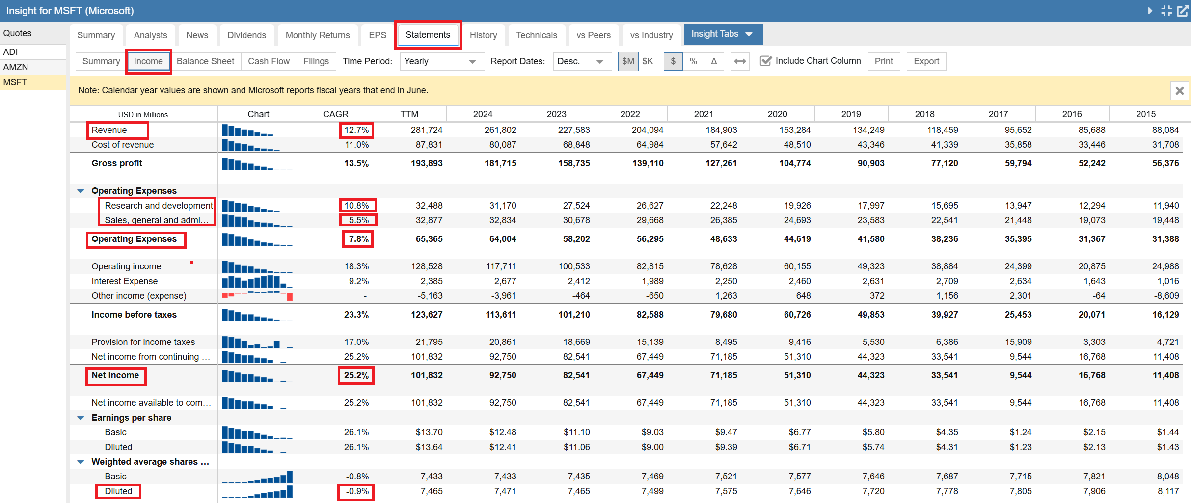
Switching over to the Income Statement, I see a couple more things I like. The 10 year revenue CAGR (Compound Annual Growth Rate) is over 12%, but expenses grew at less than 8%, and within that, R&D (the good expense) grew faster at 10.8% vs. S&GA which only grew at 5.5%. All of this together results in a Net Income after taxes CAGR of over 25%. That is a great corporate performance.
Last but not least, the diluted shares are slowly shrinking at a little under 1% per year, meaning they are buying back more shares that they issue. One of the things you worry about with a tech company is excessive compensation via options, resulting in major shareholder dilution. Microsoft does not have that problem.
Balance Sheet
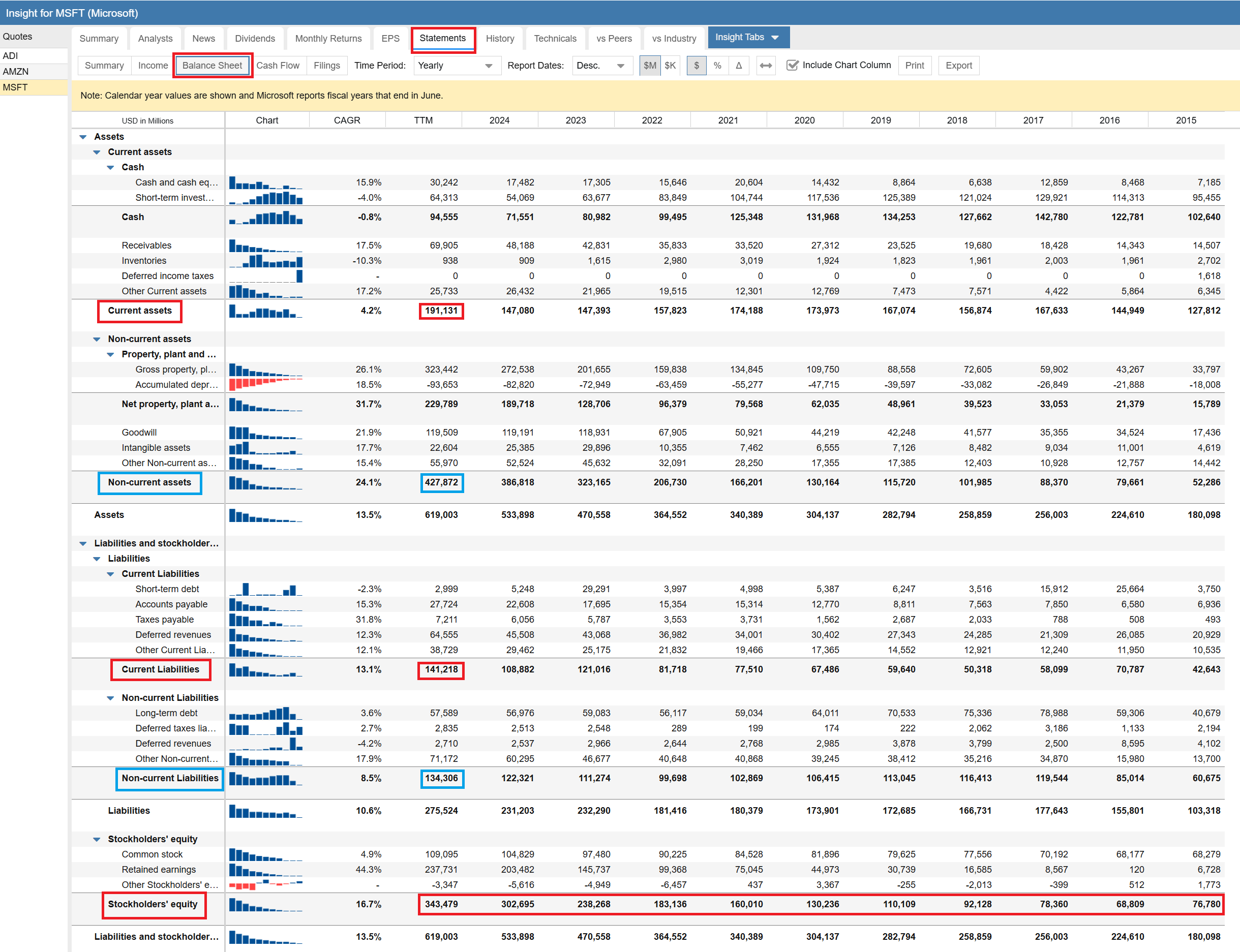
Turning to the Balance Sheet, we can see that current assets greatly exceed current liabilities, a healthy situation, though over time the gap has fluctuated. On the other hand, looking at the blue boxes, we see that long term assets have grown steadily as the business has grown. Long term liabilities have grown as well, but at a much slower rate. The net result is stockholder equity is growing rapidly. There is nothing to worry about here. They have a great balance sheet.
Cash Flow Statement
Unsurprisingly, it is the same story with cash flow. Both cash flow and free cash flow are heavily positive and growing. Overall, Microsoft has a great set of financials.
Additional Tabs
There are four other tabs in the Insight Panel that provide a lot of useful data. We are not going to cover them in depth here because we will use other parts of Stock Rover to delve more deeply into these areas in parts 2 and 3 of this blog series.
I will briefly discuss each of the four tabs so you can see what they contain.
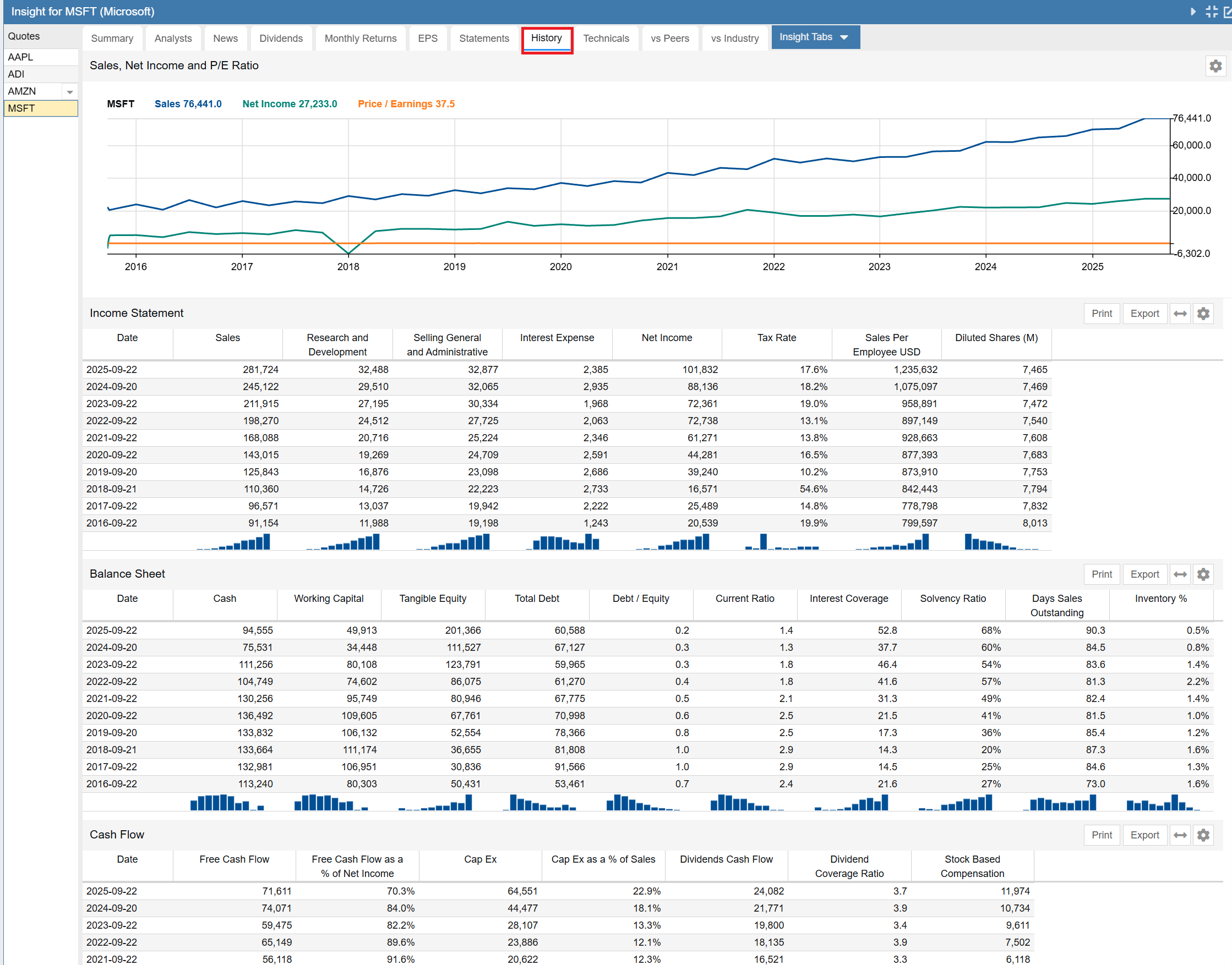
History
This is the history tab, showing how a lot of key financial information has evolved over time for a company. The first item is a fundamentals chart with sales, net income and P/E over time. That is followed by a series of 5 tables containing a wide variety of historical data.
The tables in sequence are the summary income statement, the summary balance sheet, the cash flow statement, the profitability table and key per-share data. Note the last two tables are not shown.
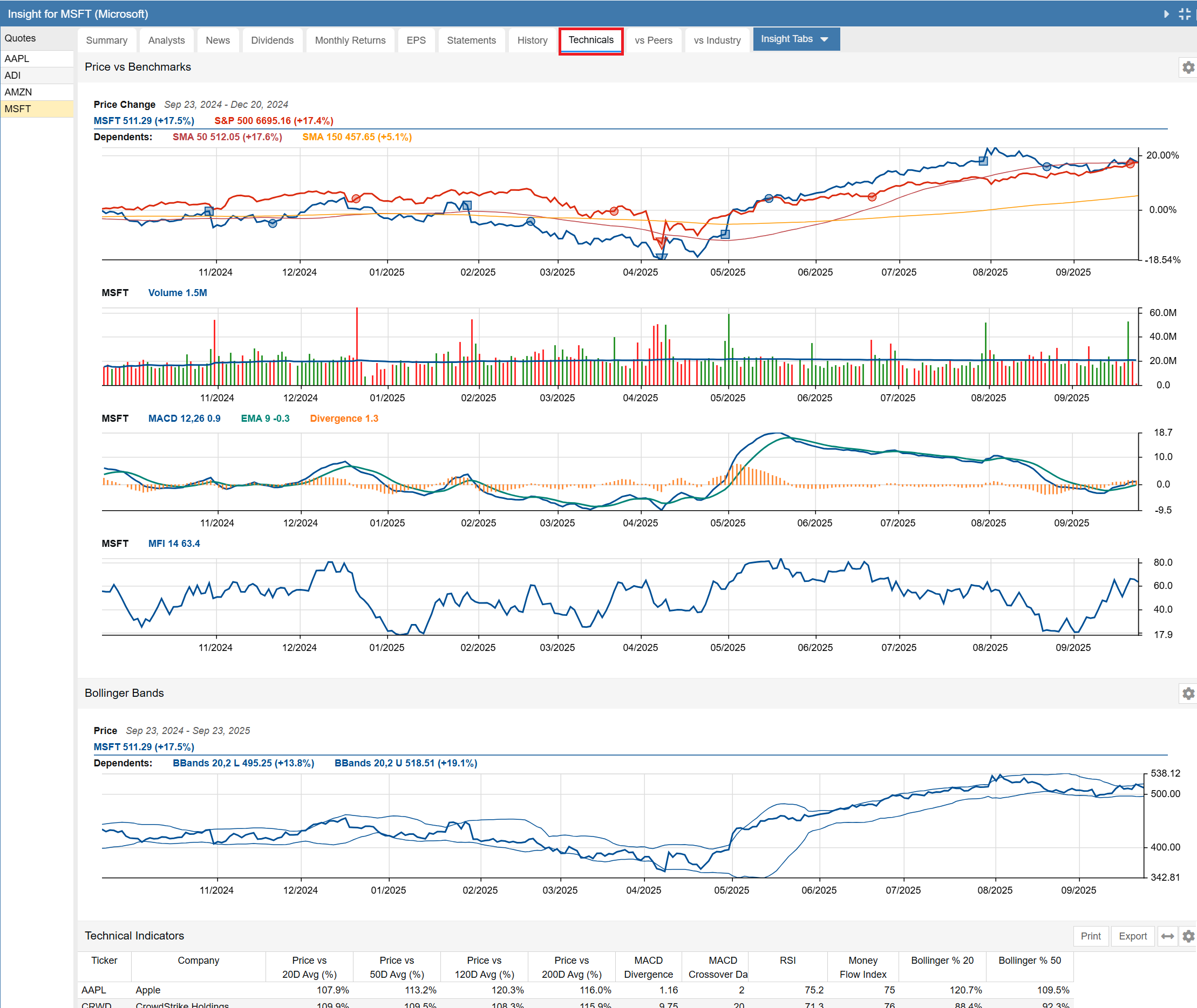
Technicals
This is the technical tab, showing key technicals for a stock’s price performance. The last component (partially shown) is a table showing the company’s technical indicators vs. a number of peers.
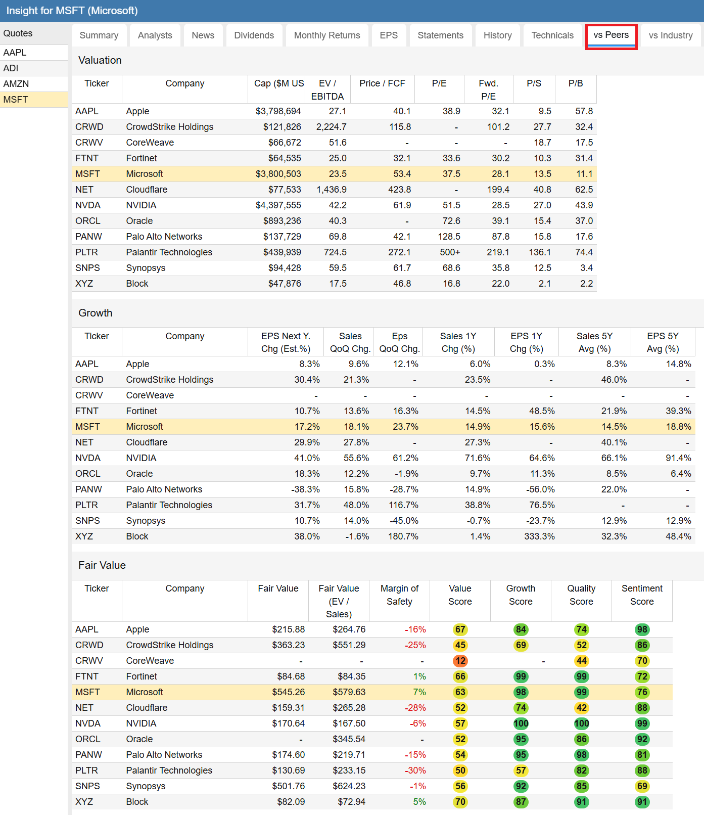
vs Peers
The vs Peers tab shows a company vs. a number of its peers, across a number of interesting metrics such as valuation, growth, fair value, returns and price strength and drawdown risk.
vs Industry
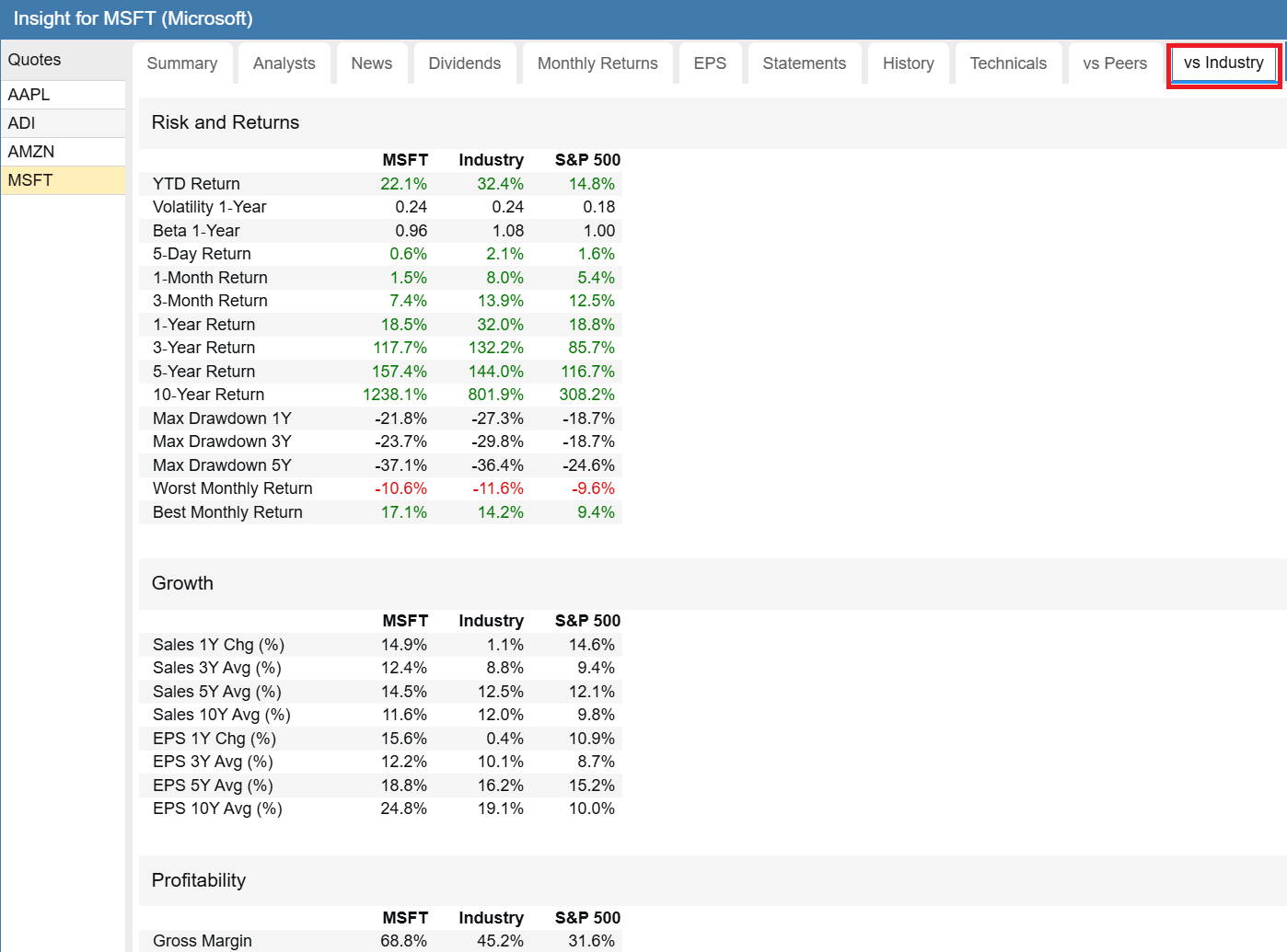
The vs Industry tab shows a company vs. its industry across a number of interesting metrics such as risk and return, growth, profitability and dividends.
Roll Your Own
With the Insight Panel you can easily create your own custom tabs [56]. You can include any tables and charts you want to see and display them in whatever order you would like. The journey begins with the Insight Tabs option.
Conclusion
Ok, we have done the first part of the analysis of Microsoft. We used some, but not all of the features of the Insight Panel. We can see that businesswise, Microsoft’s performance is impressive. But how does it stack up with its peers? In the next segment [28] of this series, we will dive into Stock Rover’s Table and Ratings and try to answer that question.
Frequently Asked Questions
What information is available in the Stock Rover Insight Panel?
The Insight Panel is a comprehensive research hub that provides Summary data, Analyst ratings, Dividends, Monthly Returns, EPS history, Financial Statements, Technicals, and comparisons against Peers and Industry.
What are Stock Rover Warnings?
The Warnings facility analyzes 29 distinct issues of potential concern, such as high goodwill or declining cash flow. It flags these risks with severity levels (Red, Orange, Yellow) to help investors identify potential red flags quickly.
How can I customize the Insight Panel?
You can create your own custom tabs within the Insight Panel. This allows you to select specific tables, charts, and data points you want to see and organize them in your preferred order for a personalized research workflow.


11 Comments To "How to Research a Stock in Stock Rover Part I – Deep Dive"
#1 Comment By Rose On June 5, 2022 @ 6:02 pm
Thank you for this great tutorial! Lots of info here that I was not aware of. Really helps in sizing up a company
#2 Comment By abhishek khatri On June 6, 2022 @ 12:10 am
Thanks for the amazing explanation on every section of the insights panel. I look forward to the next two parts and more of such posts in future.
#3 Comment By Jacques Hennequet On June 11, 2022 @ 4:29 pm
Excellent, tutorial, thank you. I realized how much I underused the Visual Tabs within Insight.
#4 Comment By Kos Mich On June 12, 2022 @ 9:58 am
Congratulations!!!! Excellent tutorial. I would be obliged if you did more so that we discover the little “secrets” of StockRover.
Thanks one more time!!!!
#5 Comment By Walter On August 29, 2022 @ 8:44 pm
Excellent tutorial; looking to dive into part 2 and 3 after dinner.
#6 Comment By Dave R On December 20, 2022 @ 8:33 pm
Great summary. I am new to the platform and this is very helpful!
#7 Comment By john On February 3, 2025 @ 6:44 pm
There are no effective youtubes or docs on how to use Stock Rover to chart our own stocks. I thought this was the purpose of the whole program?
Could you do a YouTube on this? There are only videos on how a Rover Programmer, programmed it.
#8 Comment By Ken Leoni On February 4, 2025 @ 8:18 am
Hello John,
Here are 2 videos, which you’ll find quite helpful
1. Charting Overview – provides a comprehensive tour of Stock Rover’s Charting Facility. You’ll find the sections on Settings at 1:40 and Benchmarks at 4:25 to be especially helpful
[58]
2. Advanced Charting – covers broad set of capabilities, including technical charting, fundamental charting and event annotations – [59]
#9 Comment By Kevin W On October 5, 2025 @ 11:46 am
Superb. I haven’t spent much time in Stock Rover so this was VERY useful.
#10 Comment By Trent Arterberry On January 31, 2026 @ 12:20 pm
As a newbie to the program, this is just what I needed. Thank you!
#11 Comment By Ken Leoni On February 2, 2026 @ 2:44 pm
Hi Trent,
You’re welcome! We’re happy to help. We are always trying to deliver content that’s clear, informative, and useful.
Also, here are some great resources:
1. Quick Start Guide — this is designed to be followed in order:
[60]
2. How-To Library — once you have the basics down, this lets you focus on exactly what you want to do (screening, valuation, portfolio analysis, etc.):
[61]
3. Online Help & Videos – these are best used as reference tools when you want to go deeper into a specific feature:
[62]
Regards,
Ken