Contents
- Introduction [1]
- Out-of-the-Box Tabs [2]
- Earnings Per Share [3]
- Dividends [4]
- Monthly Returns [5]
- History [6]
- Technicals [7]
- vs Peers [8]
- vs Industry [9]
- Summary [10]
Introduction
We have added a powerful new capability to Stock Rover called Visuals. This blog post covers the out-of-the-box capabilities of Visuals. The second blog post [11] in the series covers how to customize Visuals.
The Visuals feature is available for all subscription plans, including free.
So what in the heck is Visuals?
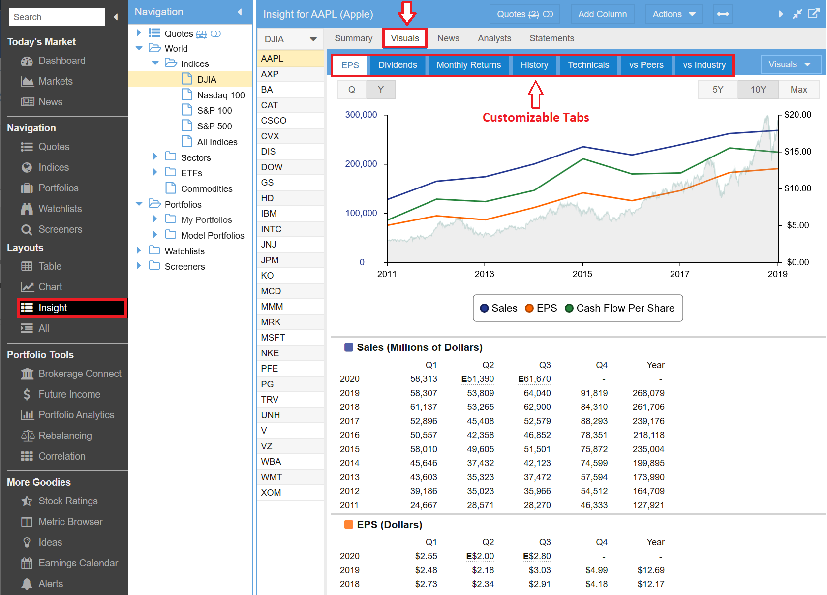
Visuals is a fully user customizable display that is part of the Insight Panel. And as they say, one picture is worth a thousand words. Below is an example of the new Visuals tab within Stock Rover’s Insight Panel.
Out-of-the-box Stock Rover ships with seven different tabs or sections under the Visuals tab of the Insight Panel. Each tab shows different information for the selected ticker. For the purposes of this blog we are using Apple (AAPL) as our example ticker. The seven tabs in order are: EPS, Dividends, Monthly Returns, History, Technicals, vs Peers and vs Industry.
The first three tabs, EPS, Dividends and Monthly Returns, are factory defined, meaning their content cannot be changed. However you can change the order in which they appear in the Visual tab list or you can hide the tab altogether.
The next four tabs, History, Technicals, vs Peers and vs Industry, are completely user definable. That are examples of what can be done with Visuals customization. They are also a nice starter set, showing off the capabilities of Visuals, while providing very useful information.
Your Stock Rover account will have these seven tabs loaded by default. However, you can change Visuals to make it exactly what you want. Any tab can be moved in the order or hidden. The last four tabs can be altered, renamed or deleted as well. You can also create new Visual tabs that are customized for your needs.
Each tab contains a series of tables and charts that are stacked vertically. You can up to twelve separate tabs. Each tab can have up to six tables and charts and they can be ordered in any sequence you like. Tables come in three varieties: History, Peer Comparison and Market Comparison. Charts also come in three varieties: Price, One Fundamental and Multiple Fundamentals. The screenshots that follow will illustrate the different types of tables and charts available.
On the banner of every user configurable table or chart on the right side is a gear that allows you to edit the table or chart as you see fit. Additionally for tables, to the left of the gear, there is a double arrow that will auto-size the columns to the width of your display when you click it.
So what I would like to do now is briefly walk you through the seven out of the box Visuals tabs that Stock Rover provides as a starter set.
Out-of-the-Box Tabs
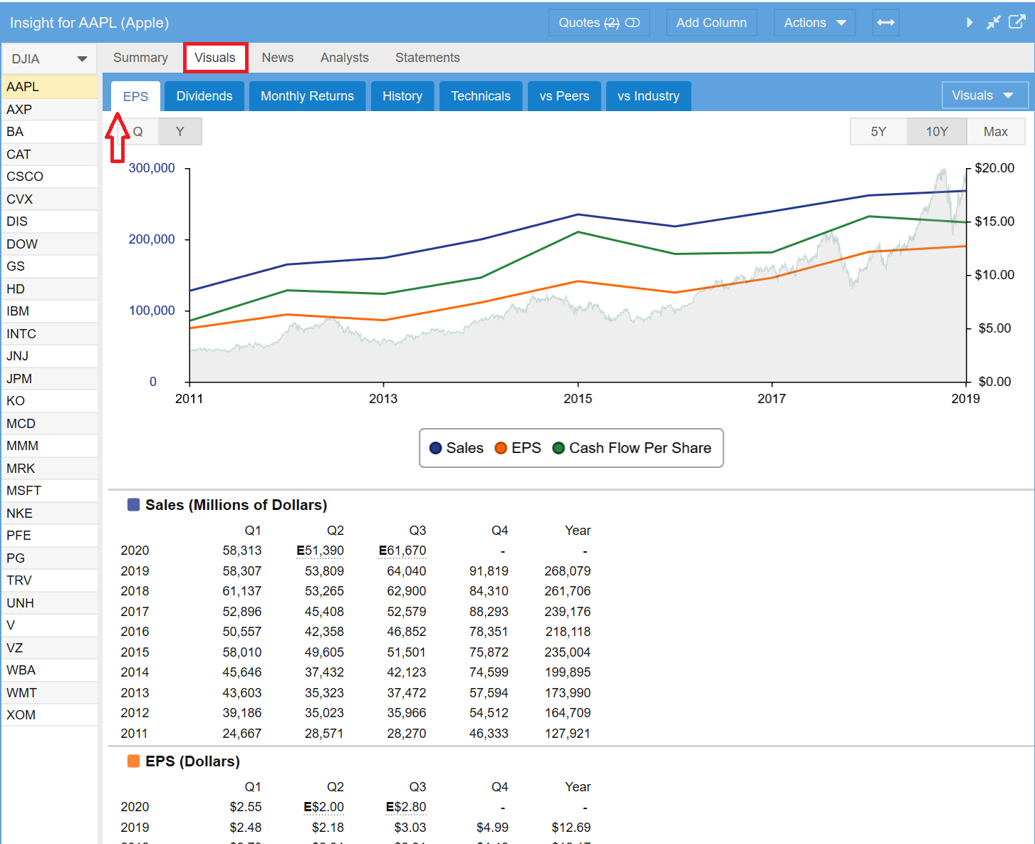
The Earnings Per Share or EPS tab displays Sales, EPS and Cash Flow Per Share data for the selected ticker. The data is presented in both chart and tabular form. The underlying stock price is shown on the chart so you can see how well the stock’s price change tracks against sales, EPS and cash flow changes over time.
You can change whether the chart shows quarterly or yearly periods and the time frame to consider (5 years, 10 years or Max). You can also eliminate or or add back any line in the graph by clicking on its legend.
Dividends
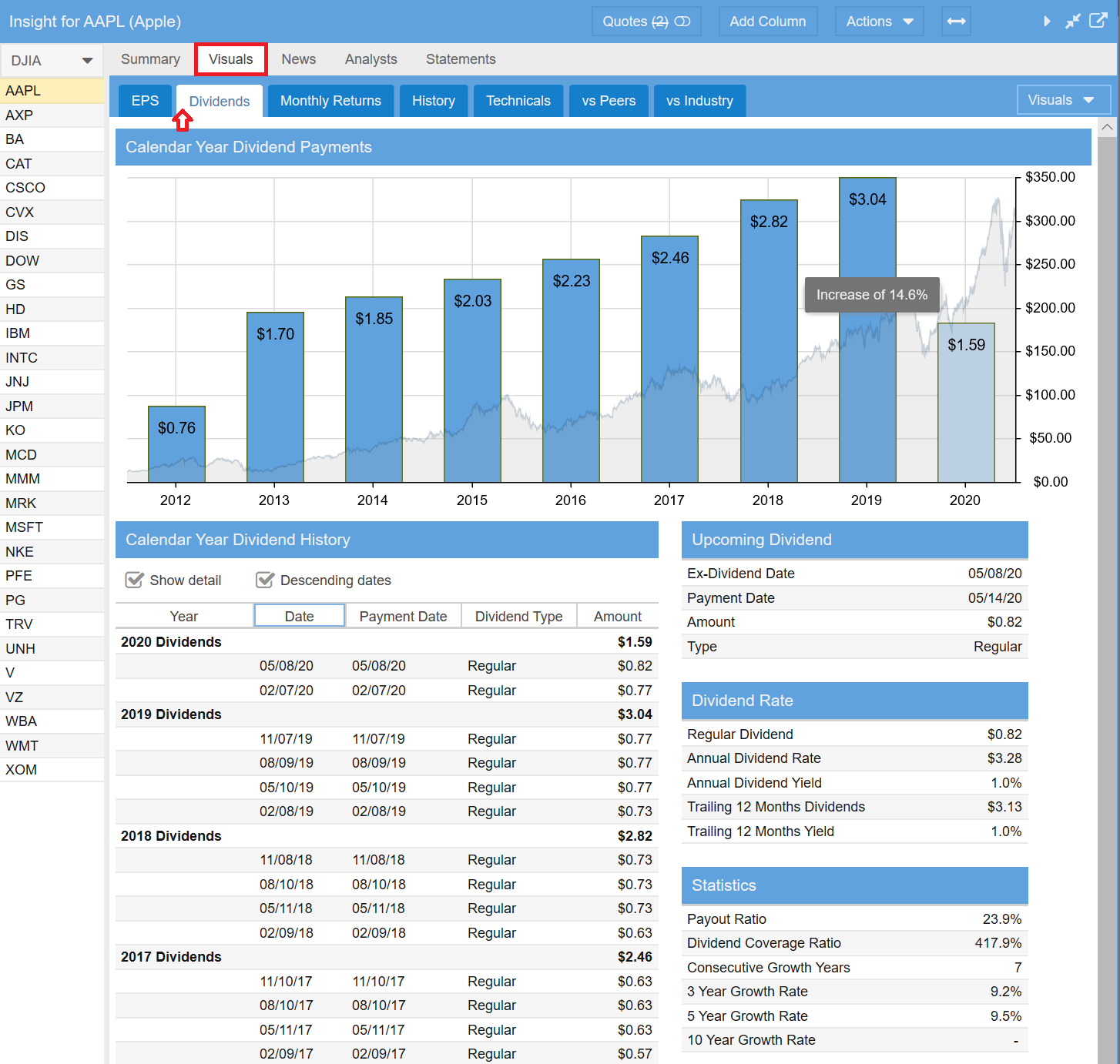
The Dividends tab allows you to see the dividend history of a stock, ETF or fund, along with additional data pertinent to dividends.
The dividend chart shows the total dividends for each year. The gray background displays the pricing history of the ticker. Note if there is a light blue bar for the last year, this means this is not a complete year.
Below the chart is a table that displays the actual dividend payments, grouped by year. You can control whether to see the actual payments or just the yearly dividend summary. You can also sort the table in either ascending or descending order by date. Both options are controlled by the check boxes above the table.
The lower right side of the Dividends tab displays information regarding the upcoming dividend, dividend rate and yield information, and additional statistics on payout ratio, coverage and dividend growth.
Monthly Returns
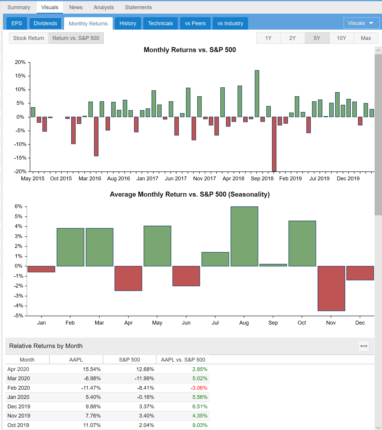
The third tab is Monthly Returns. This is a new section designed to show you the seasonality of a stock, ETF or fund. This section makes it easy to see if there is a historic pattern during different times of the year when an investment performs well or poorly.
You can control the time frame to view from 1 year to over 10 years. You can also control whether the monthly returns displayed are absolute or relative to the S&P 500 benchmark.
There are two charts, the first showing the monthly returns in chronological order, and the second showing the average return per month across the years.
Below the two charts is a table showing the monthly return data in tabular form.
History
The first three tabs shown above have a fixed display format. You can however can change the tab order position and you can even hide the tab if you don’t want to see it.
The next four tabs are completely user configurable. You can alter the content and format, rename or delete them and create your own tabs. The mechanics for doing this will be described in part 2 of this blog series.
Stock Rover gives you a running start with the Visuals feature by pre-configuring the tabs in a way that we think many investors will find useful. The first of these four user configurable tabs is History.
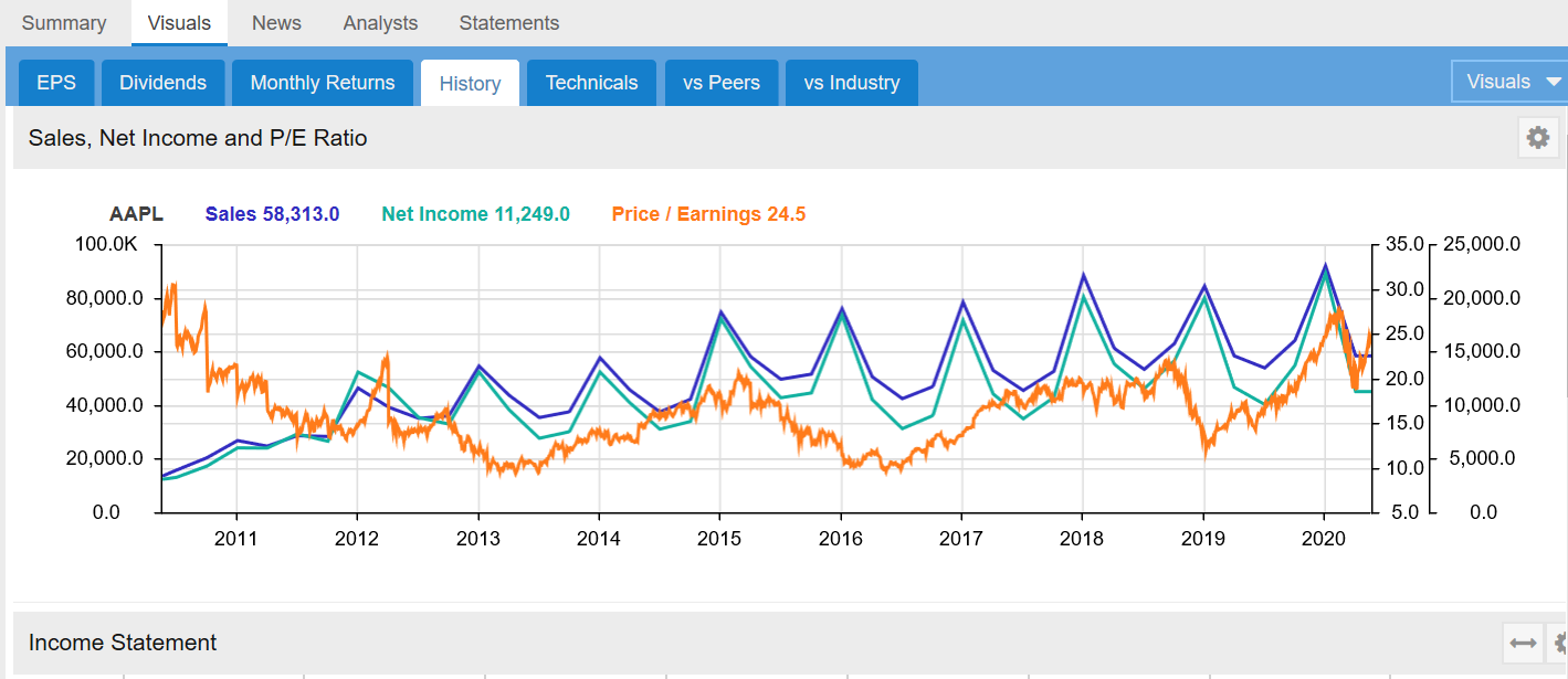
History is designed to give you a succinct look into the historical performance of a company along many key metrics. The section starts with a chart that graphically shows the Sales, Net Income and Price to Earnings ratio over time. This allows you to correlate the financial performance of the company over time with how the market is valuing it.
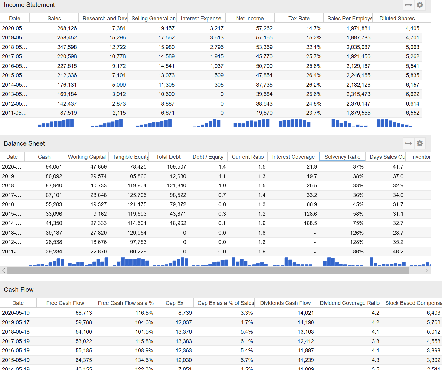
The next three tables show key metrics from the Income Statement, Balance Sheet and Cash Flow Statement over time.
The final table shows key profitability metrics and how they are changing over time.
Technicals
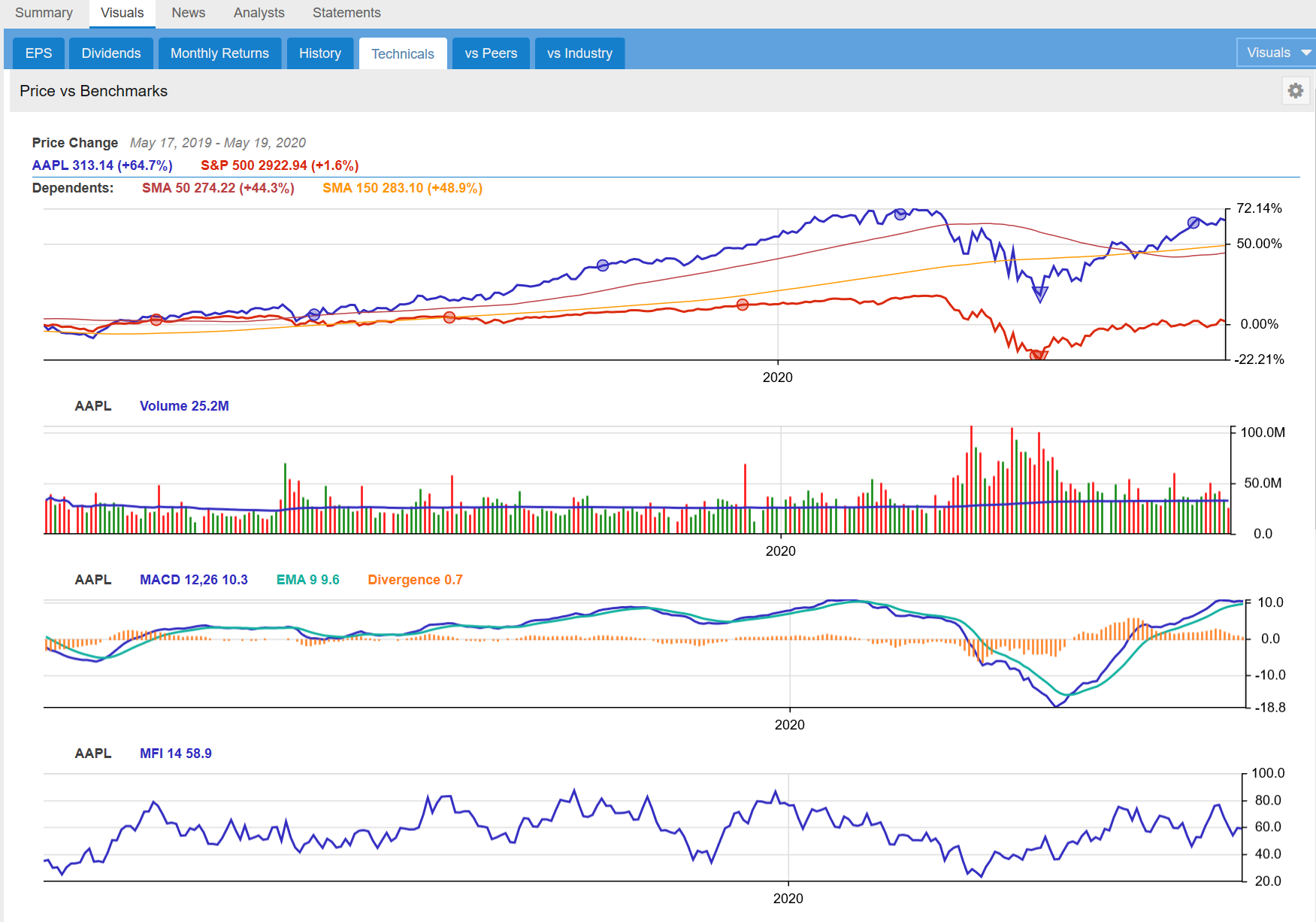
The Technicals tab contains five charts followed by a table of technical indicators for the selected stock as well as some of its key peers for comparison purposes.
The first chart is a price chart showing the stock’s performance over time along with its moving averages and the S&P 500 for comparison purposes. The chart also includes dividend payment information and a maximum drawdown event triangle, which shows you the period of worst performance for the stock in the period. Hovering over the triangle with your mouse will show the maximum drawdown percentage.
The next three charts show the Volume over Time, the Moving Average Convergence Divergence (MACD) lines and the MFI or Money Flow Index.
Bollinger Bands is the final chart, showing the price along with a set of price envelope bands constructed from the 20 day moving average with a width of two standard deviations of price movement.
The Technical Indicators table is the last part of the Technicals tab. It shows key technicals in tabular form for the selected stock and its key peers, so you can compare the technical strength of a stock vs. its brethren.
vs Peers
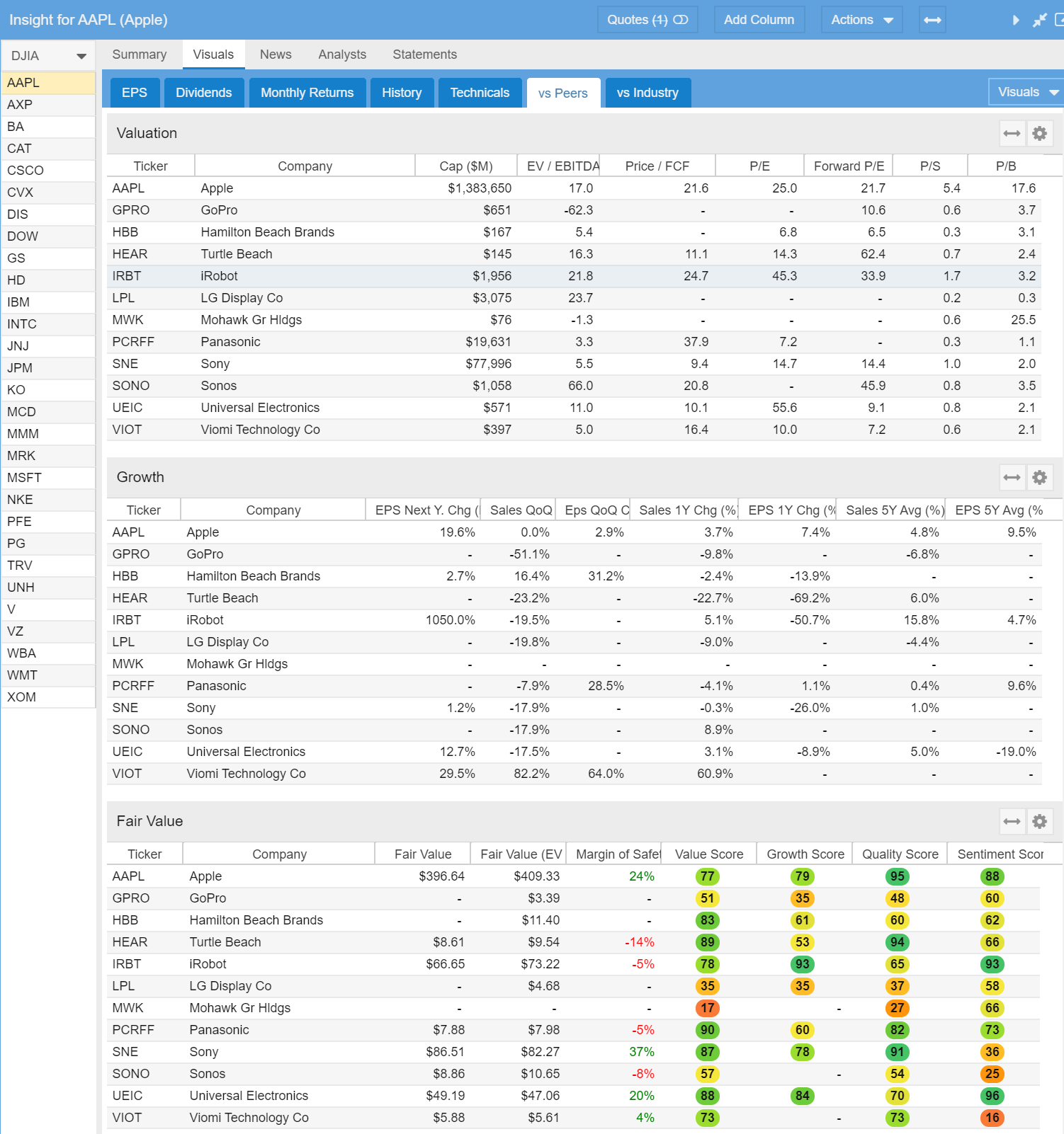
The vs Peers tab contains extensive information about a stock vs. its closest peers. There are five separate tables and a chart. The first three tables show the stock compared to its peers along key metrics in the categories of Valuation, Growth and Fair Value as shown in the screenshot below.
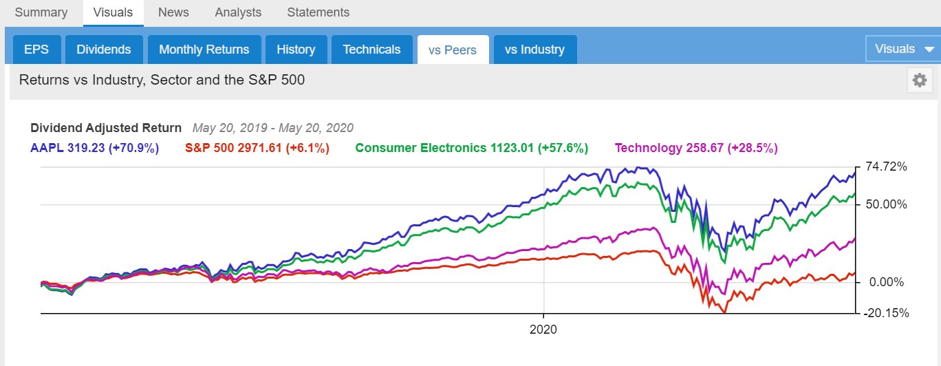
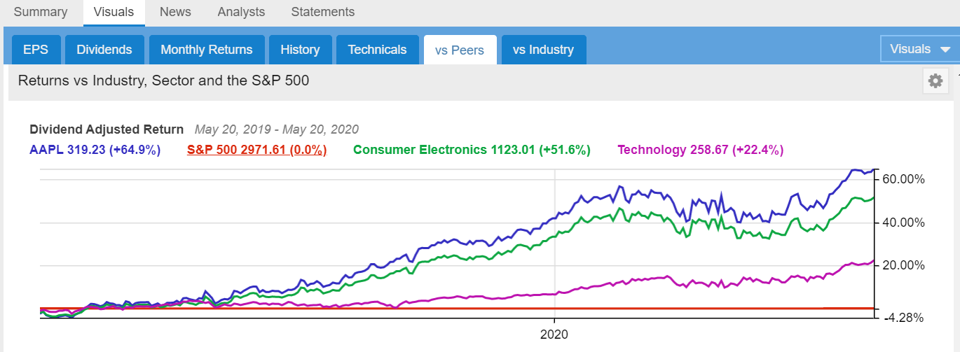
Then a chart follows that shows the performance of the stock vs. its Industry, Sector and the S&P 500. Note that by clicking on any of the legend labels, the corresponding chart line can be flattened so you can see performance relative to a baseline. Clicking the label again will remove the baseline.
For example, the two charts below show Apple, the Consumer Electronics Industry, the Technology Sector and the S&P 500 below for a one year period. The second chart has the same data as the first, but the chart lines are drawn relative to the S&P 500, which is set as a baseline
The chart below has the same data as the chart above, but with the S&P 500 baselined.
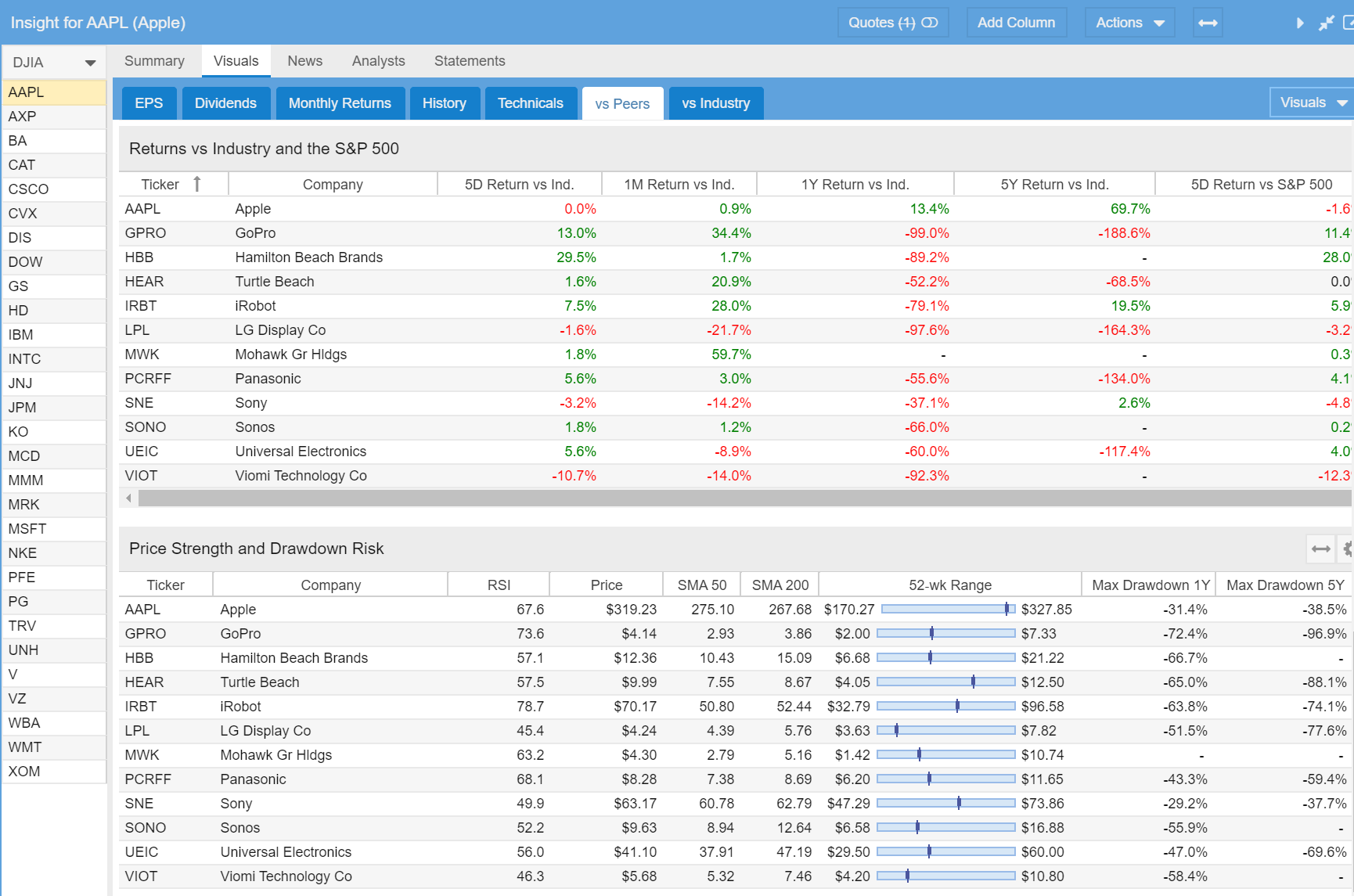
The second to last table shows the returns of the stock compared to its industry and the S&P 500 over the last 5 days, 1 month, 1 year and 5 year periods. The last table shows key metrics for Price Strength and Drawdown Risk.
vs Industry
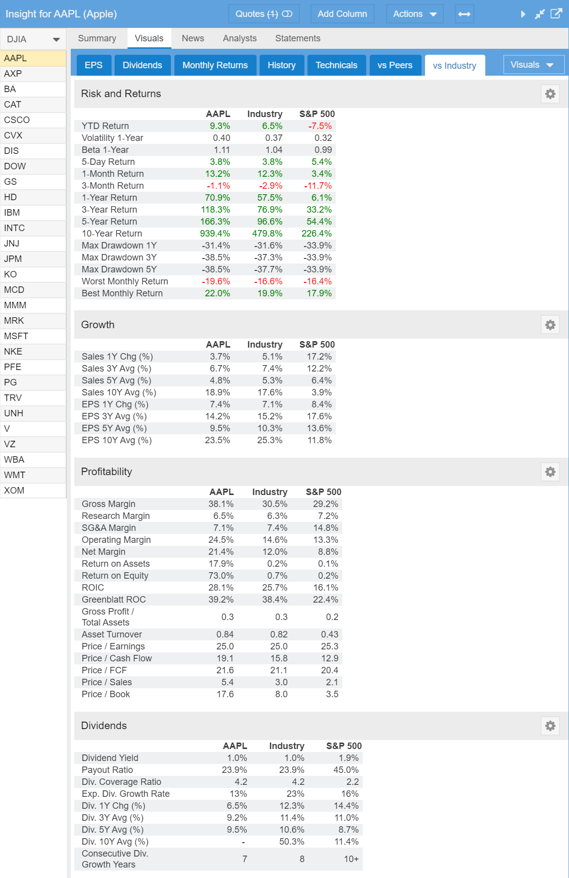
The final tab in Visuals shows key information about the stock vs. its industry and vs. the S&P 500 in tabular form. There are four sections that cover Risk and Returns, Growth, Profitability and Dividends.
Summary
The new Visuals feature in Stock Rover provides an enormous amount of power and flexibility in a very easy to digest form.
The really great thing about Visuals is the ability to customize your display to match the data you want to see in the format you want to see it in. Customization is easy to do and we will cover the details in our next blog post. But here is an early hint; Select the Visuals Drop down button on the right side of the Visuals Tab Bar as shown below.
Be sure to check out part 2 [11] of this blog post series. And as you explore Visuals, please let us know [28] what you think.




Comments Disabled To "Introducing Visuals"
#1 Comment By AndreH On May 30, 2020 @ 1:28 pm
Excellent addition. Very informative and intuitive. Thank you!
#2 Comment By Pedro G On May 30, 2020 @ 2:02 pm
no video? thanks!
#3 Comment By Howard Reisman On June 8, 2020 @ 7:19 am
Its on the list to update our videos for Visuals.
#4 Comment By David Bach On May 30, 2020 @ 4:16 pm
Great addition to a powerful and very ‘user friendly’ tool. Thank you!
#5 Comment By BILL SUTHERLAND On May 31, 2020 @ 12:57 am
Too much value. Shouldn’t be free.
#6 Comment By Aaron K. On May 31, 2020 @ 8:48 am
An amazing set of tools. Thank you for creating and sharing these valuable new tools with subscribers like myself. One quick idea: maybe have a button that lets users turn the data viz/charts into either Excel or Google (spread) Sheets?
#7 Comment By Howard Reisman On June 8, 2020 @ 7:21 am
Thank you for your suggestion . We will consider this in a future release of Visuals
#8 Comment By Andy V. On June 6, 2020 @ 6:44 pm
I would really like to to see visuals for portfolio diversification across sectors, a pie charts or something.
And how about a simple pie chart of all holdings? It could be done with the cost basis, current market value, size of unrealized/ realized returns, etc.?
#9 Comment By Howard Reisman On June 8, 2020 @ 7:18 am
Thank you for your feedback. We will consider this when we enhance Visuals.