In this post we will cover some recent changes and additions to Stock Rover V8. Included are refinements for easier and more efficient navigation, enhancements to the Dashboard, new capabilities in the management and tracking of Portfolios, and updates to the Screener Manager and Alerts facility.
You’ll get these changes automatically when you log into Stock Rover.
Contents
- Start Menu Changes [1]
- Research [2]
- My Collections [3]
- More Tools [4]
- Help [5]
- Dashboard [6]
- Portfolios [10]
- Correcting Misidentified Symbols [11]
- Trade Planning and Rebalancing [12]
- Export [13]
- Positions [14]
- Transactions [15]
- Portfolio Tools [16]
- Screeners [24]
- Alerts [27]
- New Alerts [28]
- Summary [29]
Start Menu Changes
We have changed the grey Start Menu bar. It is more logically arranged and easier to use. Specifically, we have done some regrouping and relabeling of the menu items and the section headings.
The screenshot below shows the new Start menu bar. The paragraphs following the screenshot describe the changes relative to the old menu.
Research
The first change is that the most common research functions are grouped under the heading Research.
Research is where investment investigation and analysis is conducted for tickers that are selected from the associated Screeners, Portfolios, Watchlists, or the Quotes list. In Research you are typically performing research on specific tickers or performing a comparative analysis between tickers.
Table – provides a flexible spreadsheet-like paradigm for comparing tickers and their data.
Chart – chart price, chart over 100 fundamentals, chart key technical indicators, valuation, and much more.
Insight – contains multiple tools for researching stocks in depth.
Stock Ratings – perform a detailed analysis of a company’s performance across multiple dimensions of performance vs. its industry group peers.
My Collections
Formerly called Management, this section is where functions specific to Screeners, Portfolios, and Watchlists are performed. This generally means creation, updating or deletion operations.
For example the Screener menu item would be used to alter a screener’s filtering criteria. Other examples of management would be updating a Portfolio’s holdings, or creating a Watchlist.
In addition, there is a new menu item called Portfolio Tools. When Portfolio Tools is selected, the Start Menu expands to expose quick access to an additional toolset that is unique to portfolios. Each of the tools is briefly described below.
Analytics – enhanced in Stock Rover V8 – analyze the overall performance of your portfolio as well as the performance of the individual holdings.
Brokerage Connection – connect to your brokerage firm(s) via Yodlee, a trusted cloud-based account aggregator.
Correlation – shows the correlation between all the individual holdings.
Future Income – enhanced in Stock Rover V8 – project your future dividend income on a monthly, quarterly and yearly basis.
Future Simulations – new to Stock Rover V8 – tests long-term expected portfolio growth under a variety of possible scenarios based on Monte Carlo simulation.
Rebalancing – enhanced in Stock Rover V8 – rebalance your portfolio as well as perform explicit trade planning.
More Tools
The section combined the two sections More Goodies and Resources together.
Alerts – receive a text or email alert when something happens in the market of interest to you.
Earnings Calendar – see when companies will report their earnings.
Ideas – tips and tools we think will be helpful for our customers.
Library – a repository of a variety of different investment research resources that can be imported into your Stock Rover account
Metric Browser – a fast and easy way to see all of the metrics available in Stock Rover.
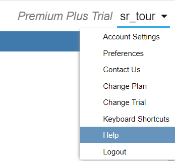
Help
The Help has been moved to the pull-down under your Stock Rover username.
Dashboard
The big change to the Dashboard is that it now includes a new Holdings Map, which is described below.
In addition, Premium and Premium Plus users can now access Portfolio Analytics and the Future Income tool directly from inside the Dashboard.
Holdings Map
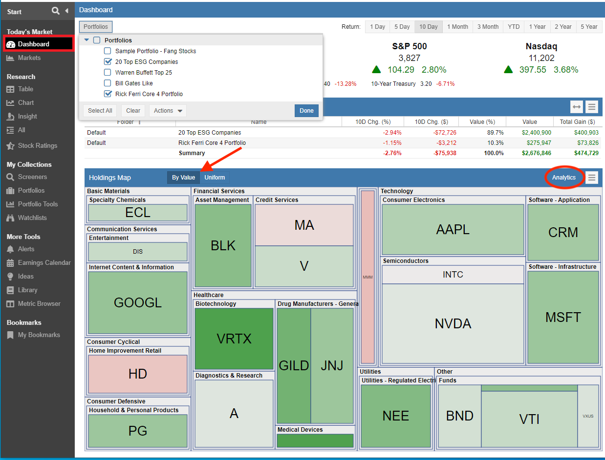
The new Holding Map in the Dashboard displays a value-based heat map for the selected Portfolios.
The heat map shows Portfolio tickers grouped by sector. By default, the tiles are sized based on value and will show as green when the value has increased or red when the value has decreased over the selected time period.
Users can also select the tiles to be sized uniformly within each sector by selecting “Uniform”.
As highlighted in the screenshot above, Premium and Premium Plus users can access the Portfolio Analytics tool directly from the Dashboard Holding’s Map by clicking on “Analytics” in the Holdings Map header bar.
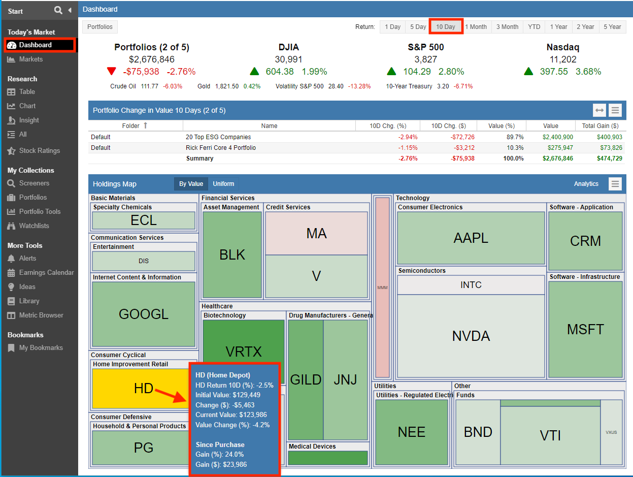
When you mouse over a tile, the tooltip will display value detail for the holding.
In the example below, the Dashboard is showing the change in Portfolio value over a 10-day period of time, the Home Depot tile showed red and we’ve moused over for more detail.
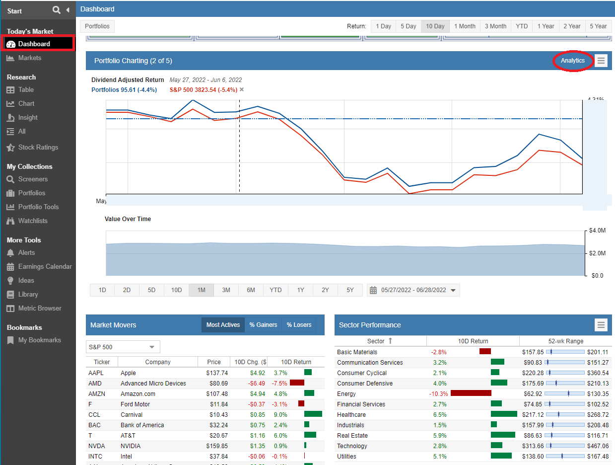
Portfolio Charting
Premium and Premium Plus users can now access Portfolio Analytics directly from the Dashboard by clicking on “Analytics”.
Future Projected Income
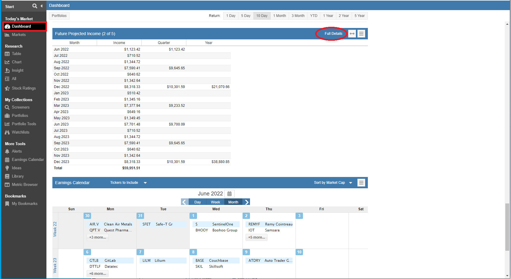
Premium and Premium Plus users can now directly access the Future Projected Income tool from the Dashboard by clicking on “Full Details”.
The Future Projected Income Tool projects your future dividend income on a monthly, quarterly and yearly basis for the portfolios you select. The expected dividend income is computed from the individual stocks, ETFs, and mutual funds you own. You can view the income at the Summary, Portfolio, and Holdings level.
Portfolios
We’ve made it easier to update misidentified symbols in linked Portfolios. In addition, Trade Planning and Rebalancing now supports the saving of Model Portfolios. There is also new export option that allows you to export portfolio positions and transactions as a .CSV file.
Correcting Misidentified Symbols
Stock Rover can optionally connect to your brokerage firm(s) via Yodlee [39], a trusted cloud-based account aggregator. When you connect your Stock Rover account to your brokerage accounts, details for each portfolio are delivered to Stock Rover and regularly updated.
In the event that Yodlee makes an error and classifies a known ticker as an asset, or assigns the wrong ticker symbol you can now correct the misidentified symbol.
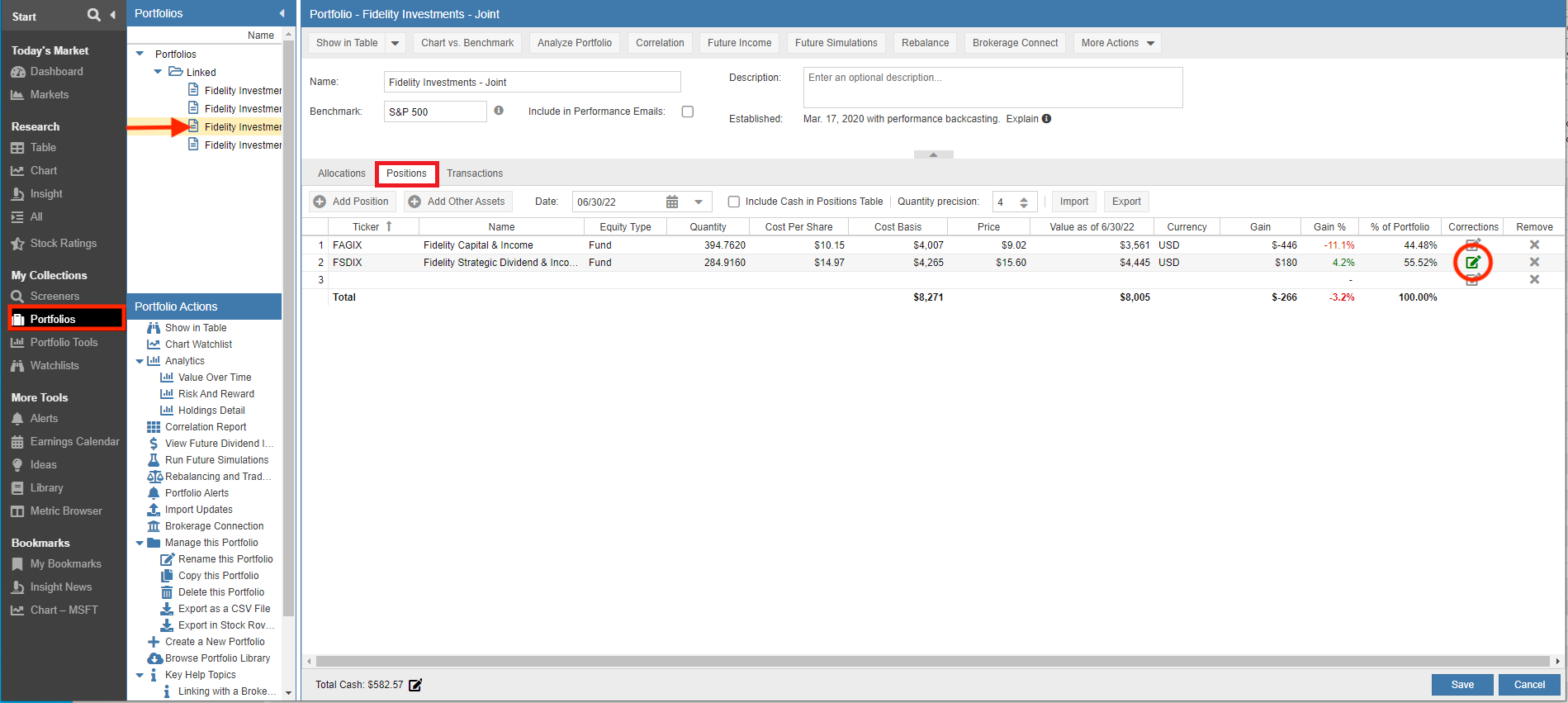
From Portfolio Manager select the Portfolio and then go to the Positions tab.
To make a change, highlight the misidentified ticker and scroll to the right to the new ‘Corrections’ column, then click the edit button.
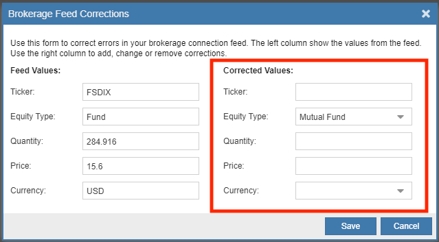
A popup will appear where you can then enter the corrections under “Corrected Values:”. Once the changes are saved, the correction(s) will take effect immediately and the Portfolio screen will then refresh with the corrected values.
Trade Planning and Rebalancing
Trade Planning and Rebalancing [42] allows you to test potential trades. Based on your planning decisions, an alternative version or model of your portfolio is created, You can then compare the planned or model portfolio against your actual portfolio across a number of key analytics such as historical return, maximum drawdown, risk-adjusted return vs. the S&P 500, correlation with the S&P 500, beta, volatility, and the Sharpe ratio.
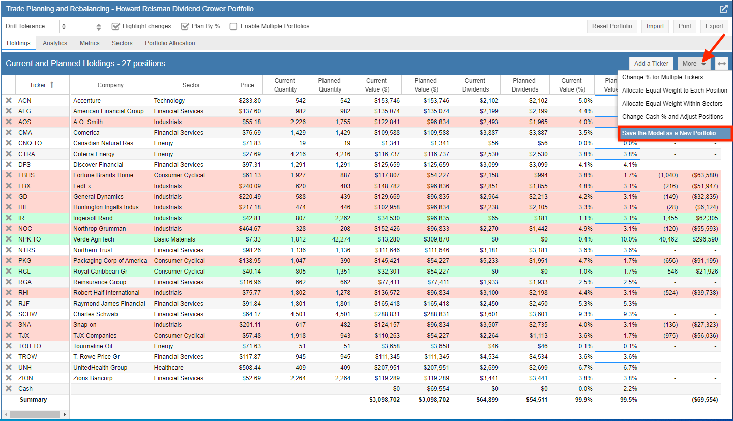
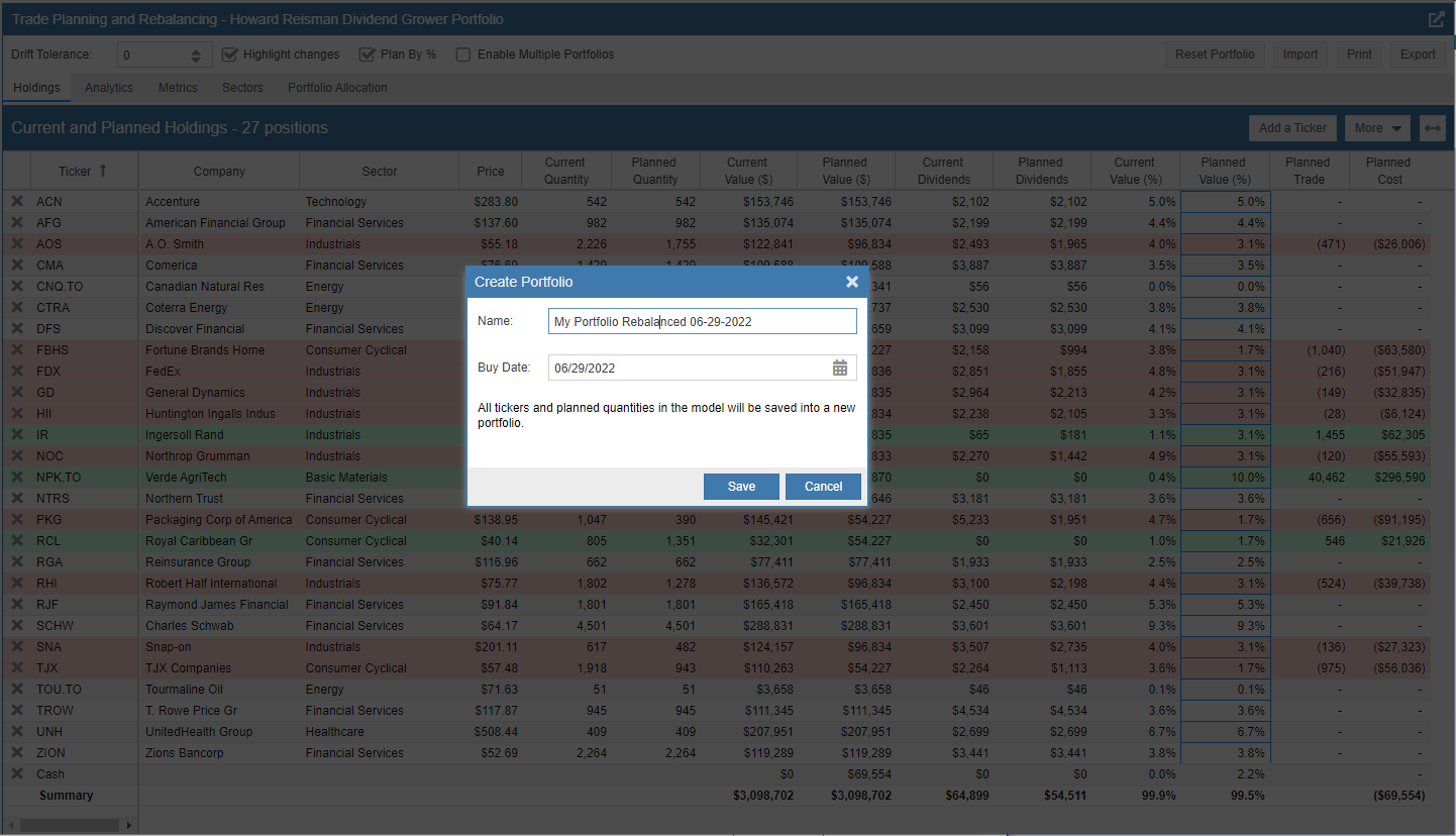
A new option has been added to Trade Planning and Rebalancing so that you can save the planned or model portfolio. Once saved, you can then reference the newly created portfolio just as any other portfolio – in both Portfolios and Portfolio Tools.
To save the model portfolio, complete your trade and rebalancing exercise, then select the “More” pull-down and click on “Save the Model as a New Portfolio”.
You can then name the newly created model portfolio and specify the buy date for the trades made as part of the planning exercise.
Export
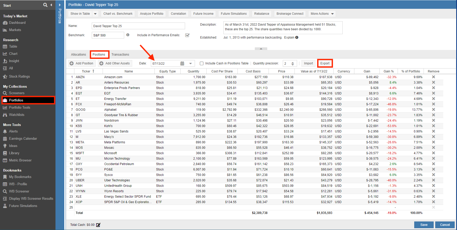
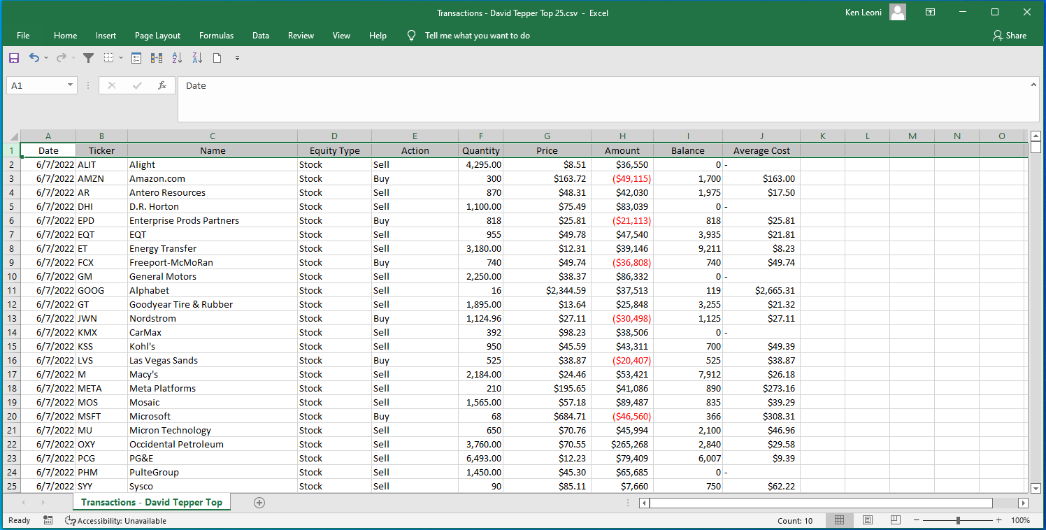
The “Export” option allows you to export a portfolio’s positions or transactions into a .CSV file. The export is based on what positions or transactions are currently loaded in the Portfolios Table.
Positions
Selecting the “Export” button will create a .CSV file that mirrors what is loaded in the Table. Below we selected the date pull-down and chose to display a portfolio’s positions as of July 13, 2022.
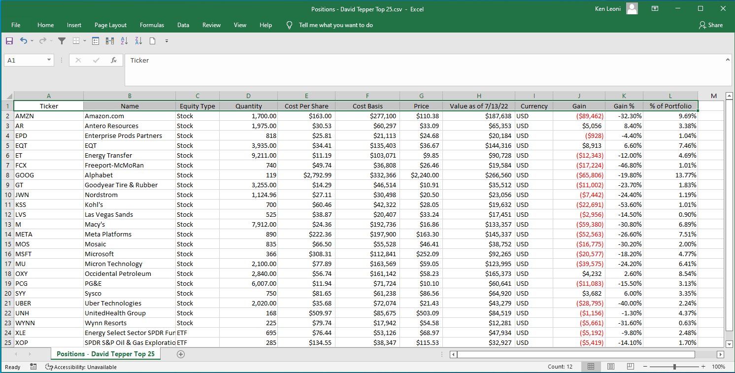
Here are the results from the export.
Transactions
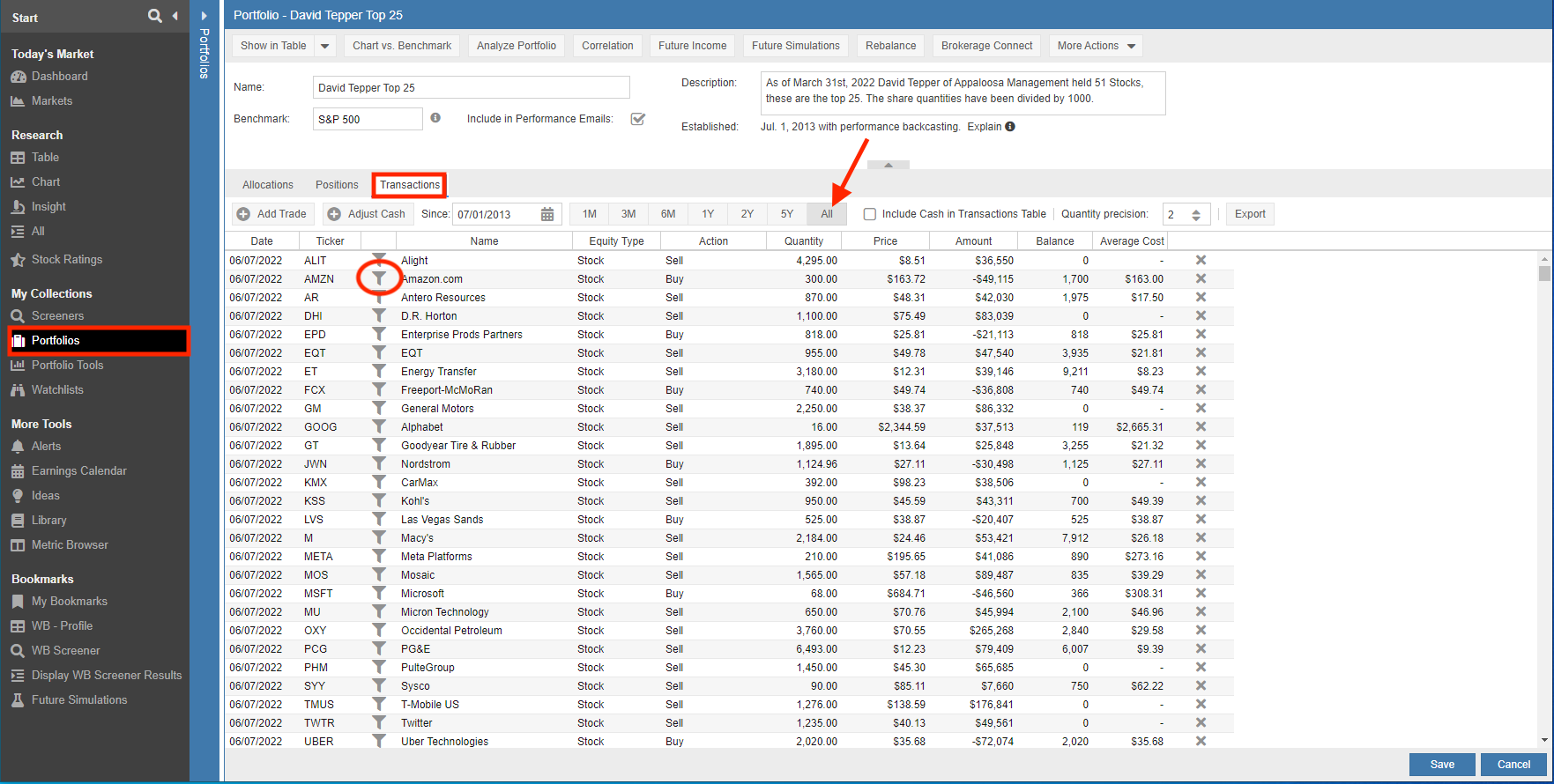
Selecting the “Export” button will create a .CSV file with the portfolio’s selected transactions. In the example below we selected “ALL” as we wanted to export portfolio transactions for all time periods. We could have selected to go back only 1-Month in which case our Table and the ensuing export would return the transactions generated over the last month.
You can optionally select the filter icon next to a ticker to load the Table with the transactions for the selected ticker only. Clicking on “Export” will then return only the transactions for that selected ticker.
Here are the results from the export.
Portfolio Tools
There are a number of enhancements and new capabilities that help with the management and tracking of Portfolios.
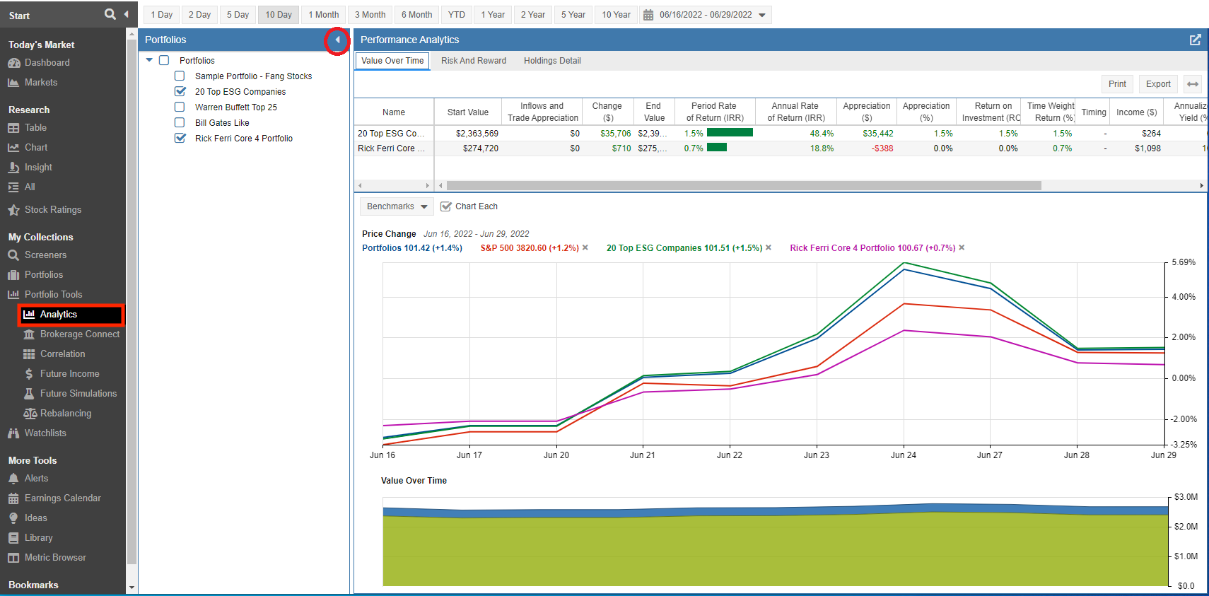
Simply click on the icon in the navigation pane to toggle between expanding and collapsing the Portfolio navigation pane. The example below shows the control while in Portfolio Analytics.
This feature is especially helpful when running Stock Rover on smaller screens.
Portfolio Analytics
The Portfolio Analytics tool has undergone several improvements. There are two new charts that show price change and value over time. There are also a few new metrics metrics, as well as a new configurable Holdings Map which displays holdings detail as a heat map.
Value Over Time Tab
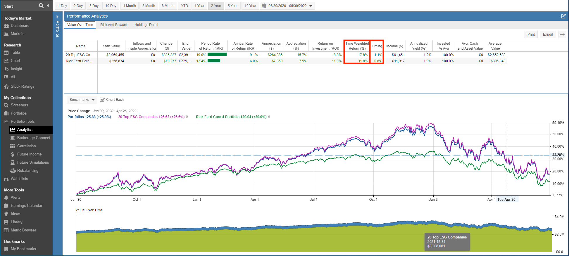
Two new columns have been added to the value over time table. The new columns are highlighted in the screenshot below.
- Time Weighted Return (%) – Time weighted return is shown by portfolio in the Chart. It is like a stock or fund return in that it is computed from the daily returns without adjusting for changes in total portfolio value over time from inflows and outflows.
- Timing – Shows how many percentage points your personal return was increased by having more funds invested on bullish periods than during bearish ones.
The Value Over Time Tab also gets two new charts.
Price Change Chart
The Price Change chart is located at the top of the charting pane and is calculated based on the weighted average performance of the portfolios’ holdings each day over the selected period of time. A sample chart is shown below.
The Benchmarks pull-down includes popular benchmarks and any benchmark used by a portfolio that you would like to include in the chart. Our example is charting the S&P500 along with the Portfolios.
Selecting “Chart Each” controls whether each portfolio is charted individually or whether they are all charted as a single portfolio. When charting all portfolios as a single portfolio the calculation is based on the weighted average performance of all the portfolios’ holdings each day.
Mousing over the chart will show the price change values next to the Portfolio labels located at the top of the chart. In our example, we moused over Tuesday April 26th and the values have been updated next to the Portfolio labels to reflect the price change from June 30, 2020 to April 26, 2022.
Value Over Time Chart
The Value Over Time chart, is the area chart located at the bottom of the charting pane and displays a stacked area graph where each colored area represents a specific portfolio and its value over time. The chart factors in inflows, outflows and the underlying change in the value of the investments themselves.
Mousing over a specific point in the graph will display the dollar value for the portfolio and day selected. Below we see we’ve selected to display the 20 Top ESG Companies’ portfolio value as of December 31, 2021.
Risk and Reward Tab
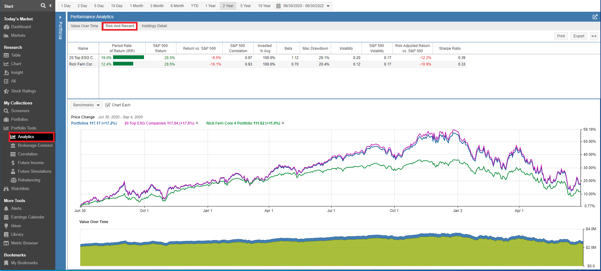
The Risk and Reward tab shows the amount of risk you took to achieve your return.
Risk and Reward now displays the Price Change and Value Over Time charts described in the previous section.
Holdings Detail Tab
The Holdings Detail tab shows the contribution of the different holdings of the portfolio to overall portfolio return. It will include any holdings you held during the period of reporting, not just the current holdings. There are several noteworthy changes. They are as follows.
The new “Include Closed Positions” selection allows you to control whether closed positions are included as part of the analytics.
New columns have been added to the holdings detail table. They are as follows.
- Unrealized Gain at Start – The difference between the holding value at the start of the reporting period and the cost basis.
- Unrealized Gain at End – The difference between the holding value at the end of the reporting period and the cost basis.
- Realized Gain – The dollar gain that was realized over the reporting period by selling shares for more than their original cost.
- Value Change(%) – The simple percentage change between the holding’s ending value and its starting value.
- Time Weighted Return (%) – Time weighted return is shown by portfolio in the Chart. It is like a stock or fund return in that it is computed from the daily returns without adjusting for changes in total portfolio value over time from inflows and outflows
- Timing – Shows how many percentage points your personal return was increased by having more funds invested on bullish periods than during bearish ones.
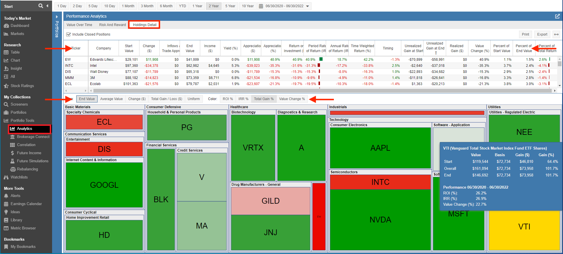
The Holdings Detail tab also sports a new Holdings Map that displays a heat map of the selected Portfolios.
The heat map displays the Portfolio tickers grouped by sector. By default, the tiles are sized based on the holding’s end value. The tile will show as green when the value has increased and red when the value has decreased over the selected the reporting period.
You can also tailor the heat map and configure the criteria for sizing and coloring the tiles.
Size:
- End Value (this is the default)
- Average Value
- Change($)
- Total Gain/loss($)
- Uniform – sizes the tiles uniformly
Color:
- ROI%
- IRR%
- Change($)
- Total Gain% (this is the default)
- Value Change%
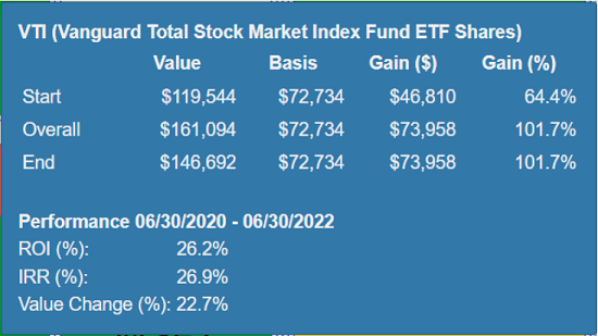
Mousing over the ticker displays additional detail.
Future Income
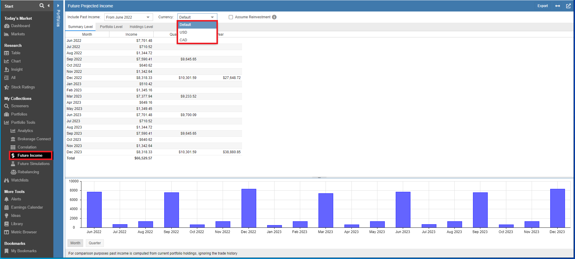
The Future Income tool has been enhanced to handle portfolios with mixed USD and CAD currency.
The Future Income Tool projects your future dividend income on a monthly, quarterly and yearly basis for the portfolios you select. The tool can show income at the Summary, Portfolio, and Holdings level.
The “Default” Currency setting will display the income using the currency of the stocks’ exchange. If you have a mix of USD and CAD stocks in the portfolio(s) then the Future Income will be displayed in mixed currency.
The currency setting allows you to view the income values in your Portfolio using the Base currency, USD, or CAD. Selecting USD displays all dividend income in USD, while CAD displays all dividend income in CAD.
Our blog post Currency Conversion in Stock Rover [56] shows how Stock Rover displays mixed currencies and demonstrates ways to effectively leverage the platform for multi-currency research and analytics.
Future Simulations
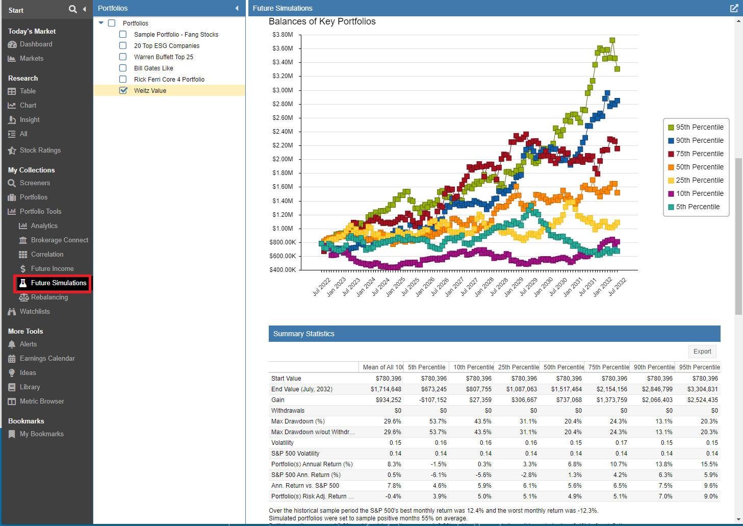
The new Future Simulations tool tests long-term expected portfolio growth under a variety of possible scenarios based on the Monte Carlo method. The Monte Carlo method uses random samplings of what has happened in the past in order to create future scenarios.
Our blog post Introducing Future Simulations [58] explains how to configure the tool and interpret the results.
Screeners
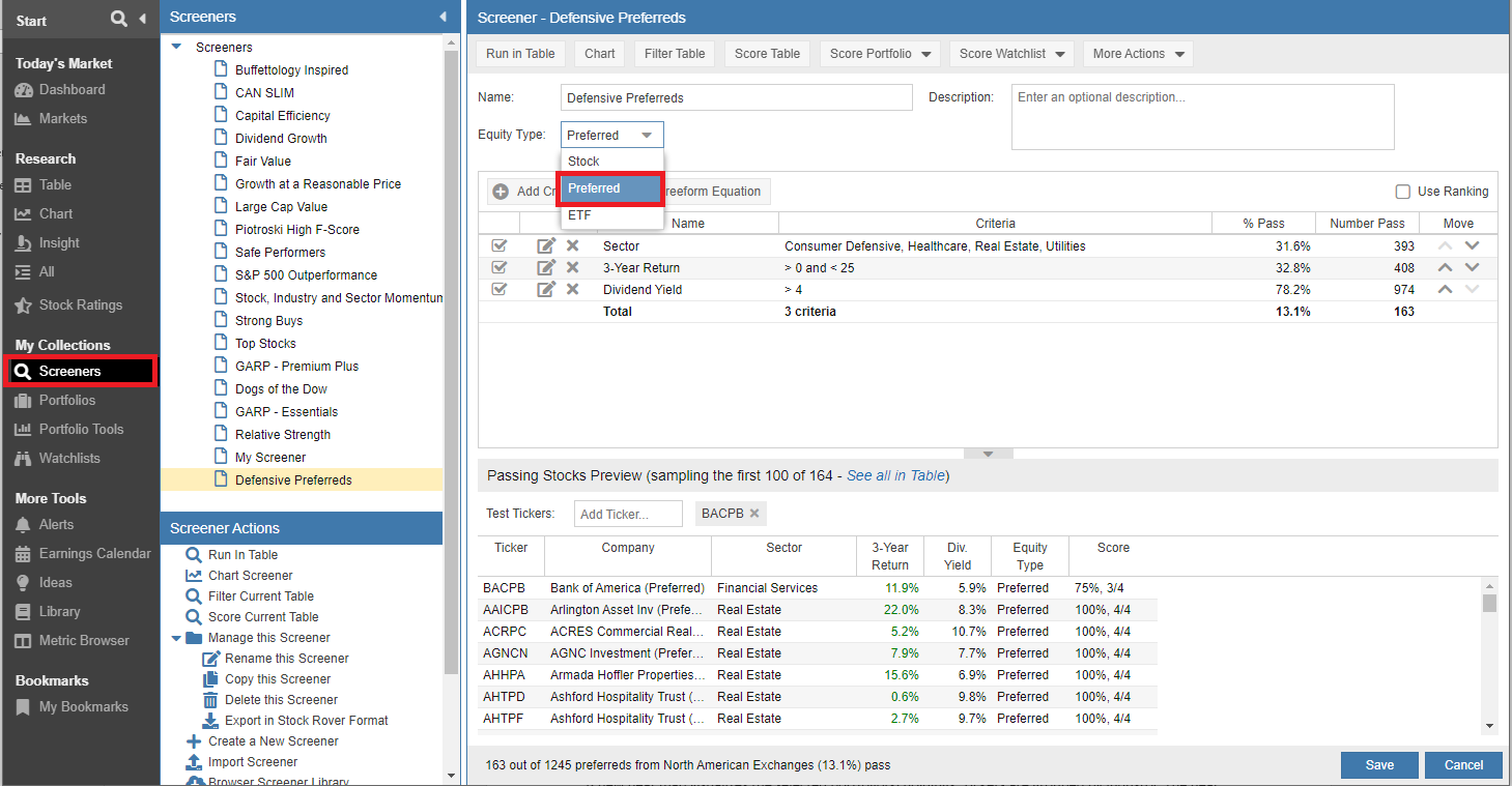
You can now narrow down the universe of Stocks to include just preferred stocks. In addition the Screener Manager now supports the reordering of filtering criteria.
Screening on Preferred Stocks
In addition to the universe of Stocks and ETFs, the Screener Manager now supports selecting “Preferred” to filter through the Universe of Preferred Stocks.
Changing filter criteria order
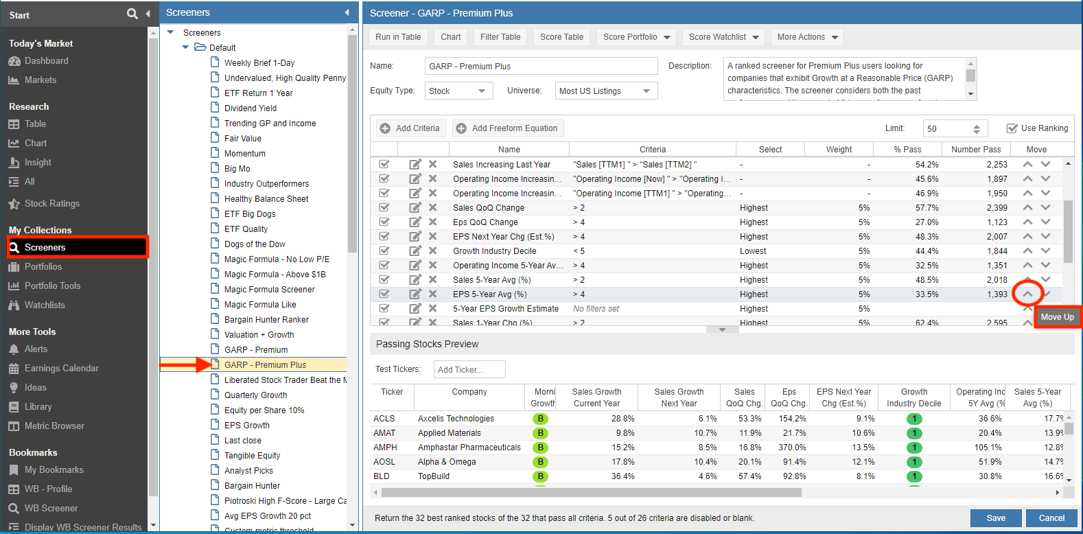
You can now reorder the filter criteria in the Screener Manager via the up / down icons under the Move column. Simply select the filter you want to move and click the move up or move down icon.
This new capability enables you to order the list of filtering criteria based on the commonality you feel is appropriate.
Alerts
The Alerts facility allows you to receive a text or email alert when something happens in the market of interest to you.
New Alerts
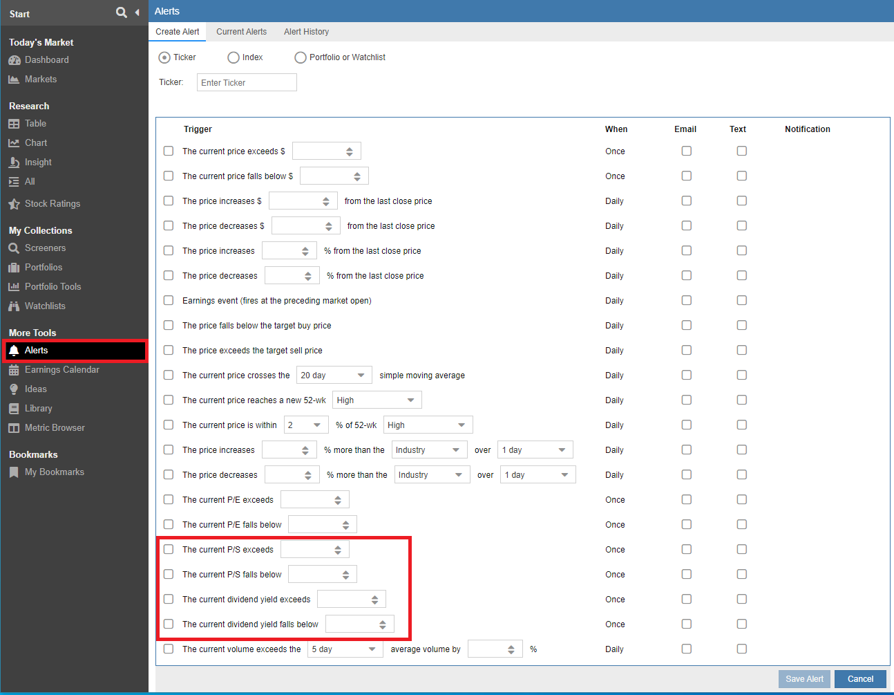
Two new alerts have been added to the Alerts facility. The first alert allows you to trigger based on the price / sales ratio going above or below a threshold value. The second new alert allows you to be notified when the dividend yield exceeds or falls below a specific value.
Summary
We hope that these latest refinements and additions help you to take better advantage of Stock Rover’s many capabilities.




15 Comments To "New Features Added to Stock Rover V8"
#1 Comment By Bruce Kebbekus On July 16, 2022 @ 1:36 pm
Will you be including manual portfolios?
#2 Comment By Howard Reisman On July 17, 2022 @ 6:19 am
Yes manual portfolio are fully supported
#3 Comment By David Stokes On July 16, 2022 @ 2:21 pm
Great stuff! Keep up the good work.
#4 Comment By Jim On July 16, 2022 @ 4:23 pm
Still getting used to the full capabilities but this looks like significant improvement. Keep it going!
Jim
#5 Comment By Jim Stettner On July 18, 2022 @ 7:11 am
I am a new premium plus member. I am on your website 2-3 hours a day trying to learn all I can. I wanted to leave a suggestion. MorningStar offers an analysis (I am leaving MS), and it is called “stock intersection”. Based on the individual stocks you own, plus all the stocks held in your mutual funds, it lists “all” stock owned in order of value. So where SR shows my largest stock holding is Abbvie, in reality my largest holdings are Microsoft, Amazon, and a several others due to my ownership of these stocks in my mutual funds. It’s an important analysis as it shows “true” holdings/value in stocks and it impacts decision making on what to buy/sell/hold. Alison replied to my questions saying that SR was working on offering this analysis in the future but did not know when. I hope it’s soon. I think your members would like this as most people own both stocks and mutual funds. Thanks for your consideration. Jim
#6 Comment By Dave On July 29, 2022 @ 6:59 pm
This would be great, including ETFs please. I use etfbreakdown.com, for an example of what works well for me.
#7 Comment By Ken Leoni On August 1, 2022 @ 2:47 pm
Jim,
Thank you for the feedback, we’ll send this over to development for future consideration.
#8 Comment By Anand Subbaiyan On August 26, 2022 @ 7:12 pm
I requested this feature a year back and am eagerly waiting for it to be implemented.
#9 Comment By Stephen Bennett On July 30, 2022 @ 8:58 am
Outstanding work, many thanks.
I would appreciate a table view that subtotals by a defined field. For example, add a tagged field for bucket 1, 2 & 3 and then sort by that field. This would allow me to see my allocation amounts by bucket. This could also work when sorting by stock, etf, asset, etc. Currently, it only subtotals by portfolio.
#10 Comment By Ken Leoni On August 1, 2022 @ 2:51 pm
Hi Stephen,
You can readily accomplish this via tags and colors and the Group By option in the Table.
#11 Comment By Glenn Lightner On July 30, 2022 @ 3:32 pm
I must be missing something, as I don’t see Heat Map in my dashboard. I tried logging out and back in, but still nothing.
#12 Comment By Ken Leoni On August 1, 2022 @ 2:56 pm
Hi Glenn,
You’ll want to:
– click on the hamburger in any of the Sections
– select “Show Sections”
– make sure “Holdings Map Performance” is checked
#13 Comment By Jim On July 30, 2022 @ 10:37 pm
I used Morningstar as well but love StockRover. 1 feature I really liked in MS was the ability to see returns in specific years – not averages or cumulative. This shows clearly which investments have the “least worst” performance on a yearly basis which is useful for defensive investing. 1 good year can easily hide some poor years when looking at averages or cumulative numbers. I derive that now by downloading and calculating but would be great to see it i\on a view and seems like a natural addition.
Another useful feature would be to allow selecting a stock or ETF as a benchmark. I look at sectors and try to find the best investments in each. So being able to easily compare eg technology investments against XLK would be useful rather than just S&P 500, DJI, etc.
The final point is more of a question. Tables and charts often say that the prices are adjusted for dividends. Is that always the case or is it only the case when explicitly stated? Simple example – the ratio chart.
#14 Comment By Ken Leoni On August 1, 2022 @ 3:42 pm
Hello Jim,
1. You can create custom metrics that map to the historical yearly returns and display them in the Table. For example:
“1-Year Return [TTM1] ”
“1-Year Return [TTM2] ”
“1-Year Return [TTM3] ”
[62] provides a bit more detail on how to do this.
2. You can select a Stock or ETF as a benchmark in the Chart in the Compare To: box [63]
3. What you are looking for would be in the metric description which is available by selecting “Explain’ when clicking on the column header in the Table or looking up the description for the metrics in the metric browser [64]
So the return metrics say they are dividend adjusted but the Price metric doesn’t so a ratio chart with Price would use the plain price.
#15 Comment By Hope Barrett On July 31, 2022 @ 4:21 pm
Love the enhancements! Especially the heat map on the dashboard.