Contents
- Introduction [1]
- Creating New Tabs [2]
- Types of Tables [3]
- Types of Charts [4]
- Adding a Table [5]
- Adding a Chart [6]
- Organizing Tabs [7]
- Reordering Tabs [8]
- Hiding Tabs [9]
- Copying Tabs [10]
- Renaming Tabs [11]
- Deleting Tabs [12]
- Modifying Tab Content [13]
- Summary [16]
Introduction
We have added a powerful new capability to Stock Rover called Visuals. This is the second of a two part blog series on Visuals. The first part [17] covered the out-of-the-box setup for Visuals, explaining the content that Visuals provides by default. This blog post will cover how to customize Visuals so that Visuals presents the exact data you want to see, organized exactly the way you want to see it.
The Visuals feature is available for all subscription plans, including free.
So How Do I Customize Visuals?
It all begins by clicking on the Visuals button as shown below.
When you click on the Visuals button, you will see two menu items. The first is the edit capability for the Visuals tab you are currently on, which in this case is History. We will explore the edit capability later in this blog.
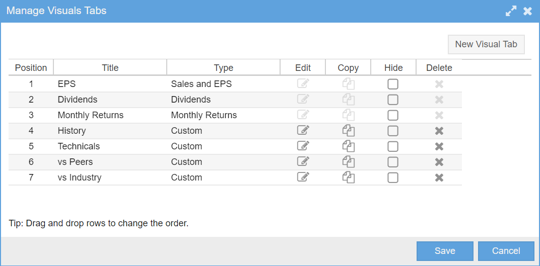
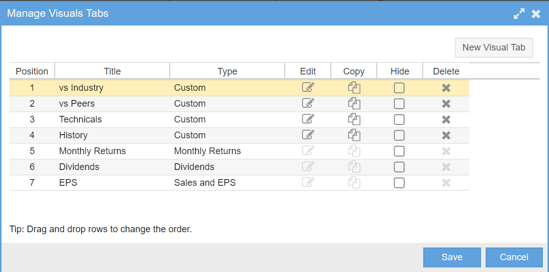
The second is Manage Visual Tabs. This option allows you to control the tabs as a group. When you select this menu item, a new window appears as shown below. Let’s dive into managing the tabs first.
Note that the EPS, Dividends and Monthly Returns edit, copy and delete icons are grayed out. This is because the format of these tabs are fixed and cannot be edited.
From this window, you can perform a wide variety of operations. Let’s begin with creating a new tab.
Creating New Tabs
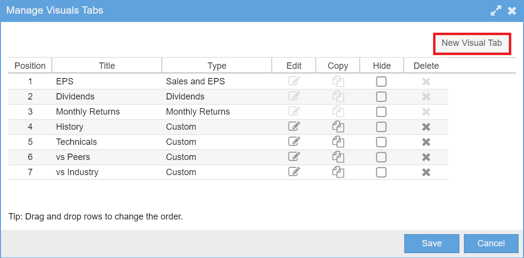
Creating new tabs is straightforward. You create a tab, name it, decide where in the tab order it should be positioned and then you populate up to six vertically stacked tables and charts. Each table and chart normally contains content appropriate for the overall theme of the table. The process begins by clicking on the New Visual Tab button from the Manage Visual Tabs window as shown below.
That will bring up the Create Visual Tab window with a default name, and a blank slate to which you can then add the tables and charts you want to see.
From the Create Visual Tab window, you click on the Add Table or the Add Chart button. This will bring up a new window where you specify the design of the table or chart you want to create.
Each table or chart is added below the preceding tables and charts. Tables and charts can be intermixed in any order. If you don’t like the order that the tables and charts render in, you can change the order by dragging and dropping any table or chart row within the list to the location you want.
Types of Tables
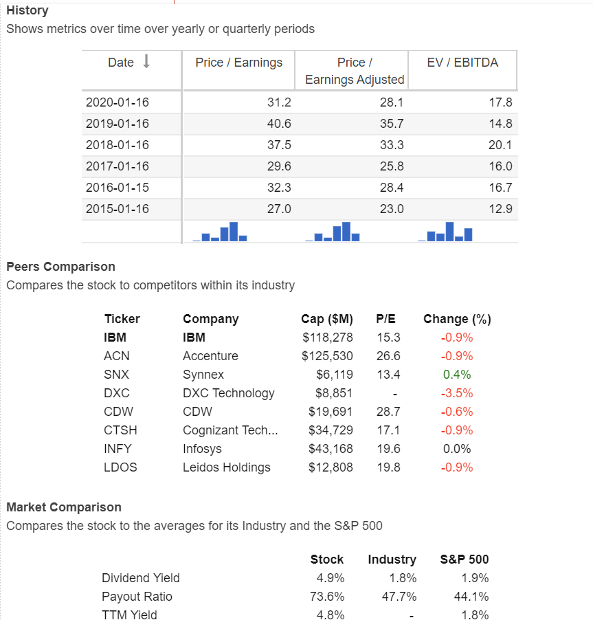
There are three types of tables you can add: History, Peer Comparison and Market Comparison.
The History Table shows a list of metrics over time, where the columns are the selected metrics and the rows are the time periods. Time periods can be quarters or years. Years can be calendar years or rolling 12 month periods, known as TTM (trailing twelve months).
The Peer Comparison Table shows a list of selected metrics vs. peers, where the columns are the metrics and each row is a different peer.
The Market Comparison Table compares the stock averages for a number of metrics vs. its industry and vs. the S&P 500.
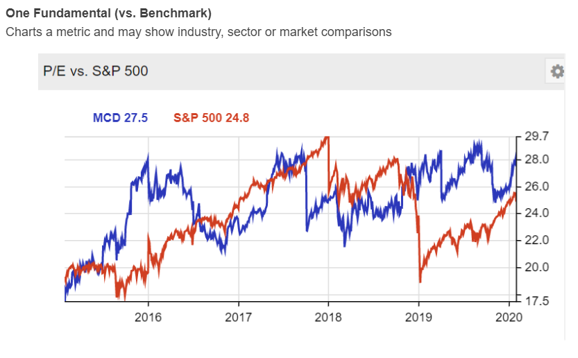
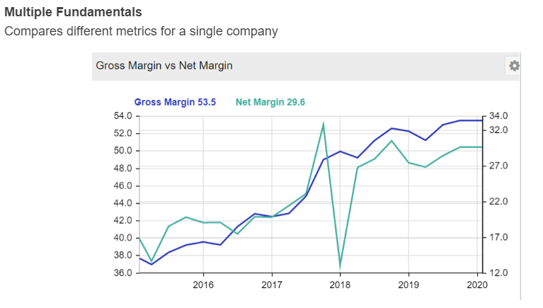
The screenshot below shows an example of each table.
Types of Charts
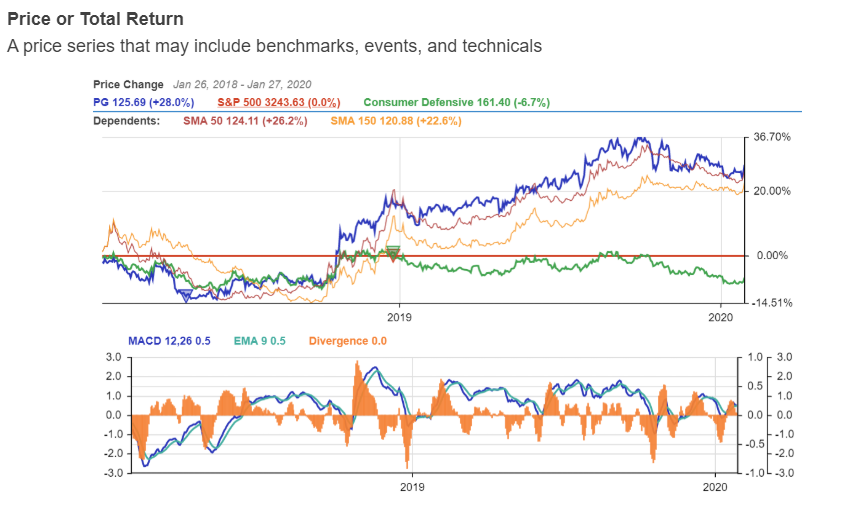
There are three types of charts you can add: Price, One Fundamental and Multiple Fundamentals.
The Price Chart shows a line chart displaying the price over time. The price can include or exclude dividends via an option in the Settings button within the Create Chart window. With dividends included, the chart is known as a Total Return chart. You can select the time period, add benchmarks, technicals and events such as dividends, earning announcements and splits. The chart display can be price $, price %, price logarithmic or candlesticks.
The One Fundamental Chart shows a chart of the price, along with any desired benchmarks and one fundamental metric all charted together. There are many fundamentals to choose from such as Price to Earnings, Price to Book, Price to Sales, Cash Flow, Free Cash Flow, Operating Margin, Long Term Debt etc.
The Multiple Fundamentals Chart shows multiple fundamental metrics charted together.
Adding a Table
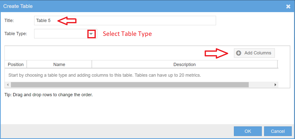
If you click on the Add Table button, a new window will open that allows you to create the table you want to add to the tab. The window looks like this:
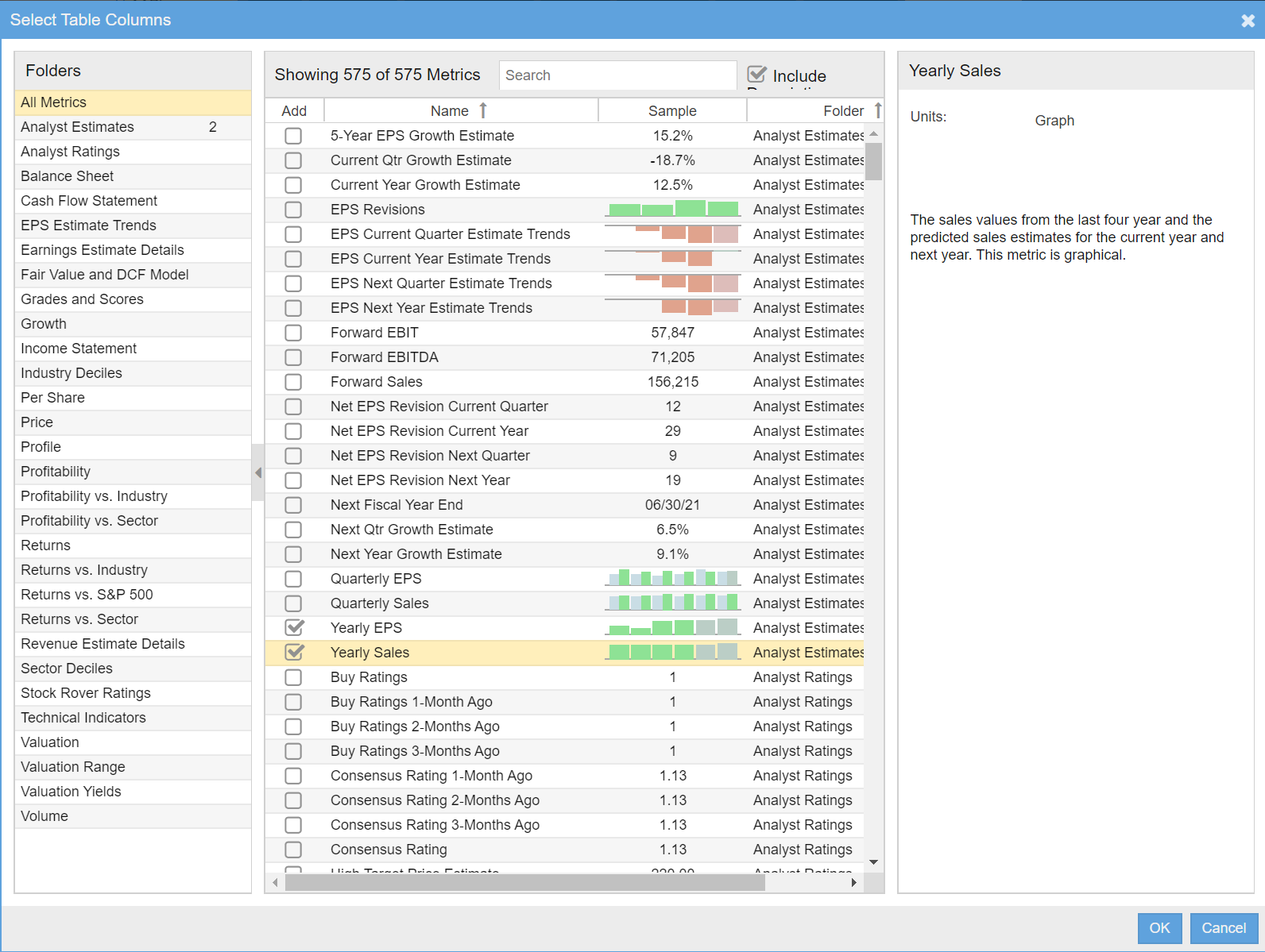
You are going to want to fill in the title for the table, use the dropdown to select the table type and then select the columns you want in the table. Adding columns will present a window that looks like this:
To populate the table with the columns you want, just check the boxes of the columns you would like to include. When you are done, click on the OK button on the bottom to confirm the column selections.
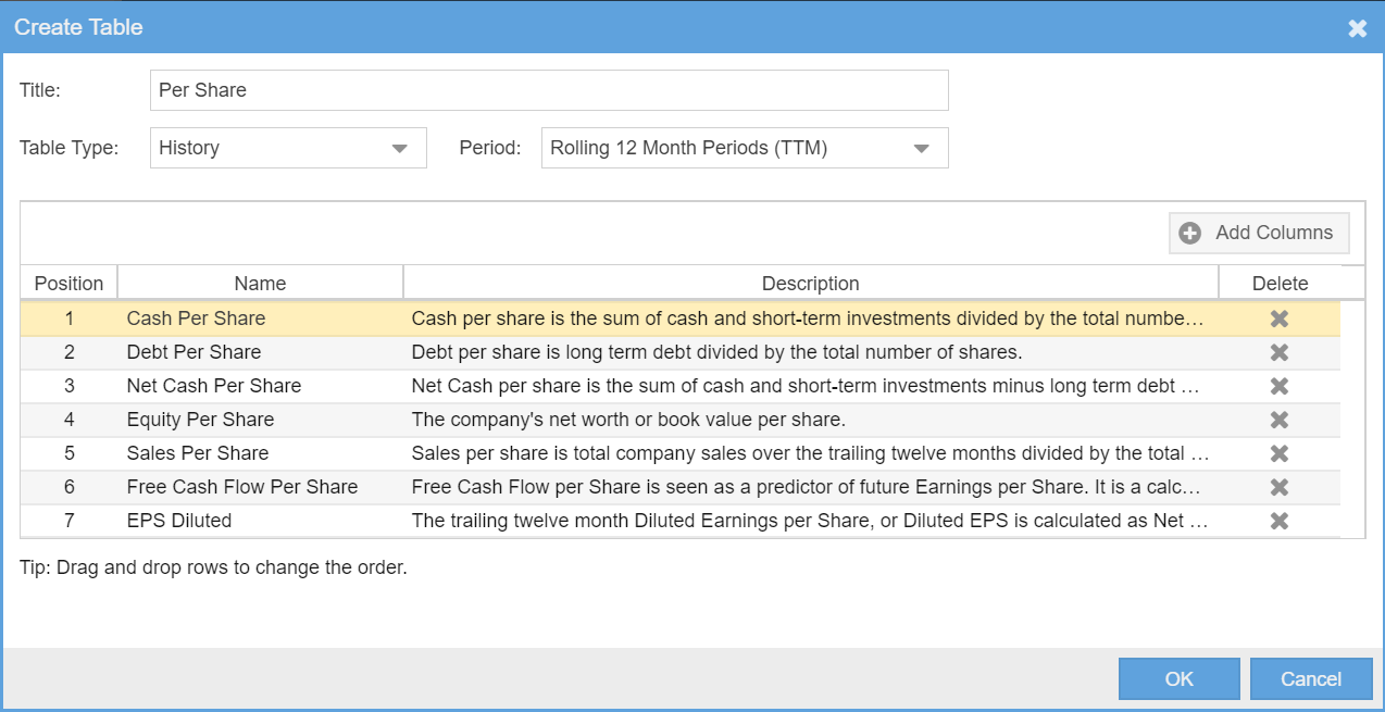
Once you do that, you will get a listing of the columns you selected as shown below. If you want to change the order the columns appear in the table, you can drag and drop the rows to reorder them as you like.
Here we see the Add Table window completely filled and ready to be added to a tab. Clicking OK will add the table to the tab.
Adding a Chart
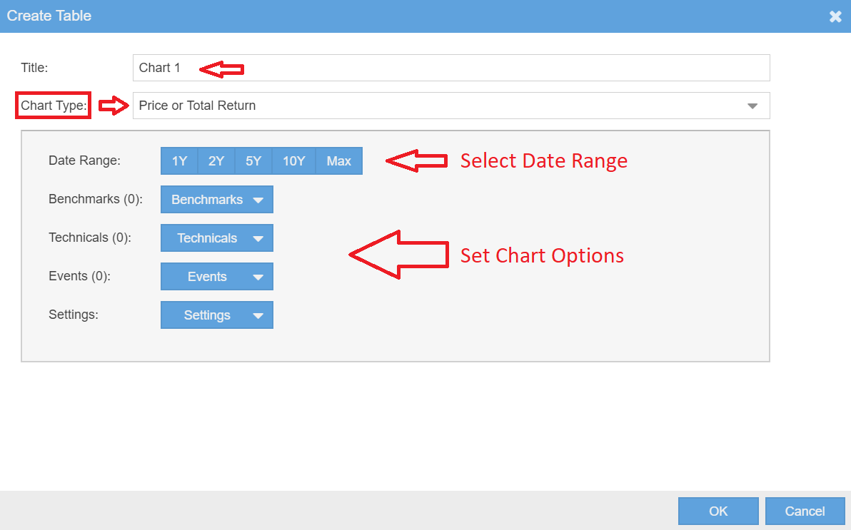
Adding a chart is similar to adding a table. You click on the Add Chart button, then a new window will open that allows you to create the chart you want to add to the tab. The window looks like this:
Similar to the table, you add the title you want for the chart and then use the dropdown to select the chart type. Depending on the chart type you select, there will be additional controls where you can enter the options appropriate for the chart you selected. For example for the Price chart, under the settings dropdown, you can control the chart type ($, %, logarithmic or candlesticks) and whether to include dividends or not in the returns.
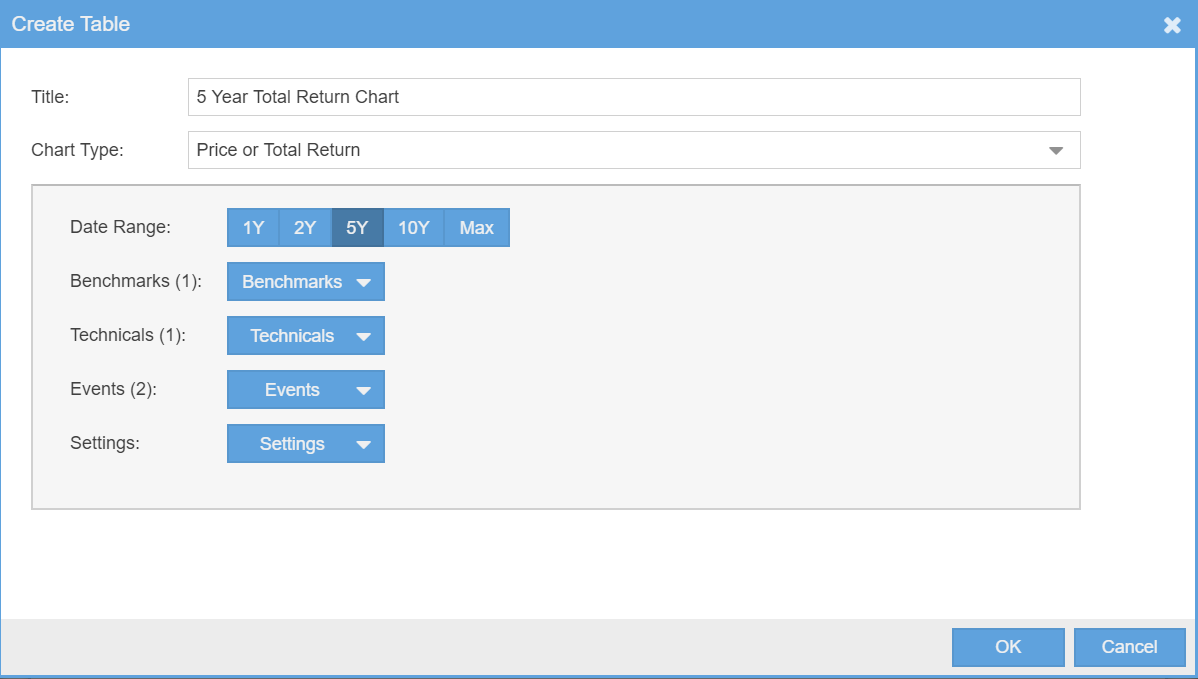
Below you see the same chart window as above, but with a new title, a time period selected and selections made for Benchmarks, Technicals and Events as indicated by the numbers next to each label.
Organizing Tabs
Reordering Tabs
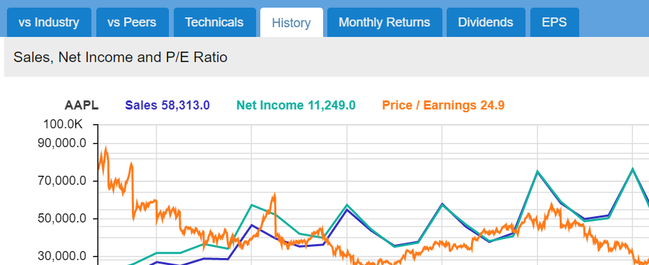
You can reorder tabs to display tabs in any order you like. Reordering tabs is done by dragging and dropping the tabs in the Manage Visual Tabs window, shown below. There is a tip toward the bottom of the Manage Visuals Tabs window to remind you.
In the example below, after some dragging and dropping, I ended up with a new tab order that is the reverse of the original tab order.
Now when I display Visuals, I can see my new tab order as shown below.
Hiding Tabs
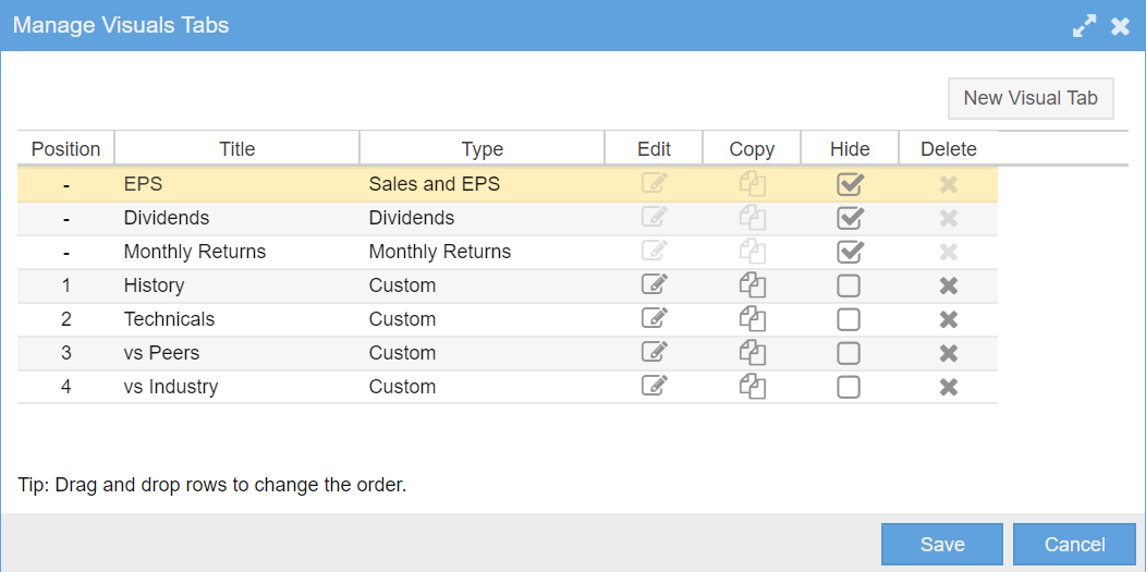
You can hide tabs if you want to keep them for future use, but don’t want to view them now. Hiding is also the way to make the three fixed factory tabs, EPS, Dividends and Monthly Returns, disappear if you want to, as they cannot be edited or deleted. Just check the boxes in the Hide column. The screenshot below shows this, hiding the three fixed factory tabs.
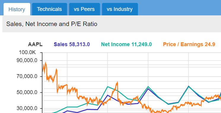
Now my display only has four tabs, all of which are completely editable by you.
Copying Tabs
Three other common operations are copying, renaming and deleting tabs.
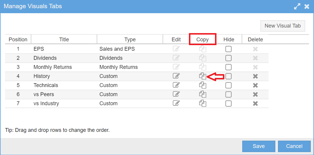
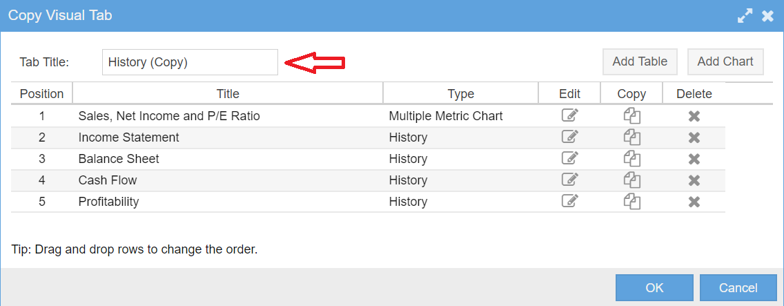
Let’s begin with copying. Copying is typically done when a tab has stuff you like, but you want to change it – yet you still want the ability to be able to get back to the original tab. To copy, simply click on the copy icon.
This will pop up a second window, where you can name the new copy. You can also edit it. Let’s just create the copy with the default name for now.
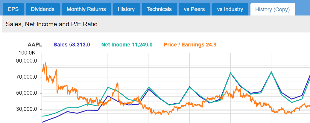
When we say OK to everything, we see that our Visuals display has been updated with the copy.
Renaming Tabs
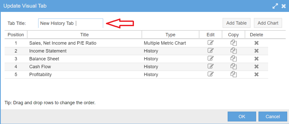
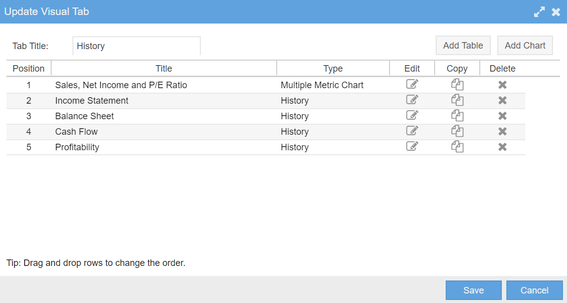
Renaming can be done by clicking on the edit button for the desired tab when you are in the Manage Visual Tabs window. It can also be done by selecting the tab for display in Visuals and then selecting the Edit item from the Visuals menu. In either case you get the Update Visual Tab Window where you can type a new name into the title box and then save it via the OK button, as shown below.
Deleting Tabs
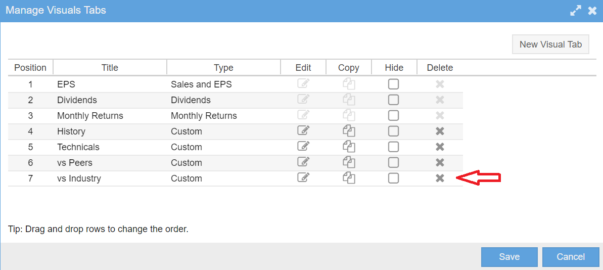
Deleting tabs is easy. Just click on the “x” next in the Delete for the tab you wish to delete, as shown below.
Modifying Tab Content
Changing Table and Chart Display Order
Tables and charts can be displayed in any order you like. To change the order, follow the steps described in the preceding section to display the Update Visual Tab window. Within that window, simply drag and drop the rows which represent the tables and charts into the order you would like.
Editing Tables and Charts
You can easily change the content of any table or chart. This includes the type of table or chart, its title and the definition of the data to display.
There are two easy ways to do this in Visuals. The first is to render the Update Visual Tab window as shown above and then click on the edit icon for the table or chart you would like to change.
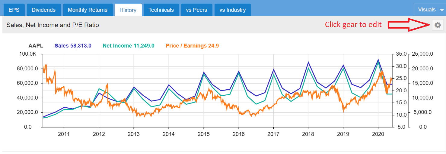
The second way is to click on the gear icon on the table or chart you would like to modify as shown in the screenshot below.
This will bring up an appropriate edit window where you can make any changes you would like to your table or chart.
Summary
The new Visuals feature in Stock Rover brings an enormous amount of power and flexibility to your investment information display.
The really great thing about Visuals is the ability to customize your display. Customization lets you tailor Stock Rover so that you get the data you want to see, with the structure you want, and formatted the way you want to see it. Customization is highly flexible and is easy to do. I think that you will find the time you spend performing customization will be well worth it.
We hope that with this blog post and the first blog post Introducing Visuals [17], we have stoked your interest enough to explore Visuals. Visuals can help make your investment research process far more efficient, productive and rewarding.


Comments Disabled To "Customizing Visuals"
#1 Comment By Gary Elsner On June 6, 2020 @ 11:49 am
Do you have ETFs organized by Sectors? If so, how many Sectors do you use?
Thanks,
/ Gary
#2 Comment By Howard Reisman On June 8, 2020 @ 7:26 am
There are around 15 separate ETF sectors that we maintain for sector ETFs
#3 Comment By jerry bastin On June 6, 2020 @ 6:16 pm
visuals is just great, love it , one request can you add volatility as one of key metrics i use thanks
#4 Comment By Howard Reisman On June 8, 2020 @ 7:24 am
Thank you for your suggestion. We will consider this when we enhance Visuals.