Last week [1] we explored sources that can help you assess the macro environment so that you can judiciously allocate your capital to stocks, bonds and/or cash. This week, we’ll apply those teachings to the current market to see what kind of conclusions we can draw about investing at this very moment in time.
It begins with a simple question: Is now a good time to invest in stocks?
To answer this, we’ll look at the strength of the economy, the valuation of the market, the outlook for interest rates, and a couple of key market cycles.
A few disclaimers before we dive in. Please note that we’ll focus on the US market here; if you are looking to invest in foreign companies or in companies with a lot of foreign exposure, you should investigate the relevant markets. Furthermore, keep in mind that we are not economists; we are, like you, investors just trying to read the tea leaves as objectively as possible.
Contents
- The Economy [2]
- The Yield Curve [3]
- Unemployment [4]
- Personal Income [5]
- Industrial Production [6]
- GDP [7]
- Inventories [8]
- Summary [9]
- Valuation of the Market [10]
- Risk Premium [11]
- Interest Rates [12]
- Cycles [13]
- Putting It All Together [14]
- Conclusion [15]
The Economy
First we’ll take a look at some of the indicators of a recession risk and then analyze what they are telling us.
The Yield Curve
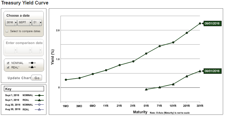
As seen below, the yield curve is normal (not inverted or flat), meaning that longer-term rates exceed shorter term rates.
Source: US Department of the Treasury [16]
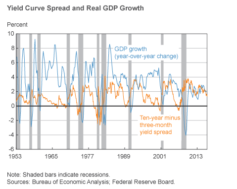
This does not signal a recession risk. However, by testing a handful of other dates (not shown), it became clear that the curve has flattened slightly in the past several months, which suggests a slowing of growth. Take a look at the following chart, which compares the GDP Y/Y growth (in blue) to the spread between the 10-year and 3-month treasury yields (in orange). There is some noise, but you can roughly see that as the spread decreases, GDP growth comes down as well. Also notice how when the spread goes to near zero or below zero, a recession (grey bar) usually follows.
Source: Federal Reserve Bank of Cleveland
Unemployment
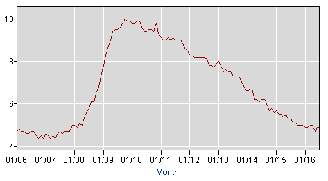
Unemployment is generally moving in the right direction, having steadily fallen since early 2010, as seen in the chart below. The current unemployment rate is 4.9%.
Source: Bureau of Labor Statistics [17]
The weekly jobless claims report (as reported by Econoday) for the August 20 week showed a slight uptick in both initial and continuing claims, but overall the report shows that the labor market is holding strong with “historically low levels” of layoffs.
Personal Income
The most recent report on personal income and outlays was positive, following tepid growth the previous month. The Bureau of Economic Analysis report (PDF) shows that personal income rose $71.6 billion in July, an increase of 0.4%, with disposable personal income rising $60.1 billion, a 0.3% increase, and the savings rate edging up 0.2% to 5.7%. According to the report, “the increase in personal income in July primarily reflected increases in wages and salaries and personal current transfer receipts.”
Personal consumption expenditures (PCE) increased $42.0 billion, also 0.3%, which follows a 0.5% increase the preceding month. The PCE price index had no change, which means that inflation is taking its sweet time to get back up to the Fed’s desired 2% rate.
Industrial Production
The most recent report on industrial production [18] showed a monthly increase of 0.7%, the biggest since November 2014. This followed a 0.4% increase in June, which itself followed several spotty months.
GDP
The GDP (gross domestic product) growth also increased at an annual rate of 1.1% in the second quarter of this year. This represents a slight increase over the previous two quarters, but a decrease overall in the past two years. The quarterly growth rate is charted below.
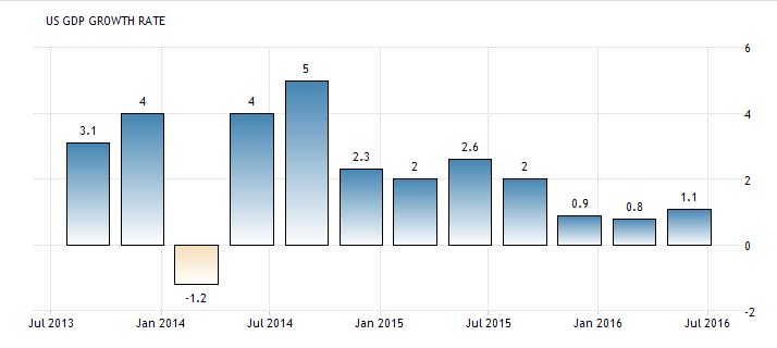
Source: Trading Economics [19]
Inventories
Too much inventory can portend a slowdown in production activity, but rising inventories can suggest high expectations for future sales. So this indicator cannot be interpreted in isolation. Ideally inventories are balanced with sales such that there aren’t backlogs or shortages.
In the second quarter of this year, inventories decreased by $12.4 billion, as shown below.
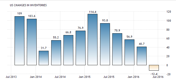
Source: Trading Economics [20]
For more color, we can look at the trend of the inventories/sales ratio (through June 2016):
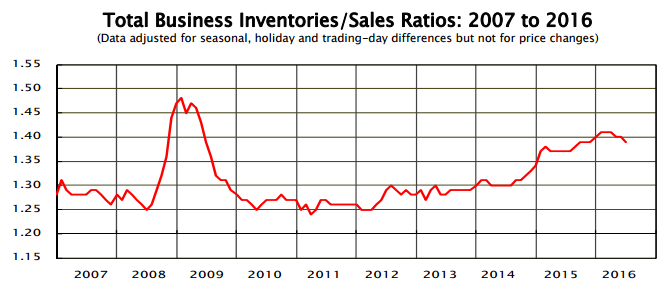
Source: US Census Bureau (PDF) [21]
The ratio has crept up between 2011 and 2016, so it’s nice to see that is has been dropping since earlier this year. The sales part of the ratio was up 1.2% from May to June, but down 0.6% Y/Y from June 2015. The July report will be available on September 15.
Based on this and consumer spending trends, it appears that the drop in inventories last quarter was the positive result of strong consumer spending, rather than a sign of business pessimism.
Summary
None of these factors point to recession, which is good. However the flattening yield curve and weak GDP growth of late mean that economic growth could be slowing. On the other hand, the labor market, personal income, and consumer spending are all looking fairly healthy.
Valuation of the Market
Now that we have a general idea of the domestic macroeconomic backdrop, let’s take a look at valuation. How expensive is the market now?
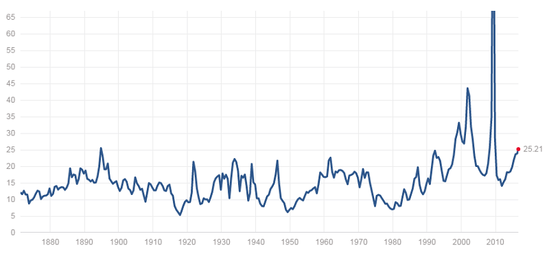
Below is the S&P 500 charted since 1880. We probably don’t need to go *quite* that far back for the perspective we need, but at least it’s interesting to see:
 [22]
[22]
Source: multpl.com [23]
With an average P/E of 25.21 at the time of writing, the market seems a little pricey, especially, as you can see from the graph, because it has just steadily crept up in the last 5 years, and that historically it hasn’t gone above the current level very often. The bubble years of the early 2000s and the freakish earnings plunge during the Great Recession has meant that P/E has swung pretty wildly in the last 16 or so years. So while it definitely seems expensive, at least by this indicator, it’s hard to say how much higher valuations will climb before they trace down again.
Let’s run through a few more historical valuation charts.
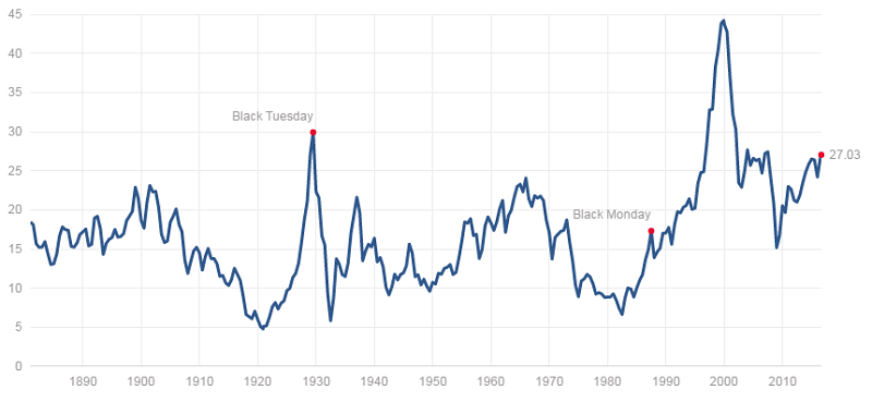
The Shiller P/E values the S&P 500 a notch higher, at 27.03:
 [24]
[24]
Source: multpl.com [25]
The Shiller P/E uses 10 years of historical price data to better account for market cycles. The market has had a pretty wild and crazy decade, so it’s not really clear if this metric is giving us a more fair perspective, or if it’s muddying a “normal” market valuation with aberrant valuations from the recent past. Either way, at the moment it is not really telling a different story from the standard P/E measure, so we don’t have to make that call. According to the Shiller P/E, the market is expensive.
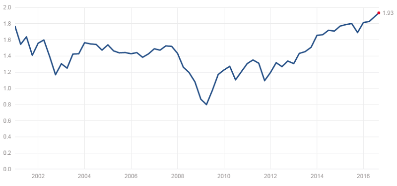
The P/B and P/S charts don’t reach quite so far back as P/E. Price/sales for the S&P 500 is telling us that the market is at its highest P/S since the end of 2000:
 [26]
[26]
Source: multpl.com [27]
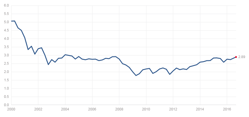
But price/book was actually at its highest at the beginning of the period:
 [28]
[28]
Source: multpl.com [29]
The reason for this is probably the dot-com bubble. Tech companies tend to have low book values because they have relatively few tangible assets—intellectual property is their main asset. In the early 2000s, tech companies with huge market caps and low book value were being marked up like crazy thanks to the tech boom, hence the high P/B of that time. But if you block that period out, you can more easily see that P/B has also been slowly rising since sometime in 2009.
Putting all of these multiples together shows that the market is indeed expensive right now. It’s not necessarily out of a normal range, but one would expect to see it corrected downward at some point in the next few years, if not months.
We also mentioned last week that you can use index ETF as proxies to get the valuation multiples for small and mid cap markets. Mid cap proxy IFJ has a P/E of 22.25 and small cap proxy SLY has a P/E of 21.13. Normally you would expect to see small and mid caps having a slightly higher markup than large caps, because of higher growth expectations. The fact that these both are lower than the S&P 500 further suggest that the S&P 500 is overvalued. It also means that mid caps and small caps may be more fairly priced.
Risk Premium
There’s another way to put the valuation of the market in context, and that is to estimate the return you can make compared with a “risk free” investment like a 10-year Treasury note. The current earnings yield for for the S&P 500 is 3.98%, while the 10-year treasury yield is 1.58%. This gives us a risk premium (the premium you get for taking on the risk of equities) of 2.40%. What this tells us is that even though the earnings yield (which is the inverse of P/E) is relatively low right now, it’s still has an edge over the 10-year T-note.
To assess how good that edge is, here is a sample of risk premiums since 2000, calculated using yield data from multpl.com:
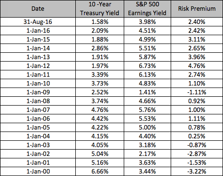
The above table really gives us perspective on how low treasury yields are right now, next to the high rates earlier in the century (they were even higher [30] in the 80s and 90s). So even though the S&P 500 has a relatively low earnings yield, the risk premium is neither low nor high when you compare it with these past samples, many of which are negative (a negative risk premium is a clear signal to move away from the stock market!). However, the current risk premium is the lowest among the past 7 samples.
Note there are other more complicated ways of calculating the risk premium, such as those that incorporate dividends, but we like the simplicity of this approach for when the measure is being used broadly, as it is here.
Interest Rates
As you are probably well aware, the federal funds rate, which has a domino effect on all different kinds of interest rates, has been very low for years. The Federal Open Market Committee (FOMC), which sets the federal funds rate, has been eyeing another rate increase as soon as it is viable. Specifically, they’ve been holding out for 2% inflation alongside indicators that the economy is healthy and growing.
Although many economic indicators have been positive, the 2% inflation has proved to be elusive. However, based on Fed Chair Janet Yellen’s speech [31] last week, a September rate hike appears reasonably likely (more so than when the FOMC July meeting minutes were released), even if the inflation target isn’t reached. She cites strong consumer spending and a solid labor market, even though some aspects of the economy are lagging.
Yellen states that FOMC “continues to anticipate gradual increases” in the rate over time, so investors should prepare for an incremental rate hike this quarter or, perhaps more likely, next quarter. Friday’s employment report was positive but not as strong as hoped for, which dims the likelihood of a rate change this quarter.
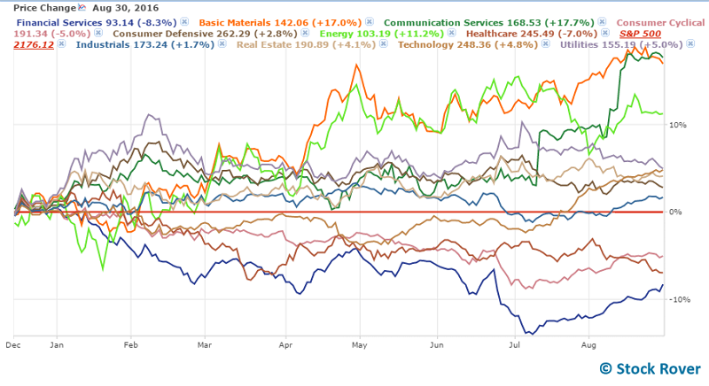
Certain sectors tend to fare better in rising rate environments (as discussed here [32]), however the financial services sector, which normally benefits from a rising rate environment, has actually been the worst performer since last December’s 25bp hike. Consumer cyclical and healthcare were the other losers. Here are all the sectors charted since December 16, 2015, with the S&P 500 set as a baseline:
This isn’t to challenge conventional wisdom about what sectors tend to be best in a rising rate environment, but just a reminder that it isn’t foolproof and cannot stand in for deeper research on individual companies. You should vet your stock picks to ensure that they won’t be overly vulnerable to rising rates
Cycles
Last week we mentioned two types of cycles that can affect markets: the May-October “go away” period, and the presidential cycle [34]. We are currently in the unfavorable period of May-October, but we are also in the last few months of the favorable period of the presidential cycle. So, that sends conflicting signals (but then, when are there not conflicting signals?). Based on how strongly you believe in these cycles, you can make your decisions accordingly.
If you are stock picking, as opposed to buying, say, index funds, you may be less inclined to worry about these cycles, because your stock research will probably make a stronger, more tangible case than the abstract drag of market cycles. However, it can be a mistake to assume that your picks will rise above market dynamics. Thus, overlaying market cycles on top of all the information we’ve just looked might help you tweak your buy/sell timing.
Putting It All Together
Okay, so let’s quickly review what we’ve learned about the current market context, and then see if we can draw some practical conclusions from it.
- Recession risk is low
- Several economic indicators suggest that the economy is growing slowly
- The stock market is probably overvalued, especially large caps
- Despite the high market valuation, the risk premium for equities is not bad (but not great), thanks to a low treasury yield
- Interest rates are low, but will likely rise in the next quarter or two
- We are in the favorable period of the presidential cycle, but the unfavorable period of the “Sell in May” cycle
Where does this leave us? First of all, this is a subjective reading, and your own actions will depend on how you personally weight different signals and information, not to mention your investing goals, risk tolerance, and time horizon.
Our own reading is that, broadly speaking, it’s a reasonable or even good time to be in stocks for the long term because of the low recession risk and generally healthy economy, plus the risk premium is not negligible. The impending interest rate hike does not scare us, it just means that we will assess stock picks with that context in mind. For example, companies with high debt or high foreign exposure might be less likely to make the cut (for why, go here [32]).
Although there are a few indicators of slowing growth, we take the fact that the Fed believes the economic growth is stable enough to absorb a rate hike soon as a good sign for the economy in general and therefore equities.
The high market valuation gives us pause however. Stocks are expensive right now and, while they could certainly still go up, it’s reasonable to expect they would peak soon. If you are looking to allocate more capital toward stocks, it might be worth waiting to see if prices come down for better entry points. No matter when you are buying, be sure to compare a stock’s P/E to that of its peers and to its historical P/E and forward P/E. This will help you ensure that the stocks you buy are not precariously overvalued. On the flipside, if you are looking to sell, precarious overvaluation is usually a good time to do it.
The fact that we’re in the unfavorable period of “Sell in May” is also a timing concern. Buyers might want to see if valuations come down a bit in September and October so you can get in at a better price before entering the favorable part of the cycle. On the other hand, if you are a believer in the presidential cycle, then you might want to invest sooner rather than later to capture more of the favorable period, which ends at the end of 2016. Considering how abnormal this presidential election season has proved to be, we are hesitant to use it as the basis for investment decisionmaking.
Conclusion
We hope you found this to be a useful review of the current market environment. Although it may seem like a lot of things to check, the process actually goes pretty quickly when you only doing it for yourself and aren’t writing a blog post about it. Plus, if you are keeping up with major economic trends (remember, Rover’s Weekly Market Brief [35] can help with that!), then you’ll already know the majority of this information at any given time, and you’ll only need to look at a few extra pieces of data before making investment decisions.
